There is a kind of novel, generally speaking in the wake of Sebald, that includes images but doesn’t use them in particularly interesting ways. Here I want to look at three: Ben Lerner’s 10:0, Elizabeth McKenzie’s The Portable Veblen, and Claudia Rankine’s Don’t Let Me Be Lonely, to try to justify what I mean by uninteresting.
It is typical of the current reception of images in fiction that many reviews of Lerner’s book didn’t mention that it is illustrated. The critics who didn’t mention the illustrations weren’t entirely wrong: there aren’t many pictures, and some are inessential to a responsive reading of the book. The pictures vary widely in purpose and in attachment to the text, but I think a comment Jesse Ball made to an interviewer fits Lerner’s approach in 10:04: Ball said something like “I suppose I don’t trust images.”
There are long passages in 10:04 about visual art, including thoughtful reviews of Donald Judd’s installation in Marfa and Christian Marclay’s The Clock (p. 52); they show that the author (and his narrator) has spent a long time thinking and looking at visual art. And yet the images are used in such simple ways that there is hardly a reason to look at them. The first two images in the book are translucent hands: one from Jules Bastien-Lepage’s Joan of Arc, and the other of Michael J. Fox in Back to the Future.
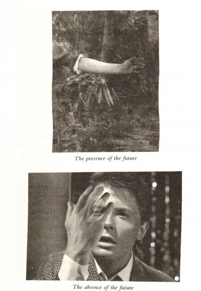
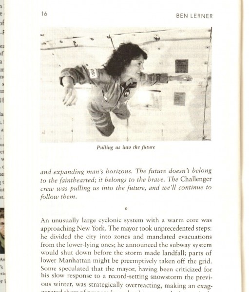
They appear after they have been described and explained, and they are small and poorly reproduced (as I’ve tried to indicate with my scans), and hence devoid of any additional visual detail that might prompt a reader to pause and consider what they add or change about the narrative. The book’s third image, of Christa McAuliffe, is the best in the book, because it introduces something that’s not in the text: the image shows her in zero-gravity, and she’s smiling—so it adds levity (a levitation, actually), introducing an intriguing and only partly explicable comment on the narrative.
The fourth image is Paul Klee’s Angelus novus, which has been hugely over-reproduced in the academic literature, and is therefore difficult to see freshly despite Annie Bourneuf’s study. In Lerner’s novel the painting may inadvertently recover some of its strangeness. The angel’s odd or delighted expression (arguably at odds with the portentous use to which Benjamin puts it) fits Lerner’s novel if only because it’s a bit like the photo of Christa McAuliffe, but I don’t imagine Lerner thought of it that way. After that there’s an image of the “face” on Mars (p. 69), which is simply illustrative of a minor point.
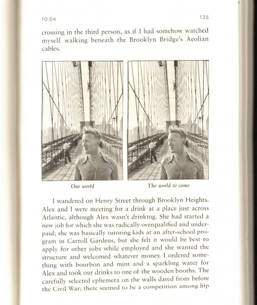
There is a photo every twenty pages, on average, which a reader might also take as a sign of the author’s lack of commitment to the visual components of his fiction. On p. 135 the book’s sixth image is a photo by Cartier-Bresson, reproduced twice in order to embody the novel’s epigraph about how the future will be “just a little different.” It’s effective as a conceptual piece, but it has no parallels elsewhere in the book—again making me think Lerner hadn’t decided on a way to use images.
After that there’s a sixty-page gap, in which images seem to be forgotten. (There is a ninety-seven page gap in The Portable Veblen, which I read in the same way: there’s no good reason for images not to be present in those pages, so it can seem that the authors lost interest.) Images return with a photo of a wall in Judd’s installation in Marfa (p. 195). Most of the book’s remaining five images are dinosaurs, because the book ends with a reproduction of a children’s book in the brontosaurus, which the narrator has written along with a boy he’s been tutoring. And 10:04 as a whole concludes with a double print by Vija Celmins, showing a field of stars and an airplane.
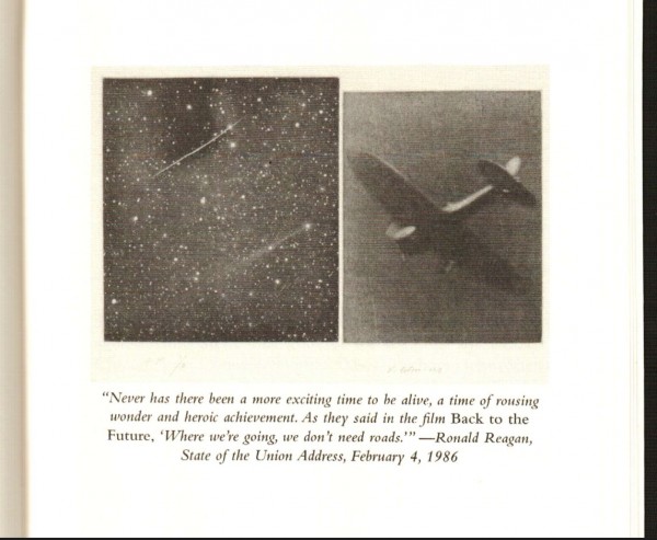
This is an evocative image (again very poorly reproduced, so it’s really just a haze of midtone grays), especially because it isn’t identified, but is instead captioned with a quotation from a speech by Reagan. Lerner himself continues to be engaged by visual art, but I think that in 10:04 a reader won’t pause more than a few moments over an image before turning the page. There’s a huge disconnect in 10:04 between the ruminative narrator, who clearly has an interest in visual art, and the not-so-visual novelist, who seems bent on creating his written voice. (Lerner’s dust jacket, by Charlotte Strick, is more visually compelling and less ordinary in its use of the visual than any of the images in the book.)
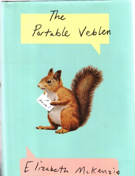
A second example of a novel with uninteresting uses of images is Elizabeth McKenzie’s whimsical novel The Portable Veblen.

The book has fifteen small black and white illustrations. (As it often happens, I did not know this book was illustrated when I bought it. Reviewers often don’t mention images, which is partly a habit in book reviewing, and partly a sign, I think, of the author’s own lack of investment in her images.)
McKenzie’s first image is on p. 18. Because nothing sets it up, it will surprise most readers. Like all the images in this book, it is given a small-caps caption with a period (“SELECTED GUNS FOR SMALL FURRED GAME.”) in imitation of older pedagogic texts of the sort the narrator might plausibly read.
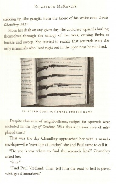
This isn’t something the narrator is seeing. There is no mention, in the text, of the book of guns or the photograph of the book. She’s been thinking about squirrels (her obsession) and the photo is an implicit commentary on what she thinks about the fact that “recipes for squirrels were included in the Joy of Cooking.”
It is possible we’re supposed to think the narrator, Veblen, owns this book with its picture of guns. She owns a camera, but there is no mention here or anywhere else in the book that she takes pictures of her possessions. There is also nothing in the book indicating she collects other people’s photographs, or that she imagines books with guns in them (she imagines many other things, including talking squirrels), and no mention of who we’re to think captioned the photos she takes: in other words nothing in the narrative to account for this image.
In the absence of any explanation or reference to the photograph or its caption, readers can assume either that the narrator owns this book (and possibly the photo of it), or else, in a more straightforward but unsatisfactory manner, that this is a photograph supplied by the author. Neither possibility has much traction, because neither is supported by the narrative, and I think that most readers will just go on past the picture, taking it as somehow part of the fiction, without thinking any more about it. It contributes whimsy and makes us think differently about the reliability and quirkiness of the narrator and the author.
The lack of any reference to the photograph or any account of the appearance of the photograph in the text is a common trait in novels that use images in what I call uninteresting ways: I think McKenzie just didn’t worry that much about how photographs might interact with text, or what kinds of thoughts might follow if a reader paused and pondered just how that snapshot of a book appeared in the novel.
The second photo is keyed to the very last words on the page, “gift basket.”
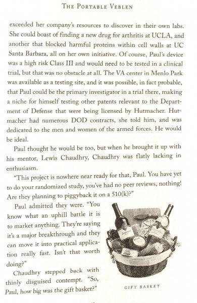
It’s a strange tease, showing a reader an image when she turns the page, but having her wait until the last line to see the connection. But it’s a fairly pointless and distracting tease, because it turns out the photo of the gift basket does not correspond with what the narrator describes, on the following page, as “a huge gift basket filled with bottles of champagne, fancy chocolates, aged wheels of French cheese, and even a sterling silver knife in a blue box from Tiffany & Co.” Some readers may turn back to the photo to check, and see that it doesn’t correspond: but then why choose a photo that doesn’t illustrate what’s in the text? It is, I think, another sign that the author (not the narrator) doesn’t expect readers to look closely at the images, and certainly not to look back and compare. But if an image isn’t to be looked at, what is it doing in the book, exactly?
The third image is captioned “ARMORY SQUARE, 1865.” It illustrates a passage in which Paul, a character in the novel, looks out of his office window onto a state of the art, Army-sponsored hospital ward where he works, and decides that “it looked no different from those he’d seen in photos of Civil War hospitals.”
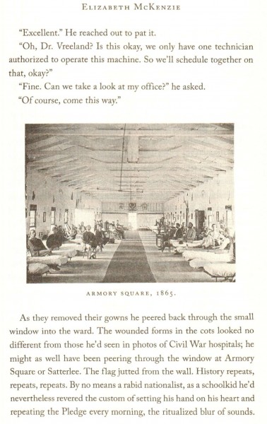
This photograph, therefore, isn’t something Veblen could have seen or known. She also couldn’t have captioned it. And since it’s the only photo in the book that illustrates an experience Paul had by himself, that leaves only McKenzie as the person who could be adding the captions. The only other part of the book that could plausibly be assigned to the author and not the narrator is the book’s Appendices. Together these facts suggest we won’t be told how the book’s photographs participate in the narrative.
At least that’s what a reader who stopped to consider these issues might conclude. But it’s also as if Paul himself wanted to show us the photo, which doesn’t make much sense in the logic of the text, since Paul doesn’t speak directly to us (the book is in third person limited narration). In addition this choice of image is arbitrary and intrusive, because Paul doesn’t ever talk about the 19th century, has no collection of Civil War photographs, and doesn’t take an interest in photography or history. The image is at odds with the narrative, which is a stronger sign of McKenzie’s relative lack of interest or “trust” in images than the free-floating appearances of the first two photos.
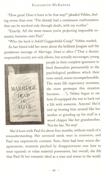
To me, the fourth picture looked faked: I thought McKenzie had printed up a fake book and photographed it, especially because the author’s name seemed so outlandish (Adolf Guggenbühl-Craig), and many other proper names in the book are clearly whimsical. So it took me out of the reader’s experience for a while and brought my to my computer. After a few minutes searching images, I discovered the book and cover are real. That took me out of the book in a different direction because I wondered, once again, if we were supposed to think Veblen had photographed the book.
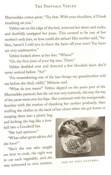
The fifth picture, “BAG OF UGLY CLOTHES,” illustrates something that’s happening in the narrative, and makes the entire novel seem that much more like a memoir: this could be just a document of the author’s and narrator’s clothes.
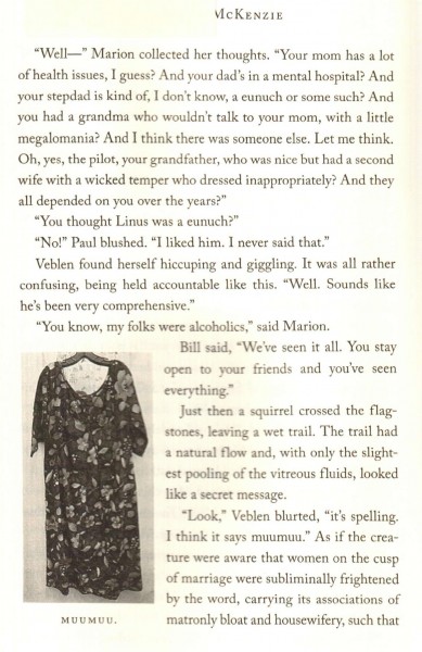
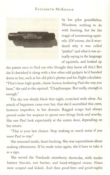
The sixth picture—we’re now 170 pages into the book, another sign that images can’t matter that much—is a muumuu, and it’s only there because Veblen thinks a squirrel might be spelling the word “muumuu” for her. So the illustration of a muumuu could imply she owns one (her mother gives her “ugly clothes”) but she doesn’t say so, and in the scene itself, there’s only a squirrel, no muumuu.
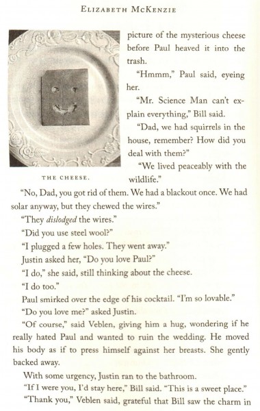
Then comes the eighth picture, the only one in the book that is actually necessary in the sense that it shows something that needs illustrating. According to Veblen, a squirrel ate this pattern in a slice of cheese–but the pattern isn’t described. Her fiancé Paul is suspicious: he thinks she did it. Readers need to consult the image to see why. To my mind this is a much more convincing and engaging use of images than the others, and it makes the others suspect by association. Were they all photos taken by Veblen? In which case, why?
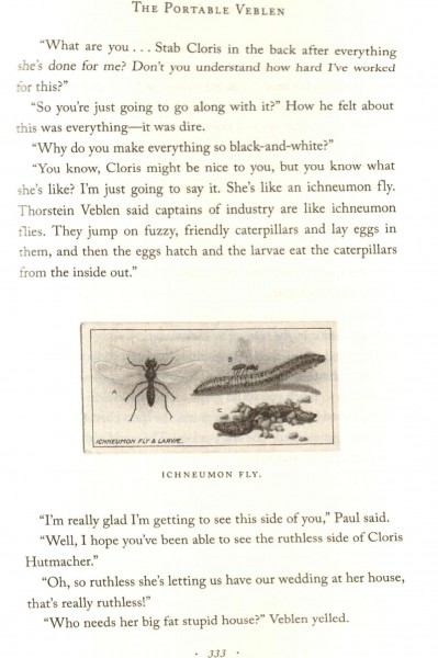
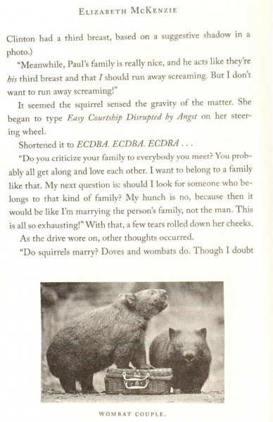
This is enough to show that McKenzie didn’t anticipate her readers asking questions like mine. I think she imagined the photos would add realism and humor, and she didn’t think readers would pause over them to ask who took the photos, who captioned them, how they ended up in the story, why they were chosen from many other possible pictures, or which ones were real and which imagined or remembered.
Claudia Rankine’s Don’t Let Me Be Lonely, my third example, shows several of these characteristics. Her use of images in this book—as opposed to Citizen, which I think works differently—is mnemonic, evidentiary, decorative, offhanded, generic, unformatted, and therefore almost always uninteresting. In order:
1. Mnemonic: the many images of people Rankine describes, such as Abner Louima, Johnny Cochrane, Amadou Diallo (pp. 56-57), are given as reminders.
2. Evidentiary: those images are also evidentiary, in that they point toward the fact that Rankine’s entire narrative is about real politics, real history, and—by implication—her actual reactions. But “evidentiary” might be better applied to photographs that indicate the narrative is telling a true story, for example the mammogram with the lump on p. 8.
(The mismatch between the ferocity of the text and what I think of as the marginalized use of images is echoed in the mismatch between the book’s very extensive “Notes” section, which describes most of the book’s references at length, and the book’s very short “Images” section, which is less than a full page. The cases of Louima, Diallo, and others are documented in “Notes,” but often the “Images” file just says “(c) John Lucas,” as if there is nothing more to be asked or known about the photographs.)
3. Decorative: an adequate description of some illustrations, such as the still of “The Wild Bunch” on p. 25, which doesn’t illustrate the points made in the text.
4. Offhanded: for example the drawings of lips speaking on p. 40, which look tossed-off, as if Rankine had decided she wanted an image, but not what she wanted out of the image.
5. Generic: the Google search bar on p. 72 which accompanies a specific idea of what might be searched, so its generic nature isn’t pertinent—it’s not clear why a reader wants to be reminded of the general idea of a Google search.
6. Unformatted: this applies to most of the images in this book, which seem carelessly placed on the page. Why does the text wrap around the image on p. 82, but not on p. 83? Why are the images narrower than the margins in most cases, but not in all? Why not decide those issues, especially if they might be distracting?
This list could easily be extended. Rankine cares for her subject matter, but her images are ornaments, additions, extras, and bits of evidence. They are rarely objects of thought. The narrative rarely needs them, rarely knows what might be done with them. They never guide the narrative. They are almost, but not quite, outside the text’s imagination.
(Still there are a few interesting uses of images in the book. I especially appreciate the repetition of the chalkboard marked “THIS IS THE MOST MISERABLE IN MY LIFE,” repeated four ties on pp. 17-18, accompanying a narrative about a disastrous change in the person who wrote it.)
*
Among an uncountable number of other novels that use images in a desultory or undecided fashion, apparently in the wake of Sebald, I would cite Leslie Scalapino’s Dahlia’s Iris: Secret Autobiography + Fiction (2003): it has pictures of Tibet, which provides a model for some of the writing. But the photographs are ordinary and not linked to the text. Scalapino is an experimental writer, and the chapters with more illustrations show the dangers of pairing images with writing which can’t be easily located between fiction, memoir, history, diary, and other forms, and which continuously changes tense, grammatical conventions, and narrative threads. One chapter that is partly on pornography has a number of drawings of Japanese prints, and partial reproductions of them: but the drawings are simple, and their relation to the prints is inexplicable; and neither can keep pace with the kaleidoscopic changes in the narrative that accompanies them (pp. 71-81). They feel like ornaments, afterthoughts.
I wonder if some of the pictorial practices in novels like Dahlia’s Iris, Jonathan Safran Foer’s Extremely Loud and Incredibly Close, The Portable Veblen, 10:04, or Jesse Ball’s Silence one Begun were made possible by the limits of Sebald’s own interest in the visual details and particularities of his images. It is also likely that Sebald’s detached or bemused tone, and his mingling of nearly autobiographical memoir with fictional forms, have had a pervasive influence on the current generation of novelists, for whom images may just come in tow.
[Edited February 2026]