The book, Seven Controlled Vocabularies and Obituary 2004. The Joy of Cooking, is exceptionally difficult to frame—to introduce, to define as an object of interest—because it is unusually multiple. Even aside from the title (which is variable, even on the printed book), the book itself existed in multiple forms even before a one-day “on-the-spot republication event” at the University of Pennsylvania April 21, 2010, at which the book was “re-edited” and presented as a series of books, texts, emails, and other files with contributions by dozens of people and appropriated texts by dozens more. The first edition (“eighth revision”) of the book is available on Lulu; it is available as a Google ebook; Project Muse (paywall) has the full text, but weirdly displayed in separate pdfs; and there are more materials on Tan Lin’s website. There are also readings (also here), a number of interviews and reviews (also here, and here), and an online appendix; the project was intended from the outset as something other than a fixed physical object. The event in 2010 produced roughly five substantial texts and a number of shorter documents, all of which are available for download and also purchase.
The amount of reading that would be required to assess 7CV (as it tends to be called in this secondary “republication” literature) would be on the order of 1,000 pages, and reading is itself what is at stake in 7CV and Lin’s other books. The relation between text and image, my theme in this project, has to be recalibrated when it comes to Lin’s work, for two kinds of reasons. Let me number these because the argument ramifies. (1) Lin is interested in the ways texts function like images, and vice versa, so that the relation between the singular object identified as “the image” and its surrounding “text” is itself in question. In addition, (2) Lin is interested in the relation between expressive writing (novels, poetry, literature) and what is often called informational writing (including everything from phone books to the backs of moist towelette packages), and in ways of reading that are more like skimming or distracted sampling.
I will elaborate on the first point, both (1a) by looking at one of the seven “Controlled Vocabularies” in the book 7CV, and then (1b) by considering some things Lin says in an interview that’s part of the 2010 “republication” event. Afterward I’ll consider larger issues of reading in relation to (2): Lin has an unusually elaborately articulated aesthetic, which can help in understanding the limits of his uses of “text” and “image” and his interest for the history and practice of writing with images.
(1a) American Architecture Meta Data Containers (17)
This is, possibly, the title of one of the “controlled vocabularies” in the book 7CV. I choose it just in order to have a specific example of ways “text” and “images” seem to work in that book. (They operate differently in the other six “vocabularies,” but they also work differently here, it turns out, from the way they might at first appear to function: more on that under the next heading.)
This “controlled vocabulary” consists of thirty-eight pages of images and text. Images are generally small on the page, so small that many can’t be deciphered. Images have no captions, but the fact that most are on right-facing pages continuously suggests they should be read alongside their facing texts. That doesn’t turn out to work very well.
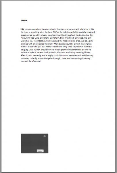
Page 66, titled “PRADA,” is a left-facing page. It has a brief meditation on the way fashion logos and other kinds of objects that contain text aren’t actually read. You “read” the Prada initials on a Prada bag, but “not in any meaningful way. After all, who has really read a bag by Louis Vuitton”? Below the “PRADA” paragraph is a small image, which seems to be a credit card or electronic pass card.
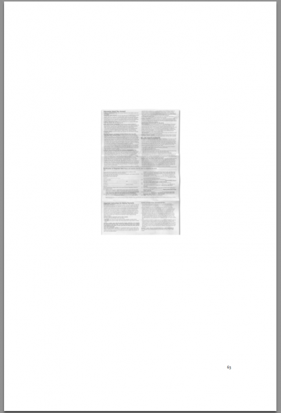
The facing image on the right page is a legal document, printed so small it can’t be read. (The section headers could perhaps be read by someone with eyesight better than mine.)
Images like these aren’t meant to be read: they present a different kind of illegibility than a Vuitton bag, but the suggestion is that many things in our ambient visual world are like Vuitton bags—including even long texts.
But because 7CV also exists as a pdf, these images can actually be seen by anyone who cares to. The facing page image turns out to be the back of a bill, perhaps a utility bill.
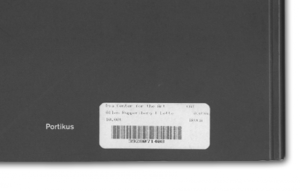
Of course I still don’t read it, but it’s curious to know Tan Lin accommodates the possibility that I might. The smaller picture below the “PRADA” text remains illegible, because it wasn’t scanned or photographed at high enough resolution:
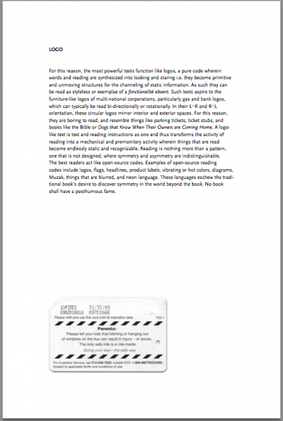
The book 7CV often returns to these sorts of musings about legibility and visibility, reading and expression, attention and distraction. Many, but not all, constellations of images and words have to do with these possibilities. Several pages later there’s a paragraph called “LOGO,” which, like many others in the book, is a short aesthetic treatise in the form of a half-page prose poem.
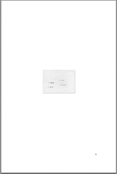
On the facing page is a very small image.
Here the text proposes that “the most powerful texts function like logos,” because “words and reading are synthesized into looking and staring.” Tan Lin is attracted to texts and images that appear “styleless,” “functionless,” and inexpressive, partly precisely because for him those are the remaining conditions of expression. In the case of logos, “reading is nothing more than a pattern.” Examples of “open-source reading codes,” he says, are “logos, flags, headlines, product labels, vibrating or hot colors, diagrams, Muzak, things that are blurred, and neon language.” This may be a slightly disingenuous list in that it includes some things that mess up its own theory (aren’t diagrams read in a concerted fashion, when they’re read at all?), but the first four are clear examples of the aesthetic proposed in “LOGO.”
The two illustrations—again one on the facing page, and one below—are not quite examples of any of these things. One is the back of a New York City Metrocard (transit ticket).
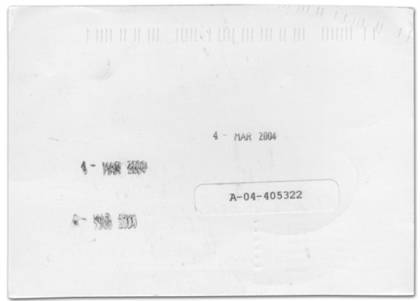
The other, on p. 67, is completely illegible in the book. The pdf shows it is time-stamped like a library card.
These two images are more loosely associated with their accompanying text than the earlier pair, and this looseness is more typical of the book. They are both objects that normally wouldn’t be read, either by “looking” or “staring” or even as “nothing more than a pattern.” If I look at objects like these, it’s to check the dates stamped on them, and that sort of reading isn’t mentioned in “LOGO.”
So it’s as if the images have strayed, lost their focus, failed to pay attention to the text. The “LOGO” text is a little theory about looking, staring, and patterns in a range of objects, and its associated images aren’t really examples—but on the other hand the distracted awareness we have of the many “open-source codes” in our ordinary lives is itself an instance of the kind of things Lin reproduces. It’s a distracted illustration of a theory of distraction, and to that extent—which does involve not reading the text for what it’s actually claiming—the images do speak to the text.
I’ll note, in passing, that when the images are enlarged, they become precious, curated objects, more like the many examples of curated instances of the everyday (in de Certeau’s sense) in the art world. They then belong to a lineage of the aesthetization of overlooked objects, found objects, and refuse that goes back to artists like Kurt Schwitters. One of the things Lin is doing in reproducing these objects so small, and so poorly, is avoiding their aesthetization, their promotion into expressive objects.
(1b) The Appendix (2010)
This is one of the documents generated at the 2010 “relaunch” event. It is also available as a book or download. It’s unpaginated, and about 10 pages in, there’s a long interview comprised of emails, dated May 2010. This is the most extensive statement of Lin’s aesthetics I have seen. It’s also remarkably consistently written: no appropriated texts, no collaging, no splicing or random interpolations; words are carefully chosen, arguments coherently developed—in short it has a seriousness of purpose often at odds with the insouciance of the short aesthetic “treatises” in 7CV.
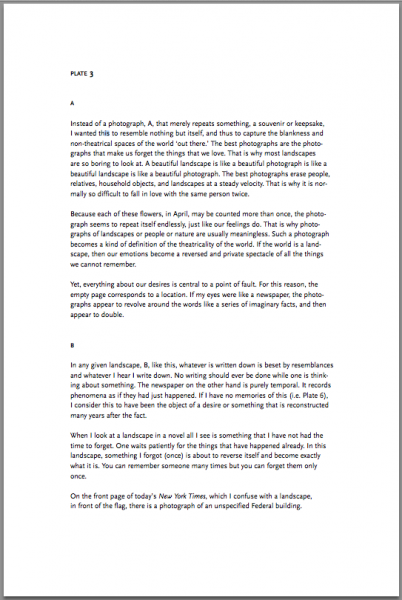
Gordon Tapper asks Lin about the relation of images and text, with special reference to a double-page layout in 7CV, in the section (or chapter, or “vocabulary”) titled “A Field Guide to the American Landscape.” Here are the two facing pages in question.
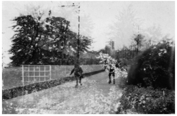
The text is titled “PLATE 3” (texts, in this section, have plate numbers as titles, and the plates have no identification). The page is a meditation on the relation between photographs of landscapes and affect. It’s a page full of refusals: Lin wants to exclude sentiment, memory, romanticism, affect. He begins “Instead of a photograph… that merely repeats something, a souvenir or a keepsake, I wanted [something that would] resemble nothing but itself, and thus capture the blankness and non-theatrical spaces of the world ‘out there'” (p. 48). Toward the bottom of this page his refusals of the qualities writers like Barthes desired in photographs (such as love, loss, and memory) drive him to paradoxical and opaque claims such as “When I look at a landscape in a novel all I see is something I have not had the time to forget.” (I’m not sure if that, or the sentences that follow, mean very much.) The page concludes with a clearly anti-affective, anti-expressive, anti-romantic formula: “On the front page of today’s New York Times, which I confuse with a landscape, in front of the flag, there is a photograph of an unspecified Federal Building.”
The image opposite is a tiny reproduction, apparently a double exposure, of two figures on a road. If I open the pdf, and zoom in, I see the image is clearly a double exposure, which makes me doubt Lin’s claim that his images are simply taken from various sources, including a flea market. It is manipulated in a way that’s very familiar from artists’ books, so that it represents a nearly erased and anonymous scene. In that sense it is romantic, affective, and even nostalgic: it’s consciously aesthetic, a modernist cousin to the postmodern decision made in the print version of 7CV to reproduce the images so small they’re nearly illegible. There is, in other words, a dissonance between the late romanticism, nostalgia, affect, and sentiment of some of the images—which is made even more intense by their small size—and the deliberately and sometimes obtusely anti-aesthetic theories in the texts.
In the interview, Lin makes a number of helpful observations about text and images. First, he says that “eliminating images (or their mildly correspondent blank spaces with a text) would make reading more straightforward and linear, and for me, unrelenting.” This is, as far as I know, an original reason for including images in a book, and it has to do with his concern with loosening the grip of expressionistic narrative—what he generally calls poetry—and returning writing to its more open and less intensely or systematically determined uses.
Lin’s aesthetic, which comes out very well in the interview, is central to all his projects. What he produces can be understood as an amalgam of writing (understood broadly, including images, media, and formats) and philosophy (in the form of a series of fragmentary, impressionistic, collaged aesthetic treatises on different subjects, very often reminiscent in format, if not in tone or content, of Benjamin’s short notes in the Arcades Project).
The book 7CV is largely philosophic, and it sometimes appears to exist for the sake of Lin’s decorated and patterned philosophic musings. It is not difficult to summarize his positions and points of reference. A consistent constellation of names is either implied or actually present in the texts (especially in Blipsoak01, and in interviews). Duchamp is the titular figure, as he was for Breton, whose Nadja is a special point of reference for Lin. Duchamp is unambiguously named but ambiguously followed, in that Lin’s work vacillates or alternates between consistently or flatly anti- or non-aesthetic positions and passages with affective or other expressive power. Pages in 7CV that are scattered with the detritus of “vocabularies,” “logos,” “memes,” and other homeless contextless pieces of legibility are close to Duchamp in their disinterest (in the proper sense of that word, as opposed to lack of interest). He is also close to Duchamp when he insists that some central properties of art (and especially poetry) such as expression, are definitively things of the past:
The photographs are almost textual in this reading space, and vice versa. There is no sequestration. In this sense, the book is a statistical landscape or minor encounter with text in general, what linguists term “word shapes” as a medium for meaning, a quasi-architectural space, a generic feeling, an inner blank spot in a system of affects and photographs that might be affects. The landscape images, which mirror something once called subjectivity, are found photographs bought at the flea market, which I then either rephotographed digitally or scanned in to something that might once have been referred to as consciousness.
It’s the wild claims such as “something once called subjectivity” and “something… once… referred to as consciousness” that read, to me, as refusals on Duchamp’s scale. (And they are also, I think, as disingenuous, as posed, as Duchamp’s refusals.) On the other hand, some pages in 7CV and in the interview are full of sudden political, conceptual, critical passions; they appear concertedly written; they feel engaged, passionate, expressive, and not ready for the Duchampian distance.
Aside from Duchamp, Lin is clearly in line with the aesthetic of the everyday, as in de Certeau, and with relational aesthetics and post-fluxus practice as in Nicolas Bourriaud and others. The reader generated at the 2010 event (TAN LIN’S SEVEN CONTROLLED VOCABULARIES: A CRITICAL READER PUBLICATION, edited by Mashinka Firunts and Danny Snelson) adds thirty or forty more names to the bibliography. Bruno Latour and Niklas Luhmann are prominent, and there are excerpts from McLuhan, Derrida, Deleuze, Jameson, and other philosophers widely used in the art world. It’s surprising but entirely appropriate that Michel Serres is one of the leading “contributors.” Lin’s aesthetics, in short, occupy a familiar position in the art world.
A large part of the aesthetic of disinterest is its anti-systematic tendency. Some words appear repeatedly in Lin’s writing and in the interview: “amusing” (Duchamp’s word), “mild” (no less than three times in the interview), “anecedotal,” “lackadaisical,” “vague,” “generic,” and “easy.” The underlying notion is that system and effort are aligned with sense and legibility, and perhaps more treacherously with expression:
The stories that I tell are a bit inert, inconsequential, minor, absorbed more or less by the everyday structures of reading and generic spaces of the city.
Along with this is a more strident anti-aesthetic when it comes to “poetry,” by which Lin means writing with expressive intent:
I see no reason to create a deep space known as the novel. I mean the minute I read a story or start a novel if it smells like fiction I immediately put it down. I’ve been doing this since I was a teenager so you can imagine how many books I’ve done this to. Most people on the planet do not write lengthy novels. They are more likely to write themselves in a restaurant review or note to a loved one, or some other short form mode of writing like a text message.
There is “poetry” in this project, “but the poetry, if it is visible, is not convulsive” At the end of the interview he says his goal in 7CV was “poetry that would read like non-fiction,” and at the beginning he says he wanted to think about reading a novel like “recipes in a cookbook.”
After a while, this aesthetic becomes familiar and, I think, less persuasive and compelling. It can seem too easy to skim over the surfaces of books, newspapers, and cultural artifacts, and the entire project can begin to seem like an overly determined attempt to avoid the entanglements, oppressions, and also rewards of producing or attending to writing that takes its expressive purposes seriously. Lin’s determination about being uncommitted, disinterested, and unsystematic can begin to seem like he’s trying too hard to appear not to be trying to escape what I am calling expression in fiction. Hence words like “mild.”
(2) The relation between writing and images in Seven Controlled Vocabularies
I hope this is enough to conjure Lin’s aesthetic in this project. The result of (1a) and (1b) is a new way of thinking of writing and images. “Writing” in this context is the expanded “writing” of poststructuralism, and especially Derrida, which includes images. As Lin says, 7CV wants to be
schematic and blandly visual in its presentation of textual and visual matter as a single operation, and its layout encourages scanning rather than continuous reading for plot.
“Scenes and photos” “are the same,” he says. Both are instances of “controlled vocabularies,” “logos,” or more generally the ambient legibility of the world in which we live. (“On the front page of today’s New York Times, which I confuse with a landscape, in front of the flag, there is a photograph of an unspecified Federal Building.”)
This is a radical idea, and it accompanies a common notion about the multiplicity and transience of images:
the book’s use of photographs is consonant with changes in photo sharing sites etc., and thus the contours of memory. Some of the photos look accidental, dated, possibly corrupted. There are tons of nearly identical or generic digital photos on Flickr, a site whose photo archives are marked by nominal editing or pruning of large photo collections, minimal metadata, reduced resolution, and, in general, personal text/image archives that are not looked at very often or are not perceived to have life expectancies greater than the person who generated them etc. This is also true of people’s photo albums, but now access to other peoples’ albums has increased exponentially. We inhabit the era of the short archive, and this suits me as a specific kind of reader: a reader with a bad memory.
I think it’s helpful to separate these two positions. The more radical one: images and texts are things that indifferently overlap; they’re mildly read, registered, scanned, seen as pictures. The less radical one: images are multiple, evanescent, collective, statistical or stochastic. Together these two positions generate the choices and arrangements in Lin’s books. The second is an aesthetic position: it supports an aesthetic practice.Lin’s books produce, for me, a low-level, emotionally cool, but dependable aesthetic pleasure, a kind of formalism—there’s a “mild” pleasure for the eye in the distributed, nearly blank pages, and affect or direct attempts at expression are kept at a safe distance.
All that is continuously undermined by claims that come from the first position. A more consistent, Duchampian writing would have a zero-degree affect. It wouldn’t produce any aesthetic pleasure, no pleasing formalisms, no sense of distant disaffection. But it might well be less interesting than the “mildly” conflicted place that Lin currently occupies.
Conclusion regarding the avant-garde
For me, especially in relation to this project of Writing with Images, Tan Lin’s position is among the most radical. The idea that images might relax the “unrelenting” literariness of continuous prose is wonderful, and genuinely new. (I mention it in the chapter on theory, where it almost fails to fit anyone’s categories.) And the idea that images can be read (or scanned, or skimmed, or glanced at) as texts, and vice-versa, is almost as new, although it could be said to come, distantly, from Baudrillard, Ong, and other media theorists.
The curious issue here is that these positions are avant-garde in relation to literature: but the avant-garde, and literature, are two values that Lin consistently critiques. In a response to Thomas Fink, written in 2009, Lin says that “the project” of Heath was to
relax the avant garde. Why? because the avant garde feels tired in its gestures, feels like it has to plagiarize to “make a statement.” Or feels like it has to resort to appropriation as something incendiary, as something neo-avant garde and from an earlier era. But appropriation is no longer avant garde. It’s standard practice in and out of the classroom… Heath is not meant to be shocking or hard to read. It may not even be literature, at least the type of literature that Tom is lobbying for. It may just be a platform, like the web, or like an index card, or like a footnote to something hors texte. I wanted to extroject literature, maybe even serious literature, or maybe “less serious” literature, into a larger reading/cultural environment to see what would happen. And the answer is: probably very little!
Heath is a set of appropriated texts, and the discussion here was about appropriation: but notice that the rhetoric of refusal of the avant-garde is itself an avant-garde strategy: Tan Lin argues for something more radical than the putative radicalism of appropriation. His positions regarding images are among his most radical—most avant-garde, if not most “literary”—inventions.
Thomas Fink had worried whether Heath might be literature, but Tan Lin says he’d rather avoid the question altogether:
I mean is there really a need for such a valorative distinction on two modes of reading or to bring them into an antagonistic (high/low; focussed/distracted) position? Who benefits from this?… I was interested in pushing at this dichotomy because in my mind it is not a sufficient and necessary condition for providing whatever it is that reading is supposed to provide. I am not sure what reading is supposed to do or how it is supposed to do it.
But again: the double refusal is itself an avant-garde gesture. The idea that the era of the medium is past (as he says in another place), that we’ve given up, “with hardly a sigh, the idea of cultural production dependent on self-reflection and individual production,” that disco, or the GUI, or something “ambient,” matter more than older forms—those are all commonplaces of the postmodern avant-garde. The avant-garde abstracted: that could be the title, and it’s definitely the camouflage, of some of Tan Lin’s most interesting practices.
And—most interesting, most disruptive of all these radicalisms—Tan Lin’s most heavily illustrated project to date, The Patio and the Index (2011), is very literary. Its subtitle is “A Sampled Novel,” and it includes apparently randomly repeated sections that interrupt its narrative. But that narrative is itself absolutely literary, continuous, and nostalgic, and the text is filled with high-resolution color family photographs, maps, charts, labels, and all kinds of memorabilia, no different in that respect from Sebald, Pamuk, or Roddy Doyle’s Rory and Ita (2002). The opening sentences are hardly different from any retrospective novelist’s voice:
One of the things that a parent’s life does, in death, is return the lives that came after it, much as an index does, and here I am thinking of my life, or one of the many versions of a childhood that an adult comes into possession of. My childhood’s childhood, the Chinese childhood encased inside a Western one, was mostly a high school affair, and it was mostly a life of the various projects my father undertook at 30 Cable Lane, in Athens, Ohio, when I was between the ages of twelve and seventeen and my sister was between ten and fifteen.
This reminds me of Marilynne Robinson, despite Lin’s bibliography (at the end of his “sampled novel”) which is mainly art and cultural theory including Leo Bersani, Marc Augé, and Bruno Latour.
In the face of this kind of nostalgia, what is the force of gestures like this one, which follows on his thoughts about his father’s death: “If memories were a little less visual, the world would be much happier, and by happier I mean a more incomplete place to live in.” Where is the anti-aesthetic here?
(As an envoi: Lin seems to be difficult to use as a model. It seems to me his fans, followers, and emulators tend either to mimic, echo, or adopt his terms, or to miss his Duchampian insouciance in favor of more energetic or strident rhetorics. An example of echoing is Gordon Faylor’s “Editorial Note” in “Selected Essays About a Bibliography,” which contains the observation that “Because much material was produced via web-based searches of shared information, there is considerable duplication, shallow appropriation, as well as mild customization of skimmed or lightly read material.” Those words, especially “mild,” “skimmed,” “lightly,” and “shallow,” are all Lin’s. Examples of rhetoric that are more strident or energetic than what Lin usually permits himself can be found throughout “Selected Essay,” which is a kind of glossary of terms in and around Lin’s work; I find it too miscellaneous to be much help in reading his work.)


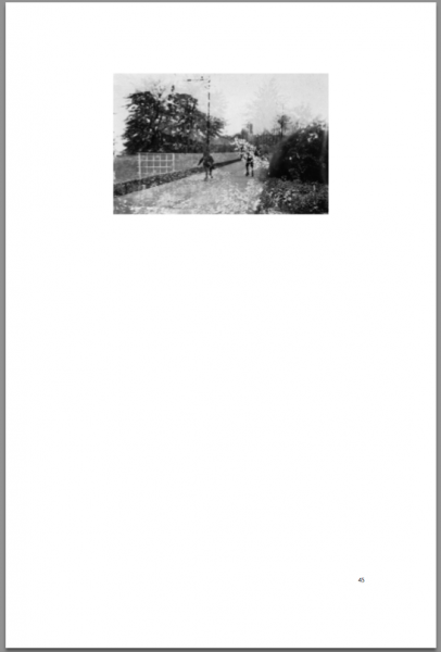
Thanks for this James. Enjoyed it quite a bit. The double exposure shot is a snapshot (I still have it) that I found at the flea market. It’s about 1.5 x 3 inches. But thought you might be interested to know this.Thanks again for this thoughtful and insightful piece.
Tan