Skira originally published L’Arrière-pays in 1972. It was republished by Flammarion in 1982, reprinted by Skira in 1992, and revised by Bonnefoy for Gallimard in 2005; it appeared in English in 2012. Each is different in format and arrangement of text and image.
l’Arrière pays raises at least four questions for this project: it shows how images might work as interruptions; it employs images for several distinct reasons; it mingles an orientalist sense of landscape and geography with an early 20th c. sense of art history; and—most interesting—it uses both the kind of poor quality, “antiqued” photographs that are familiar from Sebald, and also high quality, high resolution color images.
Images as interruptions
l’Arrière pays is a good example of the way that images in a text can function as interruptions, even though it appears Bonnefoy did not think of the images that way. (For a definition of images as interruptions, see An Attempt at Theory.)
For large parts of the book, images appear pages after the passage to which they refer. This page is a typical example:
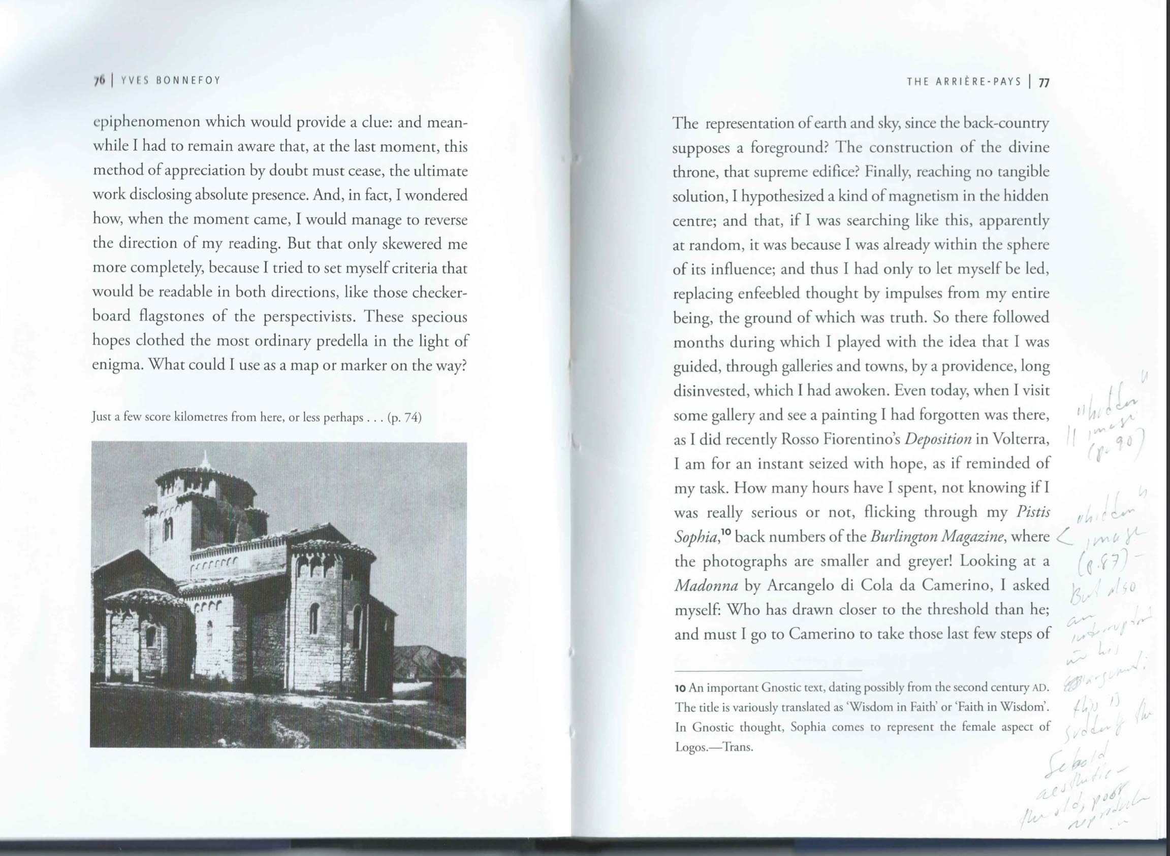
The photograph here refers to a phrase a couple of pages back, and when I turn back to remind myself of it, I see Bonnefoy is only trying to give me a general impression of “Southern Tuscany, some of Umbria, the Marches and Northern Latium.” The facing page refers to two other illustrations. (In the original Skira edition, those references are on the page before this photograph, but the effect is the same.) Rosso Fiorentino’s Deposition, mentioned on the facing page here, is illustrated 13 pages later, long after a reader will have forgotten this passing reference. And the Burlington Magazine reference, near the bottom of the page, is illustrated 11 pages later. (It’s also shown in these notes, below. In the French edition, the reproduction of Il Rosso’s painting is 18 pages after the reference, and the reproduction of the Burlington Magazine is 13 pages after it’s mentioned in the text.)
Another example, perhaps the most striking in the book, is a passage on p. 88 describing “the traveler,” a figure in a first attempt at the book L’Arrière-pays. The “author” (as he calls himself, although he also uses the first person) thinks over a passage he has written about the “traveler” (a figure for the author) in which the traveler sees a boat laden with coal. Later on the “author” realizes he had experienced that same coal in “the great Moses paintings of Poussin.” It’s quite an elliptical passage, hemmed in by qualifications (“even though I am sure of nothing now”). A reader is bound to be thinking of other things almost 20 pages later, when the prose is interrupted by two successive double-page illustrations of Poussin paintings. In the original French edition, the passing allusion to Poussin is on pp. 88-89, and the paintings appear suddenly on pp. 110-13, interrupting a passage describing how the author discovered Latin.
This kind of lag has two effects: it makes me continuously aware that what I’m reading might be illustrated later on (and so it sometimes prompts me to thumb forward to check); and it interrupts my reading when I come upon pictures I hadn’t expected, because then I have to go back to see what they are meant to illustrate. It produces a disruption in the temporal sequence that is more severe, less able to be sutured, than a conventional written flash-forward or flashback.
Different functions of images
I think these image interruptions, as I’d like to call them, might not be interesting—they might only be tedious—if it weren’t that Bonnefoy uses images in different ways.
(a) Images as guides to what people look like. It’s surprising to be shown a Fayum mummy portrait and a figure from the background of Piero’s Flagellation just to put faces on two people described in the text. It’s especially surprising because in both the English and the original French editions, the images precede the passage that explains them, so they hang in the reader’s mind without explanation. (In the English edition pp. 45, 47, 48; in the original edition, pp. 37, 39, 40.) The two portraits also made me wonder why everyone Bonnefoy mentions about doesn’t have a representative guide portrait.
Other images perform different functions:
(b) Images as generic landscapes. An example is the one of “Southern Tuscany, some of Umbria, the Marches and Northern Latium.”
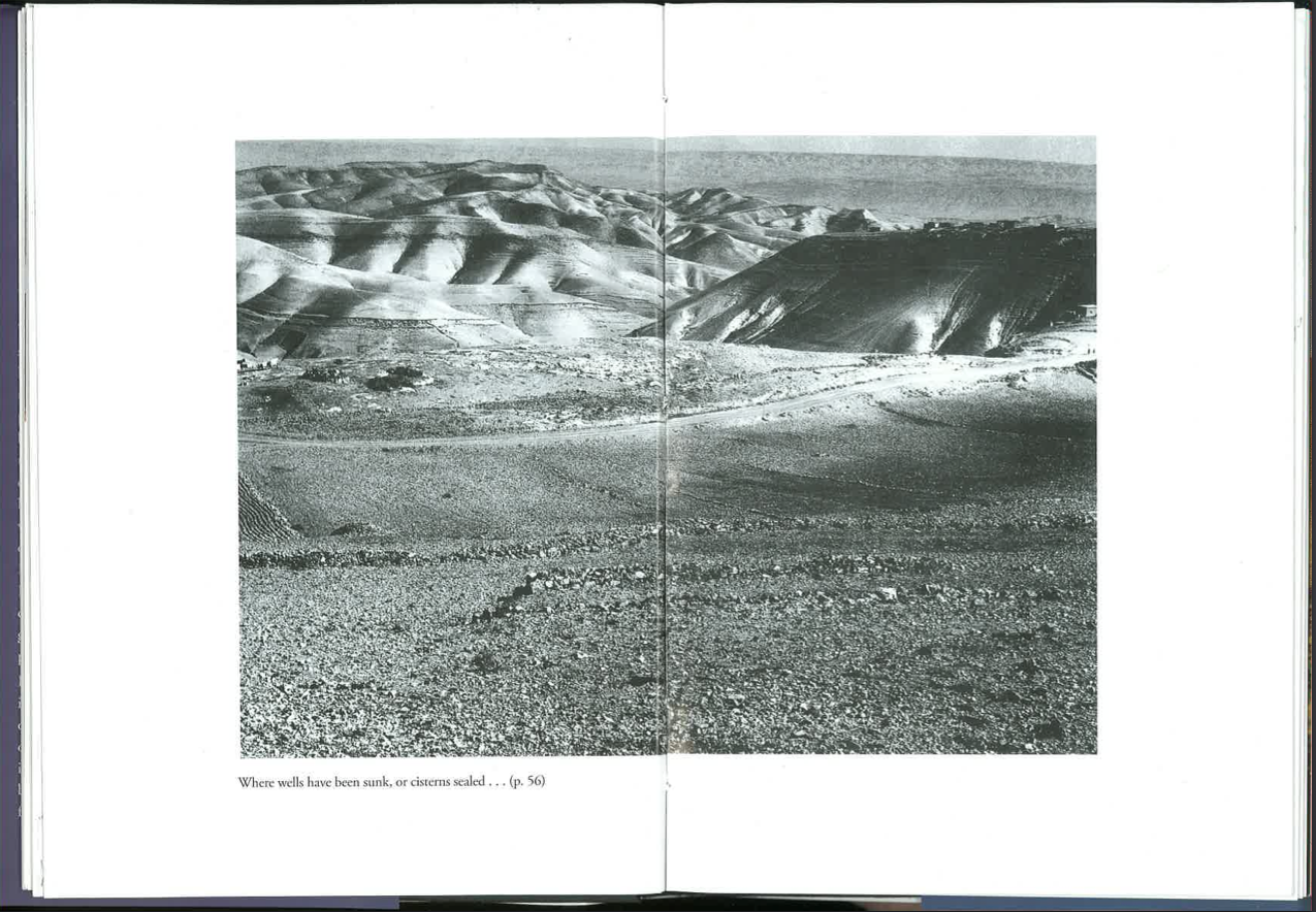
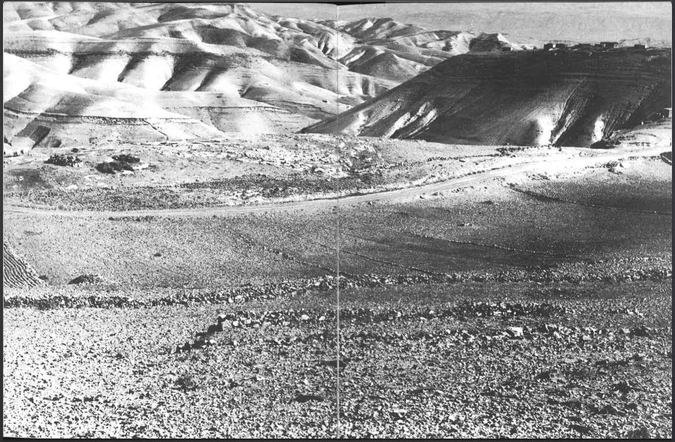
(c) Images of romantic locations such as deserts. The landscapes pp. 54-55 and 57, for example, are not described in detail. The double-page spread on pp. 45-55 is an example of a place “where I feel I might find the arrière pays.” These photographs printed across two pages, intended for dreaming, are much stronger in the larger-format Skira book, where the printing bleeds into the margins:
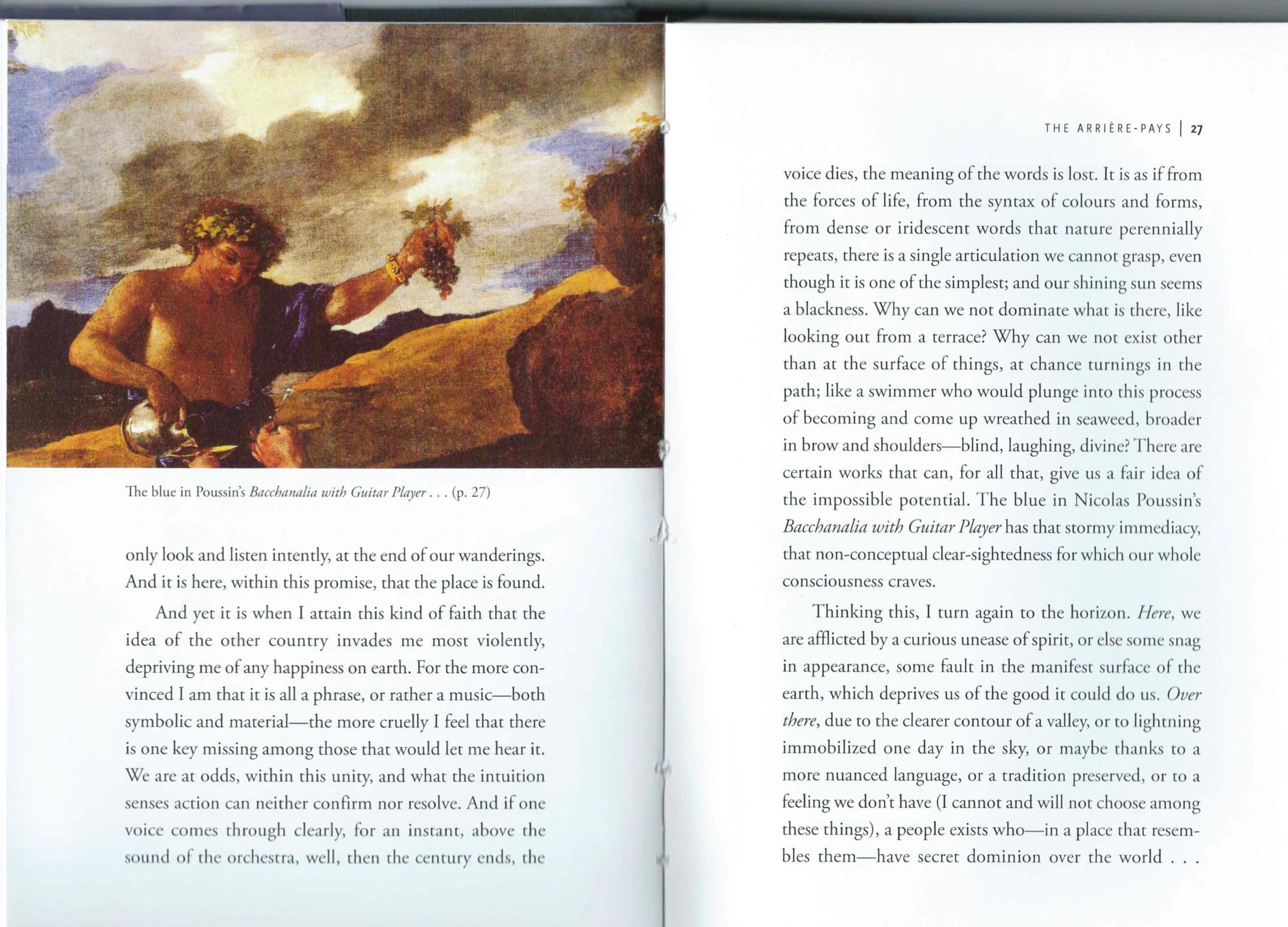
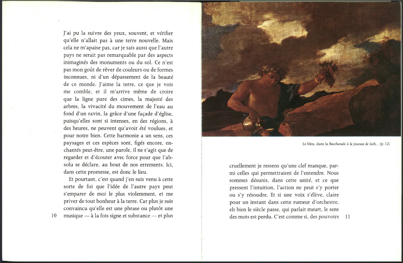
(d) Images of transcendent color or weather effects. An examples is on p. 26, illustrated to show “the blue” that has “that stormy immediacy, that non-conceptual clear-sightedness for which our whole consciousness craves.” (“l’immédiaté orageuse, la clairvoyance non conceptuelle qu’il faudrait à notre conscience comme un tout,” p. 27, p. 12 in the Skira edition.)
It’s interesting, given Skira’s reputation as a premium art publisher, that the reproduction in the original is so dark there is almost no blue at all. It is certainly stormier; but is it closer to Bonnefoy’s intentions?
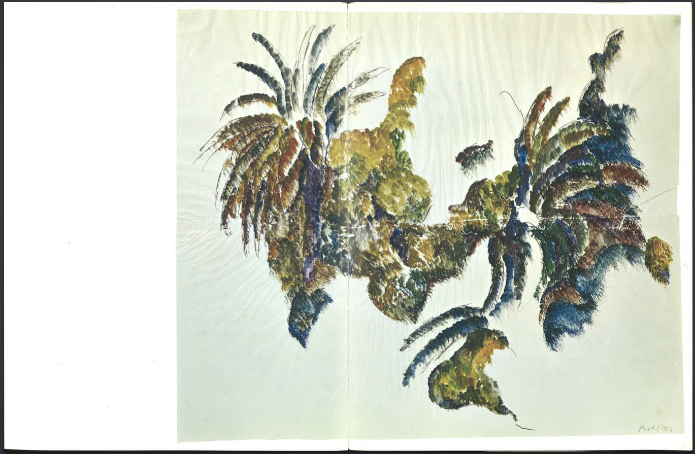
(e) Images that are chosen for incomprehensible, perhaps personal reasons. Who is Miklos Bokor, the artist who painted a Composition in 1962, which Bonnefoy uses to illustrate “a marvelous late afternoon warmth” on p. 126 (the double-page spread pp. 136-7 in the original Skira edition)?
It seems Bonnefoy never thought through the different ways his images illustrate his text, even though there are only a half-dozen different kinds of illustrations. In a longer project, or one less devoted to an obsessive motif, it would presumably have been necessary to work through these uses of images, because their differences would have become more apparent.
Bonnefoy’s sense of art history, and his orientalism
From an art historical point of view, Bonnefoy’s taste is derivative; it depends on the fin-de-siècle admiration for the pittura chiara of the Quattrocento that is exemplified in Berenson, Pater, Stokes, and others. He says he hadn’t known much about Italian painting before his first trip to Italy, and he describes his late conversion to surrealism—both typical of his generation (pp. 66-67; he was born in 1923). Piero and Poussin are two of his touchstones; Piero is admired for his “pale” colors, his light, his austerity.
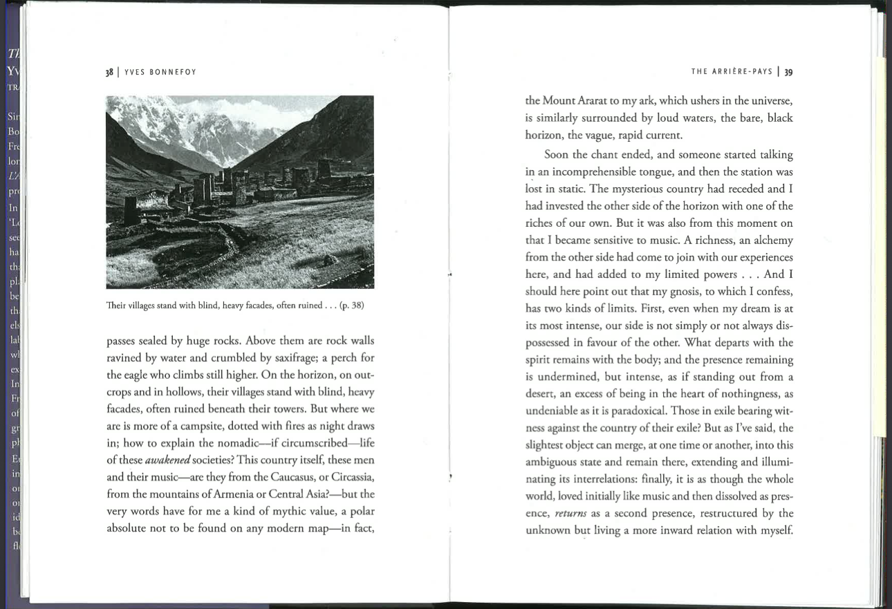
The photographs of ruins, deserts, and other landscapes also conform to late romantic ideals common in Europe, and especially in France, in the mid 20th c. There are a number of photos of places Bonnefoy doesn’t identify in the text; they stand for distant, exotic places and people. The notes at the end identify most of them: they’re photos taken in Turkey, the Caucasus, and Corsica, and one of “Mexican Tarasco Indians dressed for a procession.” (The image below is identified as a “fortified village in Svanetia in the Causasus. Photograph by Vittoria Stella [c. 1909]”). Bonnefoy’s yearning for Tibet is especially symptomatic, and so is his equation of “authentically Buddhist countries” with Mallarmé (p. 56).
All of those places and ideas are projections, justified by Bonnefoy’s interest in the shape of his own imagination: but they make it difficult to sympathize with parts of the narrative, exactly the way Barthes’s exoticism and racism in Camera Lucida are an obstacle to the ideas he wants to explore.
This is not to say I am unsympathetic with some of his choices. I have also read Alexandra David-Néel’s amazing account of Tibet, and I know exactly how Bonnefoy feels about it (p. 50); I’ve toured Tuscany using the Italian-language Guide Rosse published by the Italian Touring Club, so I recognize the attraction of the fragments of poetic writing the editors permitted themselves (p. 43). Yet there are relatively few passages in l’Arrière pays where Bonnefoy looks idiosyncratically or with originality. Images, in this book, are largely taken from a certain received ideas about Italy, the Quattrocento, Poussin, Fayum, Leonardo, Michelangelo, Tibet, Peru, India, and so forth. In that sense the images are not always seen.
The quality of reproductions, and whether they’re in color or monochrome
This is a good opportunity to consider the problem of high-quality color reproduction in novels and other books that include images. In Sebald this is a fundamental question: much of his visual imagination, and his historical concerns, depended on poor quality, black and white images. Some of the observations Bonnefoy makes require good reproduction, for example when he conjures journeys into distant landscapes; and he also mentions color several times. But there are other images that require a lack of good quality, in order to achieve what I call the Sebald effect: an aesthetic distance, and a concomitant increase in the aura, that are best conjured by low-quality reproduction, visible Bendé dots, black and white illustrations, indifferent compositions, or manipulation on photocopies or in Photoshop. An important example in l’Arrière-pays is this photograph that is said to be from the Burlington Magazine. It’s a poor reproduction of a poor reproduction: a typical product of early 20th c. art historical publishing. (The photograph in the English edition is apparently a new photograph, completely different from the one in both French editions. It’s not clear why it was rephotographed, since both pictures are very poor quality.)
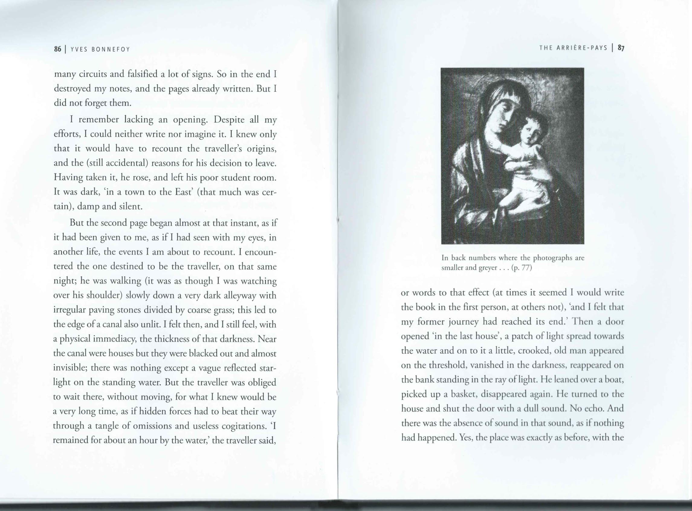
In the list of illustrations at the back of the book this is identified not with the Burlington Magazine, but as Bellini’s Virgin and Child, c. 1490. But toward the end of the book there’s a story involving a publication in the Burlington Magazine, and this reproduction resonates with that because it isn’t identified in the body of the text (pp. 130 ff.). The Burlington Magazine, which started its run in 1903, was the embodiment of the contradiction between the poor quality of its illustrations and the contents of its essays, which were connoisseurial and turned on handling, style, color, and facture.
These Sebald-effect images were described by Bonnefoy in two essays reprinted in the English translation of l’Arrière pays. In “My Memories of Armenia” (2010) he writes about illustrated books from “the first years of the 20th c.”:
They were not in color as they were to be a few decades later, [when they were printed] together with so much information on so many aspects of the places and things that those looking at the photographs can enter into the image without having to dissociate themselves from their own existence and ways of thinking what this existence bound them to. No, the reproductions I speak of were in black and white, containing few details and, due to the poor quality of the paper, which was in any case old, there was even something grey about the light. It is not possible to enter into those images without breaking away from the place where one lives and from the person one is in daily life. And one is thus projected onto a plane where, by suspending one’s ordinary preoccupations, it is easier and perhaps even compulsory that we ask deeper questions to do with our being in the world. [pp. 205-6]
In “The Place of Grasses” (2008), an extended meditation on the meaning of otherness and presence in l’Arrière pays, he says:
Take certain old photographs of monuments or villages clinging to hillsides, on the horizon. The photographs are old, not because the arrière pays belongs to the past but because such images, technically of poor quality, simplify what they represent, which one would otherwise understand too easily; and one can thus invest with some deeper intelligence this woman or this man halted at the edge of a terrace in front of a church in Armenia. [p. 165-66]
Note the two passages are quite different, even incompatible. The first claim is that black and white illustrations help the reader to “break away” from “the person one is in daily life”; the second argues, differently, that the simplifications of black and white photographs prevent us from understanding them “too easily,” and permit us to “invest” them with “some deeper intelligence.”
For Sebald, I think the world of such photographs does very much belong to the past, or to a narrator whose imaginative life is tending toward the past. Bonnefoy’s imagination of Italy and Greece could also be understood as something from the past of cultural history, and therefore also a desire for a past. It could also be questioned whether or not “breaking away from the place where one lives and from the person one is” will necessarily lead to “deeper questions to do with our being in the world”—I can see it leading instead to an imaginative life that avoids the writer’s present.
But these are themes that are broader than this book, and I will leave them here. Bonnefoy’s book is the only one I know that uses both the kind of high resolution, high value-range reproductions that can only be achieved on coated stock, and also intentionally dark or poorly reproduced images that are usually a necessity for authors whose publishers won’t provide all-color and coated stock. The two kinds of images produce an interesting tension, one that is not, in itself, articulated in the book.