
This is a collaboration between the novelist Steve Tomasula and Stephen Farrell, who teaches Visual Communication at the School of the Art Institute, Chicago, where I teach. The text, provided by Tomasula, is an experimental novel about a man named Square (the story is framed by Edwin Abbott’s 19th century novel Flatland, whose characters are geometric shapes) who gets a vasectomy. The narrative about Square, his wife Circle, and their daughter Oval is interrupted by a large quantity of information about medicine, eugenics, genetics, presented sometimes as fragments of Square’s inner monologue, and other times as disconnected quotations from a variety of sources. Francis Crick, Winston Churchill, and many others are represented by quotations that show their sympathy with forced sterilization. The book ponders the difference between being a body and having a body (see especially p. 315).
VAS has one of the most careful and intricate integrations of images, design, and layout in the history of artist’s books. Every page is designed, and many are unique. Several features in particular depart from common practice of blending or juxtaposing words, images, and design.
1. The book asks readers to pay attention even to very small graphic elements. The dedication page, to begin, has several unusual elements:
The left-facing page is ordinary except for the header, “[CATALOGING,” which is a full inch below the top margin, suggesting a smaller book is being reproduced in the actual book. Later in VAS, books of different sizes, as well as screens, folding pages, and scrolls, will also be suggested by devices similar to this. The right-facing page, “DEDICATIONS],” has a couple of unusual graphical features. There’s an underline partially overlapping the name “Jiwon,” and there’s a device (as these arrangements were called) of initials, like a monogram. There are also two very faint brackets aligned with the right margin (which is an inch from the fore-edge of the book): one bracket is above “FOR JIWON,” and the other is right of “For Maria, Alba & Ava.” All those marks, a reader might well assume, are private references, although the faint brackets imply the two authors’ dedications are mutual.
On the right margin, there are two black semicircles, with abbreviations of the authors’ surnames. These are imitations of the cut-out tabs in 20th century reference works, and a quick flip of the pages of the book reveals that the fore-edge is indexed with these references.
Asking readers to pay attention at this level is equivalent to asking the reader of a normally designed text to read very slowly. When I saw these details on the dedication page, I went back and read the fine print on the cataloging page, just to see if there were also design interventions there. (There aren’t.)
2. The book teaches its readers how to read its graphics. The number of graphical interventions—fonts, arrangements of lines, images, typographic elements—increases as the book goes along. It quickly becomes apparent that the ideal reader is meant to notice every new design element and waits for its explanation. Some are self-explanatory, and others are explained on the pages following their introduction. In effect, a reader is taught how to read VAS. (By contrast, a reader who reads the text only, without attending to the graphics, will miss more and more as the book progresses.)
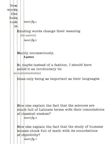
For example, most pages in VAS have several vertical lines near their outside margins:
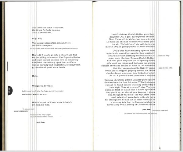
The body text is aligned exactly with one of the lines. By “exactly” I mean that on a right-facing page, the right edge of the letters touches one of the lines. Punctuation overlaps the line and spills into the margin (or the stripe between lines). Other lines of text are aligned with different vertical lines, and some lines of text are not aligned with vertical lines. Some of these lines of text are italicized; some are in sans-serif boldface. It is apparent that these are parenthetical thoughts in the narrator’s mind, things he thinks of in passing; but they are also often continuous narratives that are interrupted by blocks of the body text.
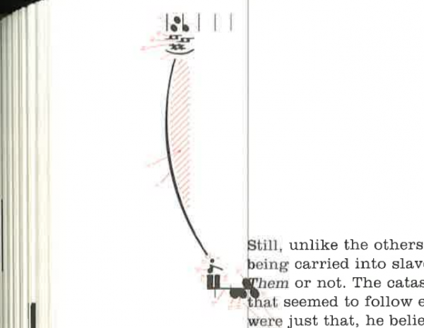
The lines themselves represent a strand of DNA. This is clear on several pages (eg., pp. 61, 201 or 314):
But the lines also signify scars (pp. 158, 253), scratches (p. 327), and music (eg, p. 255 ff.). They come and go; sometimes there are four, sometimes one. There is a disparity between the book’s articulation of almost all its layout, design, and images, on the one hand, and the looseness or unpredictability of the number and meaning of the vertical lines.
In general the voices (and fonts) do not line up consistently with one or another line. But there are many exceptions. On p. 104, interpellations are lined up on different verticals, as this detail shows:
(The Figures in question are on the facing page.)
I mention this as the counter-example that proves the rule: nearly every other mark in this book, no matter how appaently random, is placed as it is for a reason.
Readers learn throughout the text. On p. 81 there are two very small, very faint “Cl”s near the bottom of the page. In most artists’ books they could be ignored. On p. 82 there are more, along with pale pink “NA”s. The “Na”s and “Cl”s congregate on one of the vertical lines. This is explained on p. 83: it’s an illustration of a science experiment: “Leave a paper clip suspended in a glass saturated with salt,” and you’ll grow a salt crystal.
In an email, I suggested to Stephen Farrell that there is a parallel between observing seeing these elements introduced, one by one, and watching the way a character is built up in a traditional narrative. In both cases the reader learns how to read the text while she reads. The image and design elements are codes for a complex reading.
3. The book is clear about what is to be read or analyzed, and what is to be skimmed or glanced at. It’s implied that readers will look at every mark and read all the texts, and one way that is communicated is by the infrequent appearance of counterexamples.
On p. 25 there is a graph and two tables that are clearly not meant to be read all the way through:
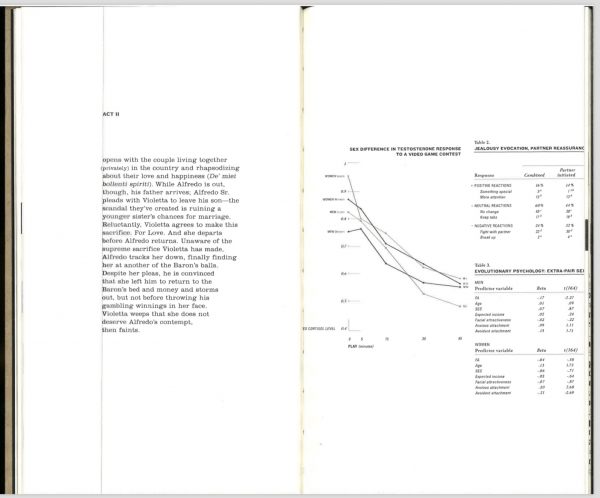
On the other hand, the graph and tables are entirely legible. On p. 139 there’s a graphic that cannot be fully decoded: in context I know what some of it means, but I can’t make sense of the whole:
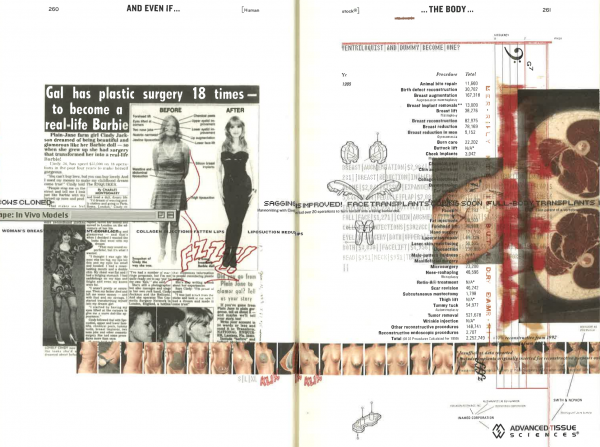
There are pages of collaged advertisements for body enhancements, but it’s clear almost immediately what constitutes an adequate reading (I readthe headlines and sample the texts):
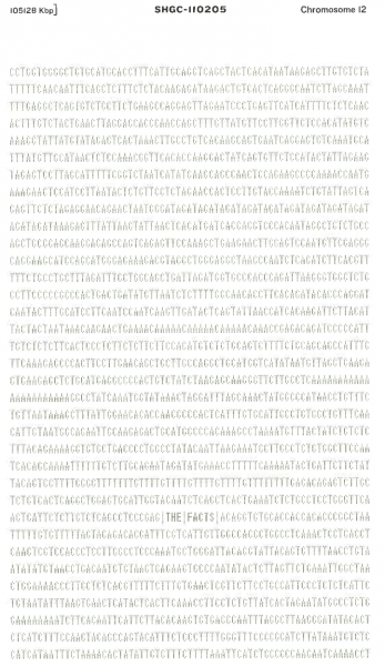
There are pages of printouts of genetic code, only one of which has a legible section:
And there are some pages with musical notations in the margins:
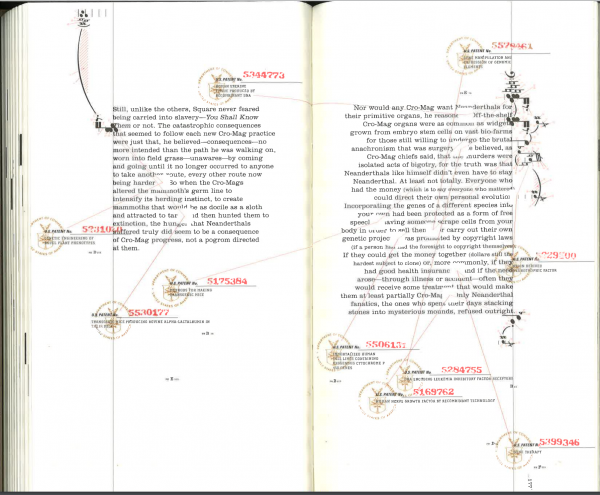
(Here there are also seals representing patents for genetic engineering, to complement the narrative, which is a wild fantasy about genetic engineering among Cro-Magnons and Neanderthals.) The music uses the single vertical line as a musical stave line, but it is ornamented by minute red lines and arrows with numbers in nearly microscopic script. In this detail the scanner doesn’t even resolve the tine numbers:
But there are very few pages like these, where I cannot decide whether or not I’m expected to read or look in detail. The fact that moments likes these are so clearly anomalies demonstrates the stability of the book’s system in general.
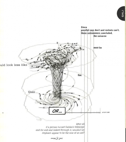
4. The collaboration between the writer and designer is complex, so the book presents itself as a whole. This is rarely the case when artists illustrate or transform existing texts. Here is a double-page spread in which Circle’s mother gets a surgical implant. The interpellated quotations (with encyclopedia-style semicircular tabs) are from Ovid’s Metamorphoses:
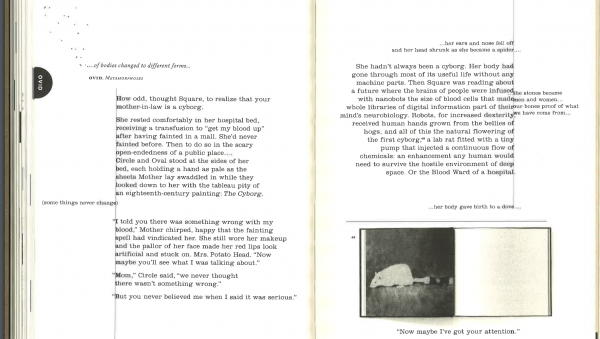
The dots in the upper left are a reference to Galileo’s discovery that the Earth revolves around the Sun, and also his discovery of Jupiter’s moons (this is explained, graphically, on the precedeing page), so it fits the theme of unexpected or unbelievable change.
Clearly the original typescript could not have included these four elements (photo of a mouse in a lab, Galileo’s drawing, lines from Ovid, and Square’s narration) in this arrangement, but well arranged and coherent as a two-page spread. In an email, Stephen Ferrell described his collaboration. Steve Tomasula approached him, he wrote,
with a theme and with initial research notes and clusters of raw writing fragments in a series of Word documents. From these, I conceptualized an organizational mechanism that could deliver the macro theme (i.e., the DNA strand, the writer as Square) while arranging the fragments into “voices” which would occupy fixed positions on the DNA strand. This then framed the way Steve “wrote into” the organizational structure–into the voices–delivering me chunks of voiced texts thatfollowed this format. All of this became the raw manuscript for the book. I developed other layout formats (eg, the Pedestrian Story, the tabbed quotes, the chromosomal lists, the comic book ending) as other kinds of writing began to emerge. By this time, I was also researching around the topic, and Steve and I both amassed a large collection of visual material. I worked this material around or into (or, in some cases, as a replacement for) the text clusters… [Email, May 2014]
When the book works best, as it does on these pages, the collaboration cannot be disentangled. This yields a much richer reading experience than most artists’ interventions in pre-existing texts.