1. Summary
Silent Anatomies is nominally a book of poetry, with 20 poems (that’s the count in the table of contents). The book has some interesting combinations of images and text in which phrases from poems are posed around anatomical illustrations, with lines leading from the texts to parts of the image, as in anatomy textbooks. It’s a great idea, and it’s a good contrast with the usual practice — common even in Sebald — of letting the image signify as a whole. In Ong’s book a reader is invited to look back and forth, from text fragment to part of image, rather than seeing the image quickly and as a whole, as happens regularly in Sebald.
Most of Silent Anatomies experiments with images in other ways. Thumbing through the book, you might not realize there are 20 separate pieces, because the visuals and layout change so much from one piece to the next. Kore Press (a feminist press in Tucson) has done an excellent job, producing a well-designed 8 x 11 book, big enough let Ong’s graphics work along with the text. The poems speak to Chinese and Filipino history, identity, and politics, through the lens of the narrator’s experience, and one reason for the variety of formats might be the need to speak differently about social norms, diaspora, family memories, and a range of other subjects. But other than that possibility — which is not consistently thematized — the variety of formats has to appear more as experimentation on Ong’s part, as if she is searching for an optimal way of working with texts and images. I’ll mention some of those experiments, in order to give a sense of the book as a whole, and then say something about the pieces that address images in detail.
2. Examples of the variety of practices in Silent Anatomies
The longest piece in the book, “The Onset,” has its own half-title page, and runs for 24 pages, alternating blank pages that have dividers and footnotes at the bottom, with photographs of bottles:
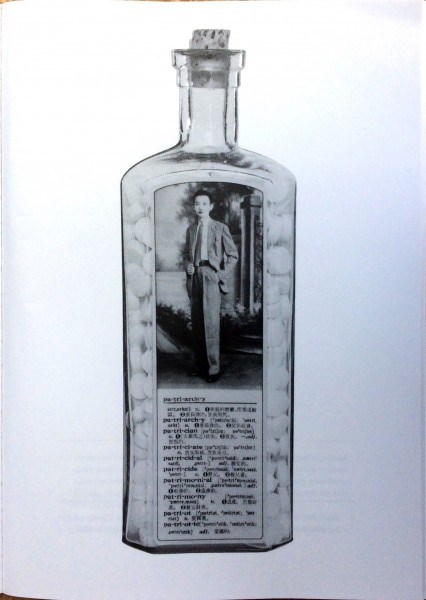
The bottles have Chinese-English dictionary excerpts, highlighting words such as “withstood,” “transoceanic,” “patriarchy,” and “deportee.” The list of illustrations at the end of the book — which is surprisingly informative, and really needs to be read along with the text — identifies some of the people in the photographs: “Patriarchy: my maternal grandfather,” “Mutable: my father as a boy.” I wonder why Ong did not put this informatin in the text of “The Onset,” perhaps as footnotes; it would have made the initial reading experience more interesting.
Another long piece is “Metal Lungs,” which runs 10 pages and is formatted with images and numbered poems:
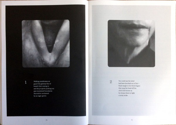
In this case the information in the list of illustrations is surprisingly uninformative, given what we’re told about other pieces in the book; here she says only that the images are “sourced from found medical ephemera and family photos.” The images are given rounded corners, perhaps alluding to transparencies or slide viewers.
“Profunda linguae” is 8 pages along, so together with “Metal Lungs” and “The Onset” it is one of the longer pieces in the book. It is eight numbered figures, each with a poem:
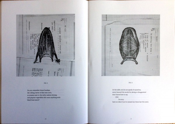
Most images are engravings of the anatomy of the tongue, overlaid on recipes. The list of illustrations at the end of the book gives a very detailed explanation, which I think is crucial for reading the piece:
Figs. 2-7: Scans of favorite Chinese-Filipino recipes my mother typed onto my father’s prescription pads, then taped into a notebook, an act of homesickness after her arrival to the United States during the mid 1970’s. Layered onto the recipes are anatomical views of the tongue, which come from a 1908 Edwardian chart.
It’s typical of art projects that the explanation is kept apart from the main presentation of the work: but why? This paragraph would have been engaging if it were placed just before “Metal Lungs”; in that case readers would be more likely to turn the pages 90 degrees to read the recipes, and ponder the connections between the recipes and the poems — or figures, or captions; their status is interestingly unsettled — underneath. As it stands, the sequence is more enigmatic than it needs to be: a reader who hasn’t found the list of illustrations will have her own associations from these poems and images, but they are not likely to be as connected to the author’s interests. The explanation directs and sharpens the viewer’s engagement.
3. Exemplary pieces
Silent Anatomies has two or three pieces that are exemplary in their detailed engagement with the visual. “Etymology of an Untranslated Cervix” is a poem and facing photograph:
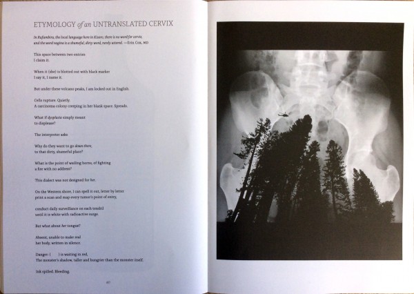
It’s a remarkable photograph, looking up to a pelvis, which is being thronged by pines and buzzed by a helicopter. The poem refers obliquely to the photograph. There’s a line about “a carcinoma colony” that fits with the threatening silhouettes and the X-Ray, and, more abstractly, some lines about lack of language and absence that fit in a general sense with the image. What’s effective here is the power of the image, which holds its own against the poem. Because the poem is a mixture of purposes and images, the photograph stays more firmly in mind.
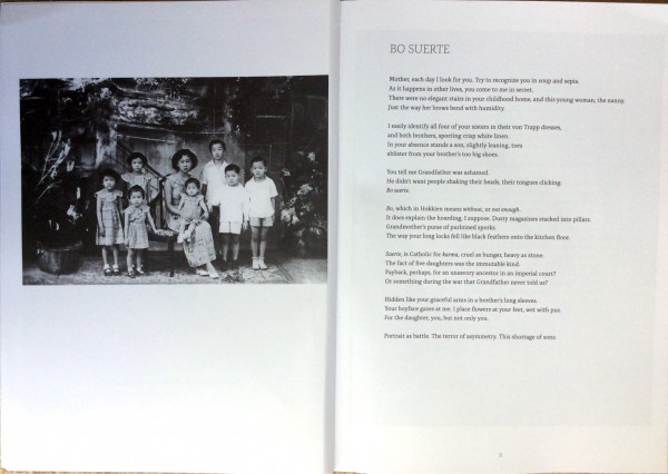
Early in the book there’s a family photograph facing a poem called “Bo Suerte.” The table of contents lists “Bo suerte” on page 2, making it clear that the image and poem are a single piece:
In this case a reader will turn back and forth from poem to image, trying to identify characters (“mother,” “this young woman, the nanny,” “your sisters in their von Trapp dresses,” “your brother’s too big shoes,” “Grandfather,” “Grandmother,” “five daughters,” “your boyface,” “this shortage of sons”). As I read, I make tentative connections to the image, and I look back and forth from text to photograph many times. But the list of illustrations at the end of the book changes everything. There she writes:
Digital collage titled Mother as a Boy (2001) based on a photo of my mother and her siblings with one of their “aunties” in Manila. My mother is the boy who is standing second from the right.
To me this is surprising, annoying, and hard to understand. Why would Ong pair a poem and photograph in such a way as to invite a detailed comparison if she is going to undermine it at the end of the book? Why would she turn her mother into a boy, and then just report that fact as if it did not need explanation? Is the information in the list of illustrations meant to be somehow optional? But how could it be, once a reader encounters it? And how is a reader supposed to feel returning to the poem and photograph knowing that the author has hidden her mother in the photograph, but written a poem that pretends to know nothing about it?
The most successful pieces in Silent Anatomies, from the point of view of interactions between text and image, are a couple that put the poem directly into the image, using arrows to point to different parts of anatomical illustrations, as if images of the poem were anatomical features.
One of those, “Innervation, Diary of an Intercoastal Nerve” uses an even more interesting device. Here Ong numbers the parts of her anatomical illustration, and poses the poem as a key:
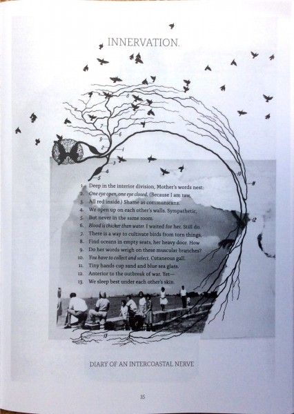
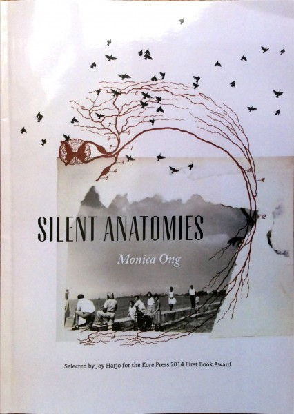
(The color version of the image on the book’s cover, reproduced at the top of this post, would have made this even more engaging, but the book is printed in black and white.)
Here list of illustrations informs us that the anatomical image is a collage “with diagram of the lower intercostal nerve from Surgical Anatomy by John B. Deaver, 1926 edition, and found family photos.” This is less of an intervention than some of the other entries in the list of illustrations, but even here it matters that this is a family photo, and not a found photograph.
Some images in the poem reflect the photograph of birds (“mother’s words nest,” “a way to cultivate birds”); some refer to the picture of people (“I waited for her,” “find oceans,” “blue sea glass,” perhaps even “anterior to the outbreak of war”); and the legend — or caption, or subtitle — at the bottom refers to the anatomical illustration (“intercoastal”). But generally the poem ignores the photograph and the choice of anatomical parts.
The idea of arranging parts of a poem around an anatomical illustration, with lines pointing to parts of the illustration, has a lot of potential. It is a way of integrating a text into an image without artificial juxtaposition. In Ong’s book the practice isn’t as fully developed as it might be because the phrases from poems do not speak to the individual parts of the image: if they did, the link between words and images would be even tighter. In the example I reproduce here, the lines of the poem — or key, or legend — do not refer to the 13 numbered parts of the anatomical diagram, although it’s conceivable that such a thing could be done. It is also possible to imagine the 13 lines referring to 13 birds, or 13 people. The possibilities for tighter, more absorbing integration of words and images are intriguing.
I am a poet and avid admirer of poems and poets, so my opinion is out until I read and see the actual illustrations and poems. This narrative has me very much confused about the book. Dean Young, at times, is a mystery. Ocean Vuong is cumbersome and Akbar’s imagery is cumbersome but exquisite. Looking over this review has not helped me at all. My one thought is that all the illustrations, overlays will embarrass the poems and make them difficult to read
bad review. if you knew anything about literary analysis these poems wouldn’t be “annoying” to you. Bo Suerte is a breathtaking poem, and Ong hints to her mother being the boy in the photo many times. Ong is not careless, you are.
I’d be interested to know why, if there are adequate hints in the poems about her mother’s identity, she puts that paragraph at the end of the book. Be glad to modify my thoughts on the page if you can explain that. (It might be worth saying I like Ong’s work; she has an exhibition at the moment at the Poetry Center in Chicago.) Thanks, Jim