These days it seems nothing is left to discover in literature: it’s possible to read your way around the world in English translations; uncountable numbers of books are digitized, and those that aren’t can be bought in minutes. But there are a few writers whose work remains genuinely, deeply unknown. Of them, Marianne Fritz may be the most interesting.
Fritz (1948-2007) began her writing career with a brief novel, Die Schwerkraft der Verhältnisse (1978), translated by Adrian Nathan West as The Weight of Things (2015). She followed that with Das Kind der Gewalt und die Sterne der Romani (The Child of Violence and the Stars of the Romani).
From there things became truly excessive. Das Kind der Gewalt is 560 pages long. The novel Dessen Sprache du nicht verstehst (Whose Language You Do Not Understand), 1985, was issued in two versions. The larger-scale edition is 12 volumes and 3,400 pages long. Fritz also wrote an entire book introducing the novel and its hundreds of characters.
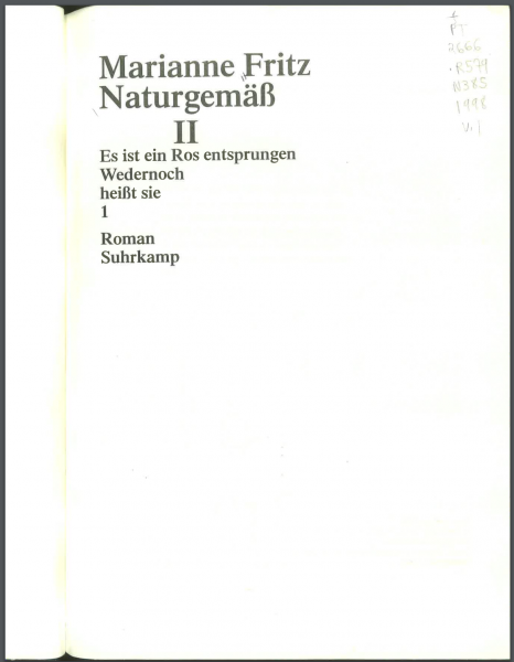
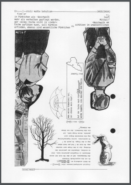
The next novel, Naturgemäß (the title could be translated Naturally) was published in two parts, I and II, and a third was in progress when she died. It breaks off at p. 5,404. She understood her life’s work all together as one project, which she called Die Festung (The Fortress). In this cumulative sense her project dwarfs even Arno Schmidt’s oeuvre, which has been getting attention recently because of John Woods’s translation of Zettel’s Traum (as Bottom’s Dream), which is only 1,500 pages long. The two massive volumes of Naturgemäß I and II and Schmidt’s Bottom’s Dream and his Evening Edged in Gold make an extremely odd collection on my desk: it’s as if I’ve shrunk like Alice, and all books have become unnaturally massive.
What I have in mind here is very limited: I’m only commenting on a few characteristics of the images and the typographic design in Naturgemäß I, II, and III. My German is not good enough to appreciate the portmanteaus and other nuances of Fritz’s German, which has been compared (inaccurately, I think) to Finnegans Wake, and even if I were perfectly bilingual I would not dedicate the next two or three years to reading the 8,000 pages of Die Festung. I only want to point to a couple of patterns in her use of images, as possible parallels for other projects.
Most illustrations I’m reproducing here are from Naturgemäß II, but graphical and typographical arrangements occur in all three volumes, and also in Dessen Sprache du nicht verstehst. Fritzpunkt is the name of a project to realize some of Fritz’s work in performances and installations, and it contains a page that reproduces pdfs of the extant pages of Naturgemäß III. (It is the easiest way to access her later work.)
Remarks on reception
Fritz isn’t unknown in German-speaking and especially Austrian literary circles, and she did win awards, but her work got consistently poor reviews and was published in very small print runs. As a result, Naturgemäß I currently (2016) sells for $200 used, and Naturgemäß II is entirely unavailable used (when I checked, no copies were for sale anywhere on the internet); it lists for €298 on the Suhrkamp website. I have my copies from interlibrary loan. These books are actually rare.
Reviews in the German press that I have seen are almost uniformly negative. In 1985, Wolfgang Von Nagel dismissed Fritz’s neologisms, portmanteau words and other stylistic quirks as ineloquent and uniform–the same no matter the subject or who is speaking–and he says her writing shows blurry thinking, commonplaces, and a poor sense of style, making serious close reading impossible:
Doch auch die Deformationen der Sprache zeigen den Reichtum der Wirklichkeit nicht. Im Gegenteil: In ihrem Variationsspielraum ist diese Sprache der Norm-Sprache unterlegen. Egal wer redet oder über was geredet wird, alles unterliegt derselben Anti-Grammatik. In einer Etüde mag das spannend und aufschlußreich sein, aber bei Hunderten, Tausenden von Seiten bekommt man Sehnsucht nach Proustschen Bandwurmsätzen und Mannschen Stilziselierungen.
Nimmt man einzelne Absätze unter die Lupe, “übersetzt” man sie gar, wirken sie nicht selten banal. Die Sprachzerstörung kaschiert Gemeinplätze, gedankliche Unschärfen, möglicherweise auch stilistische Defizite. Wo ein anderer Autor präzis formulieren muß, genügen Marianne Fritz ein paar Stichworte. Was rätselhaft ist, soll Rätsel bleiben. Wilde Malerei mit Worten: detaillierte Stilkritik ist hier überhaupt nicht möglich (weswegen das Manuskript auch ohne Lektoren-Korrekturen in Satz ging). Man kann diese Sprache nur total akzeptieren – oder ablehnen. [“Kilogramm Weltliteratur,” Der Spiegel December 16, 1985]
Some of this resonates with Thomas Bernhard’s unfortunately famous verdict, rendered by Adrian West:
Before my departure I have had another glance at your recent publishing catastrophe: the 3,000 pages you have had printed and allowed to appear are the greatest embarrassment I have been acquainted with to this day. To print and bind over 3,000 pages of mindless proletarian trash with all the bombast of a centenary event belongs, quite frankly, in the record books: as a world record of stupidity. I am not speaking so much of the begetter of this idiocy, rather of the fact that the publisher has handicapped himself by releasing this fatuous vulgarity.
This is unfortunate because Bernhard’s vitriol extends to nearly everything in the (Austrian) universe, making it difficult to see what his point might actually be: but the qualifier “proletarian” is consonant with Wolfgang Van Nagel’s observation about commonplaces.
There are only scattered reviews of Fritz’s work, at least one doctoral dissertation, an obituary, and one volume of collected essays on Dessen Sprache du nicht verstehst, called Nullgeschichte, die trodtzem war, edited by Klaus Kastberger. The nine authors in compare Fritz most frequently to Musil, and less often to Schmidt, Joyce, or Proust. Musil is the point of reference, both because his work is the main model for excessively long modernist fiction in German (but not in French or English), and because both Der Mann ohne Eigenschaften and Dessen Sprache… are about the First World War. One of the more interesting such comparisons is Friedhelm Rathjen’s:
Was Musils Protagonist Ulrich auf der Flucht vor den Eigenschaften, so ist es bei Marianne Fritz die Sprache: sie will nicht eine Sprache der Eigenschaften, sondern die der Moeglichkeiten sein; sie sperrt sich gegen alle Versuche, sie zu fixieren und in ein starres Regelkorsett zu zwingen. In diesem Sinne ist bei Marianne Fritz der Musilsche Moeglichkeitssinn auf den eigentlichen Protagonisten von Dessen Sprache du nicht verstehst uebergegangen, eben auf die Sprache selbst–in welchem Ausmass und in welcher Konsequenz dies der Fall ist, muesste allerdings erst die linguistische Detailanalyse zeigen, die an dieser Stelle night zu leisten, allenfalls anzuregen ist. [p. 54]
As Musil’s protagonist Ulrich is to the flight from qualities, so Fritz is to language: she does not want a language of qualities [or properties], but of possibilities; she balks at any attempt to fix language or fit it into a corset of rules. In this sense, for Fritz’s protagonists, Musil’s sense of possibilities is nearly gone, and all that remains is language itself–but it would take detailed linguistic work to show the extent and consequences of this change…
(This comparison with Musil is especially telling given that Rathjen is a Schmidt scholar.) Among other comparisons, one of the most interesting is by the blogger known as flowerville, who has compared Fritz with Ingeborg Bachmann. I asked about Fritz’s proximity to Schmidt, and flowerville offered this: “Schmidt is positively sloppy compared to [Fritz] and in this sense I think one can get easily the impression of her as a mechanical writer” (summer 2016).
Several of the contributors to Kastberger’s anthology consider Fritz’s work as an “Emanzipationsroman” (novel of emancipation), offering a critique of forms of false belief, including belief in a sort of transparent language (Hans Heinz Hahnl, p. 18). A couple of the contributors knew Fritz (I note especially Georg Schmid, describing the letters he got “in ihrer unverkennbaren, durchaus kindlichen handschrift,” “in her unmistakable, quite childish handwriting,” p. 93), and they remark on the way her monastic life (she gave no interviews and rarely went out, and was said to work 10 hour days) are of a piece with the feeling a reader gets that the 200 characters in Dessen Sprache… were actually alive for their author. (“Sie lebt mit ihren Figuren, sie hat staendig Umgang mit ihnen, wie anderer mit ihrer Familie, mit ihren Freunden und Feinden” (Hahnl, p. 20); “wie sie von ihren figuren spricht, als lebten sie tatseachlich” (Schmid, p. 93).) These are not just claims of intimacy or immersion, but of the nature of the world Fritz creates, which seems, or seeks, to include all possible people and forms of discourse. (In this, I think, Fritz’s project resembles Karl Kraus’s.)
In English there is virtually nothing: in addition to flowerville, Adrian West has written brief pieces on Fritz (another here) and is currently contemplating proposing a volume of selected translations. Unlike the case of Arno Schmidt, whose works have been typeset (Fritz’s editor declined to typeset or proofread Dessen Sprache du nicht verstehst), and translated (by John E. Woods, underwritten by the Schmidt Foundation), there are no plans to translate any of the 8,000 or more pages of Fritz’s writing after The Weight of Things.
Some functions of the images
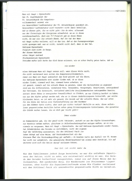
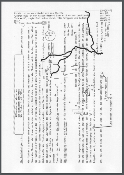
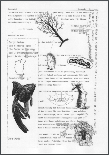
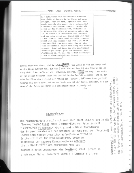
Fritz uses a range of conventional layouts in Naturgemäß . Many pages are double justified or left-justified; many are also alternately single- and double-spaced, and she uses several typewriter fonts. She also formats pages with double columns, which makes them look academic, journalistic, or legal. At times she adopts the format of a screenplay or libretto, in which speakers’ names are centered. Here is an example from Naturgemäß II:
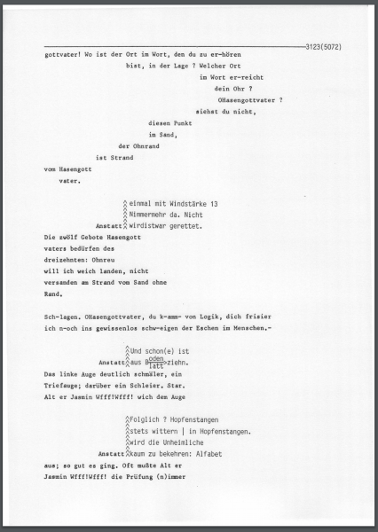
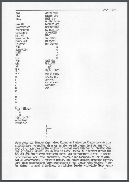
She also uses dictionary formatting, and she plays with annotations and footnotes, and variations on indented modernist poetry. These examples are from Naturgemäß III:
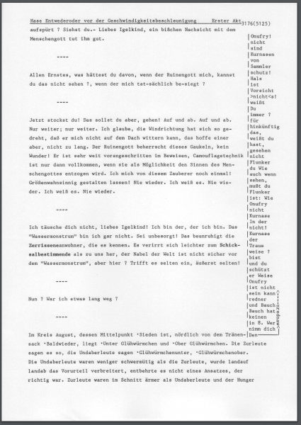
Here is a page mimicking typescript (while actually being typescript):
(It’s an interesting question, in Fritz and Schmidt, how and when readers are asked to ignore the fact that the pages are in fact typewritten, and when and how they signal a given page is to be understood as typewritten.)
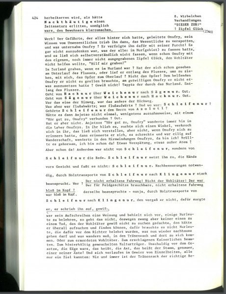
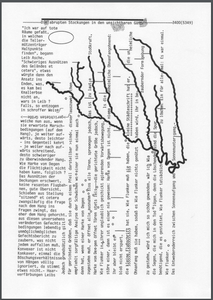
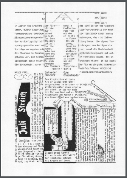
In Naturgemäß the commonest kind of unusual layout, one that’s repeated over several hundred pages, is this:
Pages like this are apparently intended to recall a certain kind of document, although I am not sure exactly what the model might have been. In this particular sequence of about 100 pages, the right-hand columns all read “8. Virbelchen / Verhandlungen / ‘DIESER ZUR!’ / 1 Zipfel Glück” (“8. Vortices / Negotiations / ‘THIS TO!’ / 1 tip luck”). (“Zipfel Glück” is reminiscent of “Ein Zipfel vom Glück,” but otherwise I can’t elucidate it.)
On the left, the text reads continuously down, forming the impression that a longer document has been excerpted for study. On this page it’s part of a story about “Heinrich Vergangenheit” who is sent in search of naphtha. The effect, graphically, is to take the ongoing mythopoetic narrative and make it seem as if it’s part of a text that is being studied for official or governmental purposes. The text has been divided, arbitrarily, into four-line fragments. This isn’t the work of a philologian, a humanist, or a linguist, because the category (“8. Virbelchen…”) is repeated over and over. Instead it’s as if the author or transcriber is following a legal requirement to attach the same label to every set of four lines. (Another reason this may be a reference to official documentation is the prevalence, elsewhere in Naturgemäss, of redacted pages.)
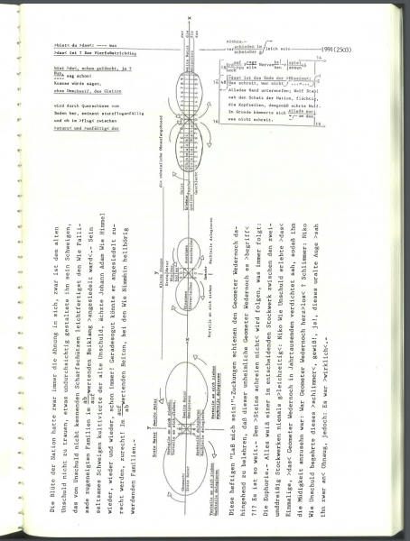
Maps
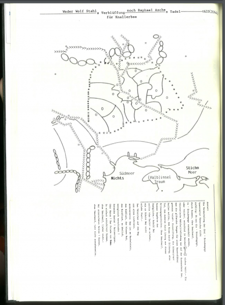
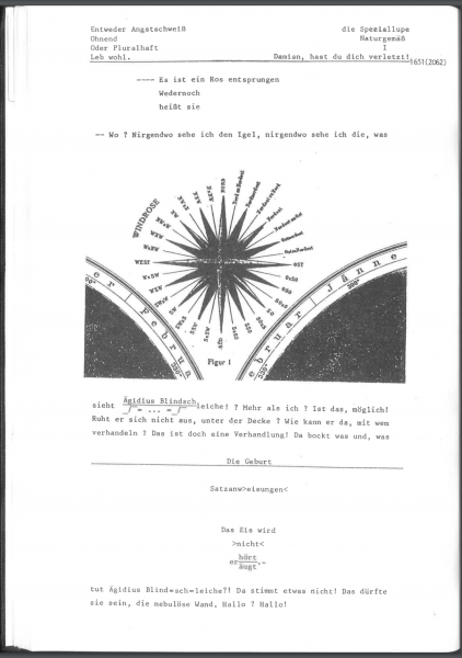
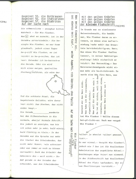
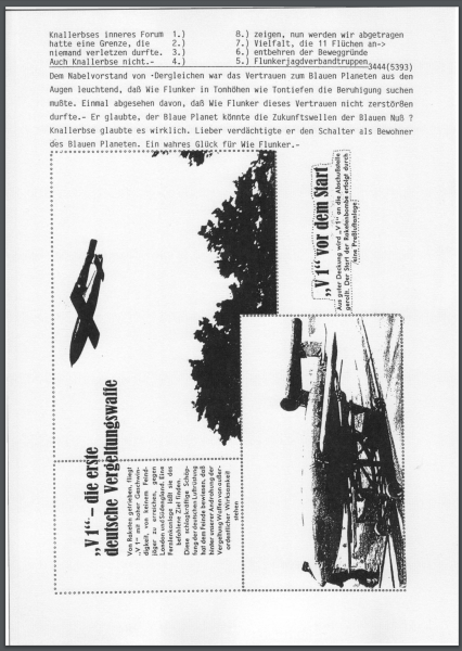
The most striking kind of visual material in Naturgemäss (as distinct from typographic arrangement) is probably the map. When these are at their most complete and literal, they are battlefield maps from the First World War, and they sometimes parallel events in the text.
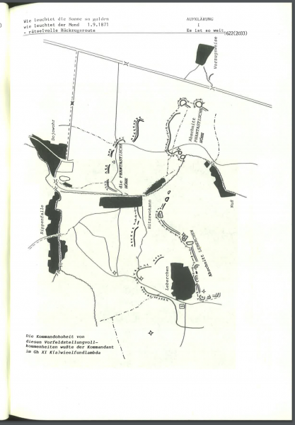
But often enough the labels are omitted or changed, making them not so much illegible—that is the common condition, I think, of many objects and passages in the book—as poetic references to maps.
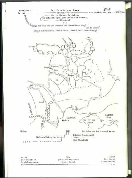
At the bottom here is “Südmeer / Nichts” (“South Sea / Nothing”), “(Halb)insel / Traum” (“(Half) island / dream”), and “Stichen / Meer” (“Engravings / Sea”)—but toward the top the map is more literal, with labels like “Regiment 1.”
Here is a version, on p. 1,633 (eight pages earlier), with fewer labels:
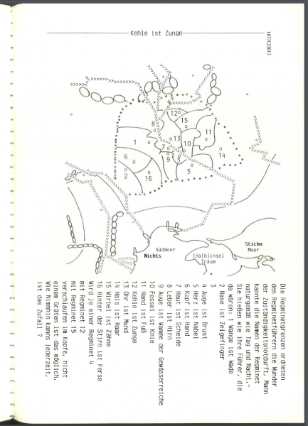
And another with numbers, elaborately keyed:
Some maps are entirely abstract, like this one which preserves only the movements from maps that are reproduced elsewhere:
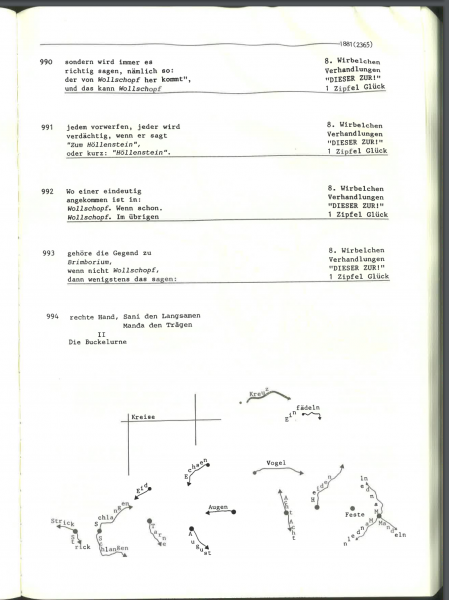
Here (p. 1,881) the labels read “Echsen” (“Lizard”), “Eid” (“Oath”), “Vogel” (“Bird”), and so forth—they are no longer either consistent or military.
A similar page, even more abstract—without even the labels on the arrows—occurs on p. 1,798.
The effect of these maps, for me, is a a kind of despair of sense, order, administration, and bureaucracy, made hallucinatory by the enormous number of versions, none of them quite creating meaning, and none of them entirely giving up on meaning.
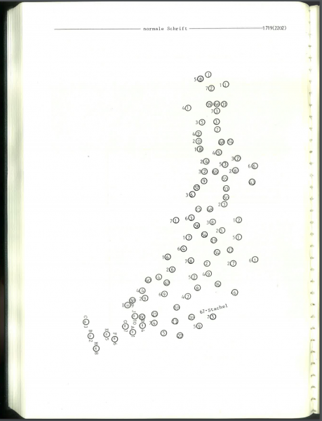
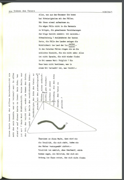
When the maps are abstract they lose their affect, as in p. 1,719, where the map almost looks like a connect-the-dots puzzle (but of course isn’t). Perhaps the most successful of these abstract maps, or map fragments, occur in the unfinished Naturgemäß III, where lines taken from maps invade text like roots:
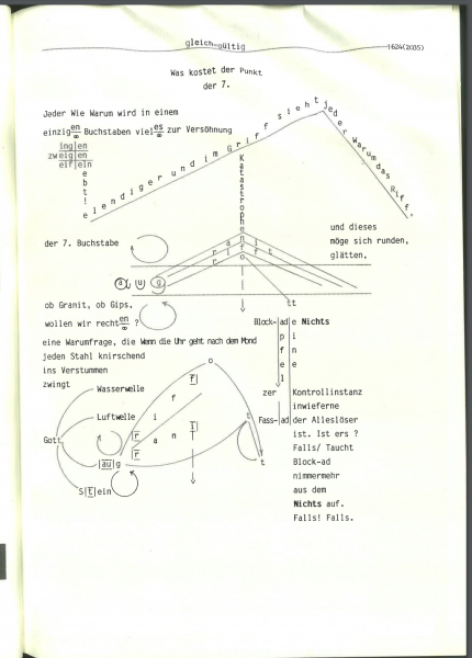
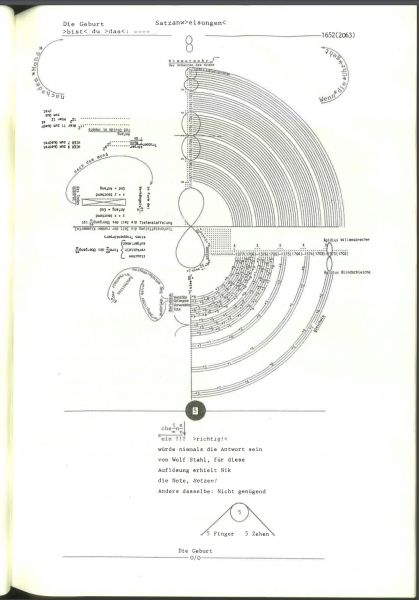
Graphically designed pages
There are also graphically designed pages in Naturgemäss II that ask to be read in the way an ordinary narrative might be. Page 1,720 is an example. It begins “o-dorn-A,” close to Adorno, and posits a sort of logical dichotomy: what was human or “impermanent” in people was “overcome with the four foot solution” (“in Vierfußlösung… aufgehoben”). But this then gives way to a story about a young man. The result of this sort of change is that the designed element stands for logic or work, and the narrative for existing facts or things.
Often the legibility decays along with the graphics, or rather the visual layout undermines the legibility (instead of accenting it, as in the “Adorno” example). Here, from Naturgemäß III, is a page where the typographic arrangement seems to be arbitrarily (annoyingly) getting in the way of readable text, which recommences at the bottom of the page:
This identification of graphic elements with the possibility of making sense—with the author or narrator, struggling to arrange things to make meaning—is a productive way to think about some pages that seem to be proofread, or to have author’s marks on them:
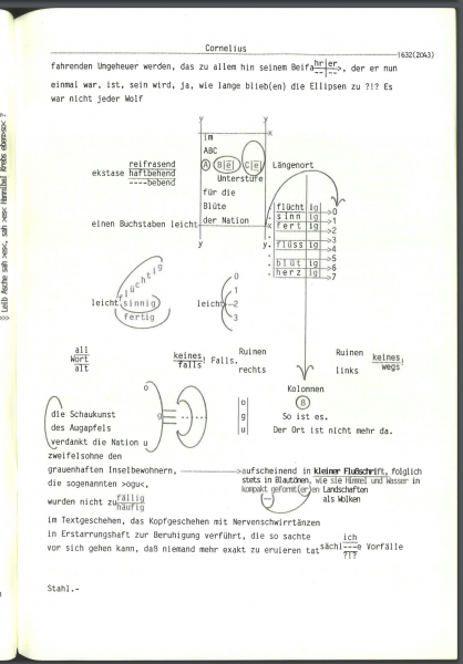
But these grade imperceptibly into pages that seem like doodles:
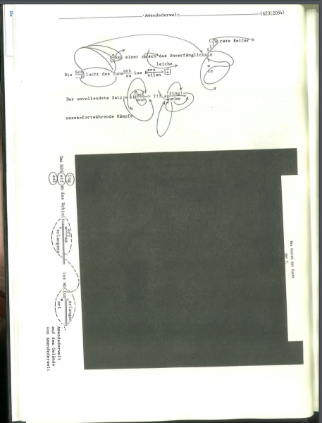
Or this from the unfinished Naturgemäß III:
And there are also graphics that seem not to express the narrator’s or author’s intentions as to document the systems, histories, and documents she is working with. On pages like these, the graphic elements are part of what is being interrogated, and they appear as alien artifacts:
Collage
And finally, many pages seem like attempts at collage. (The end of the existing part of Naturgemäss III has dozens of pages of this sort.)
Pages like these seem less serious, less engaged with the double use of graphics as artifacts to be examined, and graphics as tools to be invented in order to create sense. But in a 6,000 page project it is nearly meaningless to call them less successful.
Thanks to the Fritzpunkt project, it’s possible to see all the extant pages of Naturgemäß III at once–something that can’t be done with the other two volumes or the 12 volumes of Dessen Sprache. Naturgemäß III begins with about 300 hundred pages without images, and then, within 50 pages of the point she stopped working, introduces much more visual arrangements:
These are radically different from anything in the 4,500 preceding pages, and so it’s especially sad that Marianne Fritz died when she did: apparently just when she was realizing just how freely she could use visual material. If these last pages were to be judged alone, as a fifty-page artist’s book, I don’t think they would fare well: the use of images is haphazard, not well controlled, and generally unconvincing. But they aren’t a fifty-page artist’s book: they’re the last fifty pages of a 5,400 page unfinished project, which followed a 3,400 page project, which was part of a massive life’s work, which is still awaiting a good reader.