Two things affect the relation between writing and illustrations in this book: the ways the book refers to itself (and therefore to its illustrations), and the ways the illustrations are reproduced. I’ll consider each in turn.
(These comments have only to do with images; I have a different reaction to the book as a whole, these issues aside. It is posted on Goodreads and Librarything.)
Reading the self-referential passages
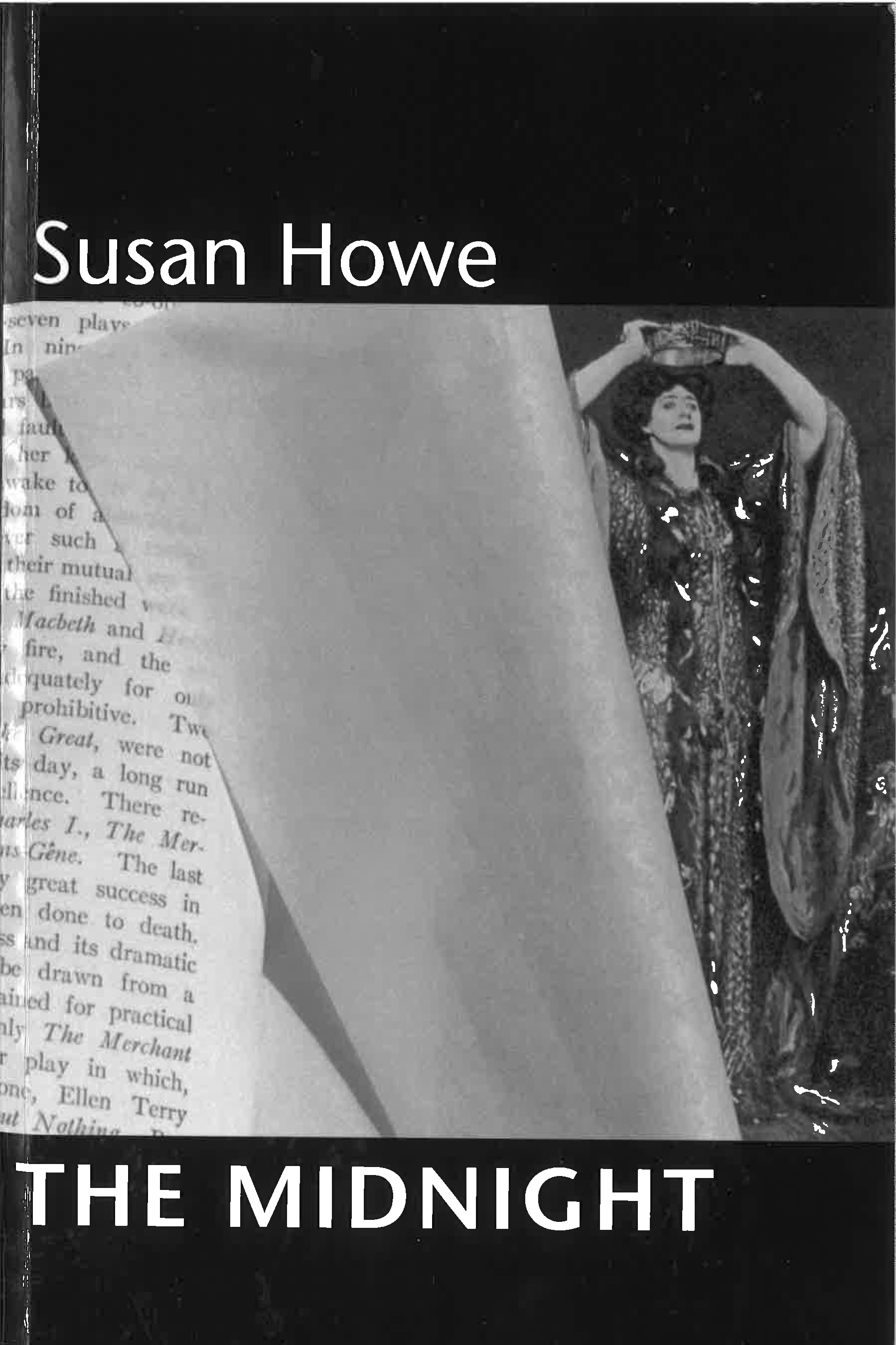
There are so many self-references in this book, and so many kinds of self-reference, that part of the reading experience has to be managing and understanding how they work. Some references are to the book’s sources. The book opens with an apparently blurry image of the title page of Robert Louis Stevenson’s The Master of Ballantrae, and we learn on the next page that it has been scanned or photographer through the translucent paper that was used in the 19th and early 20th centuries to protect title pages and other text pages from the residual ink and “offset” (the physical relief) of printed illustrations. Fifty-three pages later we are introduced to the Stevenson book: “Several years ago,” Howe writes, “I inherited John Manning’s heavily marked up copy….” In similar fashion the title of the first of the book’s five sections, “Bed Hangings,” is explained on p. 43; it’s a book called Bed Hangings: A Treatise on Fabrics and Styles in the Curtaining of Beds, 1650–1850.
I don’t think it’s unfair to say that readers of this kind of book will read everything, including the fine-print material on the back of the title page: and there they’ll discover a long list of picture credits, which sets the stage for these references even before the book begins:
The photograph of the double map illustration by William Hole from Poly-Olbion by Michael Drayton is reproduced by permission of the Beinecke Rare Book and Manuscript Library, Yale University. The photograph of Emily Dickinson manuscript 169 is reproduced by permission of the trustees of Amherst College and the President and Fellows of Harvard College. The photograph of the Charles Sanders Peirce manuscript 495 (1898) is reproduced…
Call those sorts of references external. There are also internal references, to the book The Midnight and its construction. The first is to the thin paper veils that used to be put between illustrations and their facing pages; more on that in a moment. The book also knows itself to be made of “scare quotes”—in this case meaning quotations (p. 116). There are many subtler examples as well: for instance Frederick Law Olmsted is introduced on p. 48, but Howe notes “So much for the person. He started out a few pages ago.”
I’m not sure if it makes too much sense to make a strong distinction between external from internal references, but they are often presented separately. An example of a combined reference is on p. 53, which reproduces a photograph of an actress posing as Lady Macbeth (the words are visible in the picture’s caption), partly obscured by tissue. (The proper word for this thin paper s “tissue,” not “tissue paper.”) That would be an example of an internal reference back to the theme of the tissue insert, but the page also refers to the word “hanging,” as in Bed Hangings. But usually Howe keeps references to her sources distinct from references to her own book.
There are also autobiographical references. The first mention of Howe’s mother is on p. 49, well into the second section of the book.
Relations between text and image
Howe is often praised for developing especially innovative relations between text and image. I am not as convinced: I find the use of illustrations uneven, under-developed, and careless about the visual qualities of the images. Consider the first four illustrations:
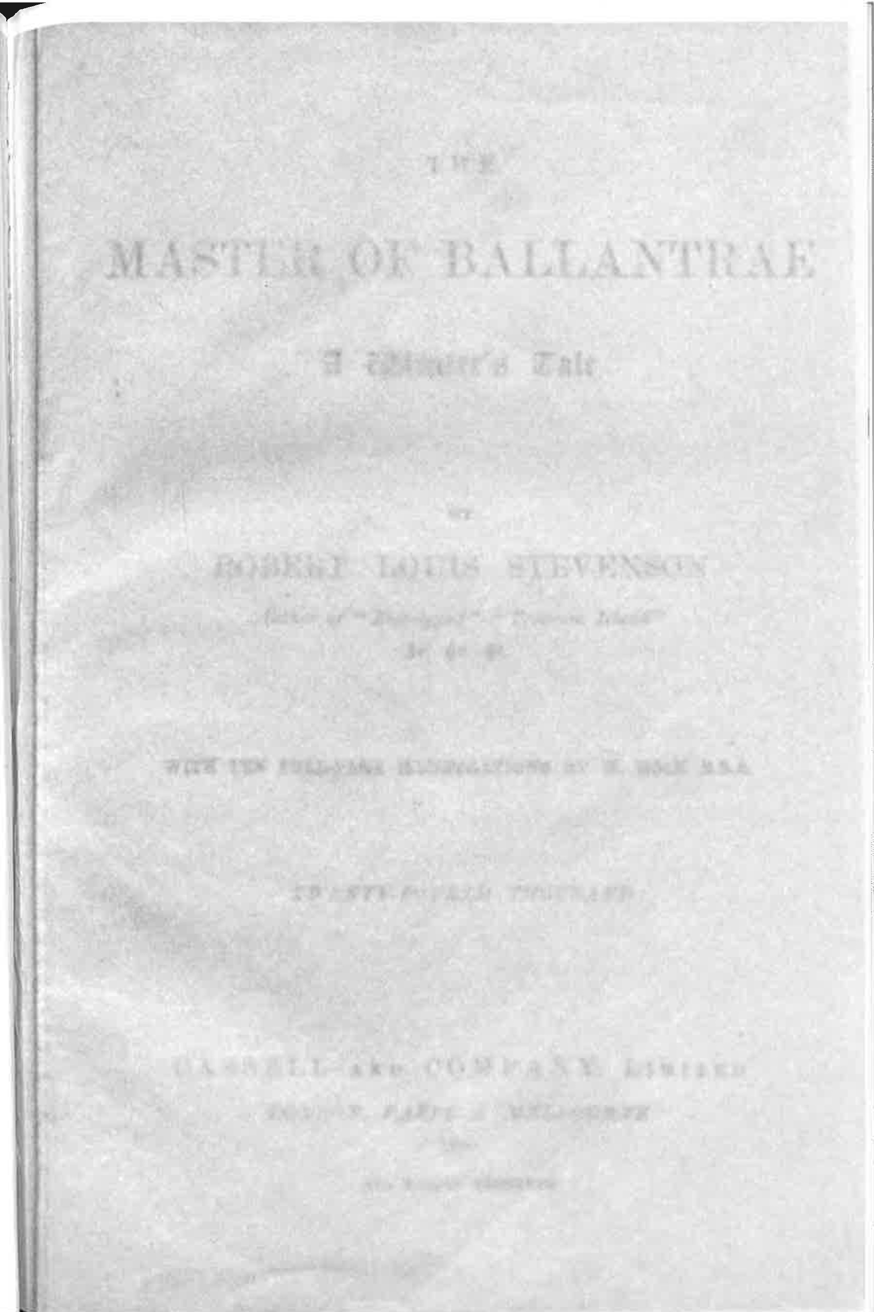
1. The book opens with the full-page veiled title page of the Stevenson book. The next page, which is the first page of text in Howe’s book, says that tissues were used “in order to prevent illustration and text from rubbing together”—a sign that the intimacy or correspondence of text and image will be in question throughout The Midnight. “The transitional space between image and scripture,” she glosses, “is often a zone of contention.”
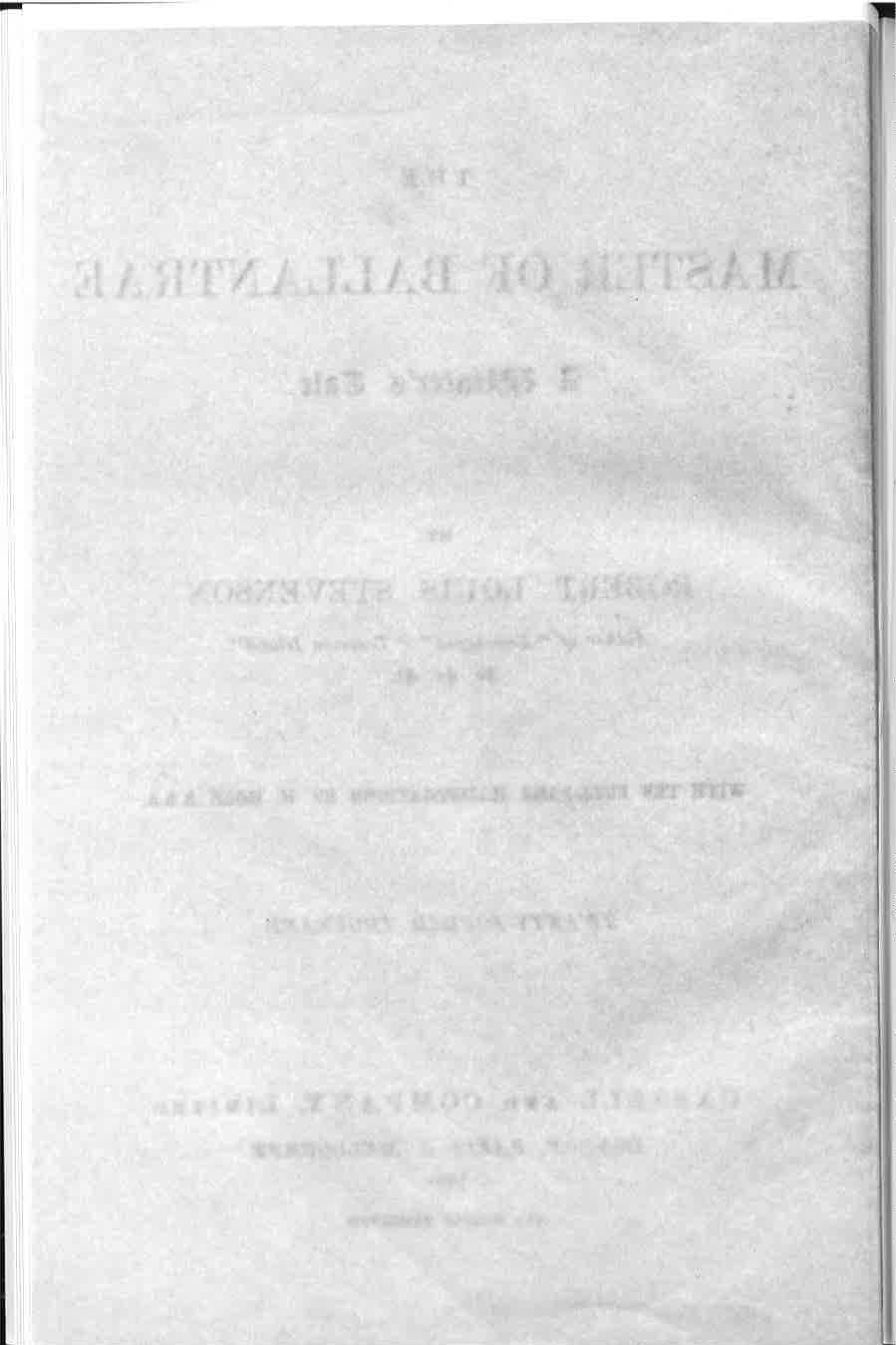
2. The second image, on the verso of the same page, is the same veiled title page but reversed. This implies that the page itself is translucent, so we’re seeing through it. Of course in the original book, that doesn’t happen, so she has re-created the metaphor of the tissue veil, so that it makes the title page itself into the veil. Unaccountably, Howe doesn’t mention this or develop the theme in any way. (The tissue is apparently simulated; see Marjorie Perloff, Unoriginal Genius, p. 187 n. 12. That fact makes me wonder how many of the other tissues in The Midnight were put there by Howe, rather than being bound or tipped into the books she read. Judging by the photographs in The Midnight, none are clearly authentic. This is a parenthetical issue, except that it goes to the level of attention Howe might have expected her readers to pay to her visual material. Apparently she didn’t expect certain kinds of close looking.)
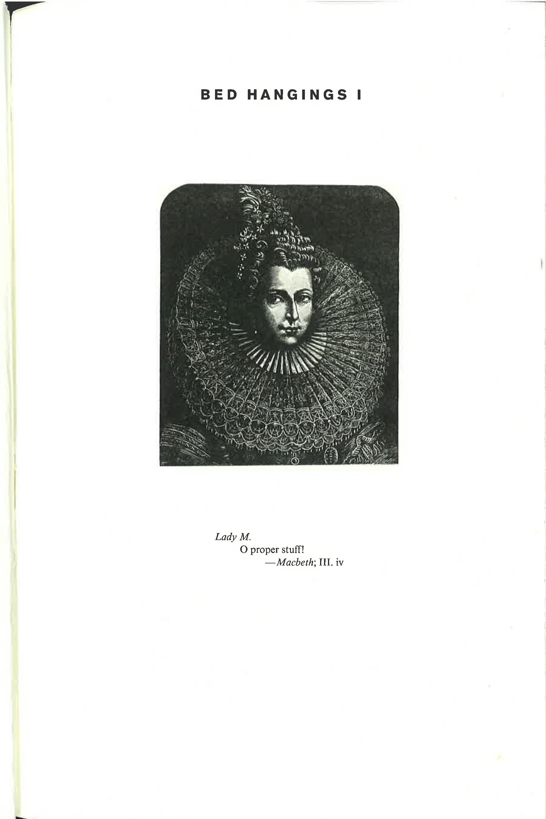
3. The next image, two pages later, is an engraving of Lady Macbeth. It serves as the half-title page to section 1 of the book, “Bed Hangings.” No tissue (real, represented, alluded to) separates it from the text opposite.
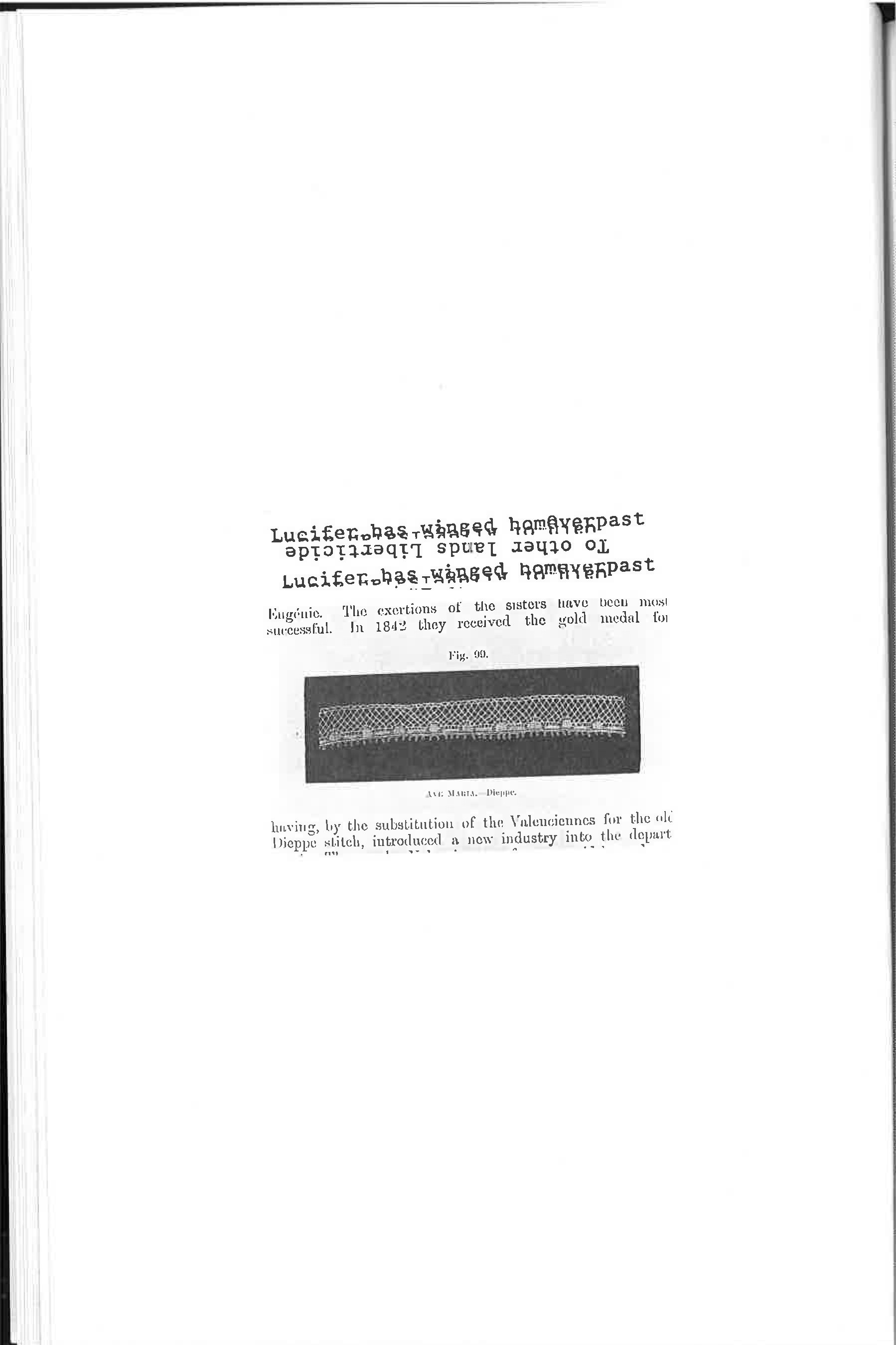
4. The fourth image, on the following page, is from an old book that the photo credits tell us a History of Lace (1902), Howe has placed some partly legible lines over it in a typewriter font. It’s possible to read “Lucifer has winged home” and “To other lands Liberticide.” This kind of palimpsest is a commonplace in contemporary visual art, and it signals several things: first, that this book will be concerned with type and writing as visual objects; and second, that not everything in the book is expected to be legible.
These four are quite different, so they pose an immediate problem for a reader: are these going to be exemplary of the ways images will be used in the book? Are the first, third, and fourth related to one another? In the course of reading, it will turn out that neither is the case—there is no particular meaning in their difference or lack of relation.
From a formal point of view the fourth image is strangely careless: why is it so small? Why is the page cropped as it is (it seems carelessly cut)? Why is the Courier font so carefully overwritten and centered above the careless cutout? Visually, it isn’t strong or compelling, and that also signals the reader that to some degree this is not a book that will be fully engaged with the visual: it’s a book where elements of the visual will be present, but not everything about design and visual properties will be part of the book’s meaning or intent.
This fourth image is also an anomaly because it’s the only image in the first section of the book. (The first three images are in the prefatory material, as it’s possible to see by counting back from the first numbered page.) Of the book’s five sections, three are verse (1, 3, 5), and they don’t have illustrations—except the pictures on their half-title pages (like Lady Macbeth), and except for this one picture. So it’s tempting to think of this picture as a sort of emblem for the first section of the book. If so, it’s not especially interesting: it simply juxtaposes the “Bed Hanging” material with Howe’s added texts, like the following poems do, but it juxtaposes them in a simple and uninteresting way. (It’s also in the wrong place for an emblem, which should be on the half-title page or posed as a frontispiece, not behind the half-title page, where no illustration would ordinarily go.)
In general, the images in the book are haphazard in quality, scale, composition, framing, and placement. Some have deep shadows, as if they were taken with the bare light bulb of a table lamp (pp. 56, 80); some are cropped in apparently random or careless ways (p. 61); some are large and stark (p. 117); some are double-page spreads that bleed into the margins (pp. 82-83). Many are unaccountably carelessly cropped, by which I mean they either show bits and pieces of what is outside the image (p. 48) or they cut off parts of the image for no clear reason (p. 61, left, or p. 41). (A “clear reason” would be to show the tissue veil, as on pp. 53 or 73.) the photo on p. 119, for example, identified as Howe’s mother in the back of the book, is itself carelessly photographed, in its paper frame, slightly but not meaningfully tilted, slightly but not meaningfully small on the page, with an indifferent amount of background or wall showing around it.
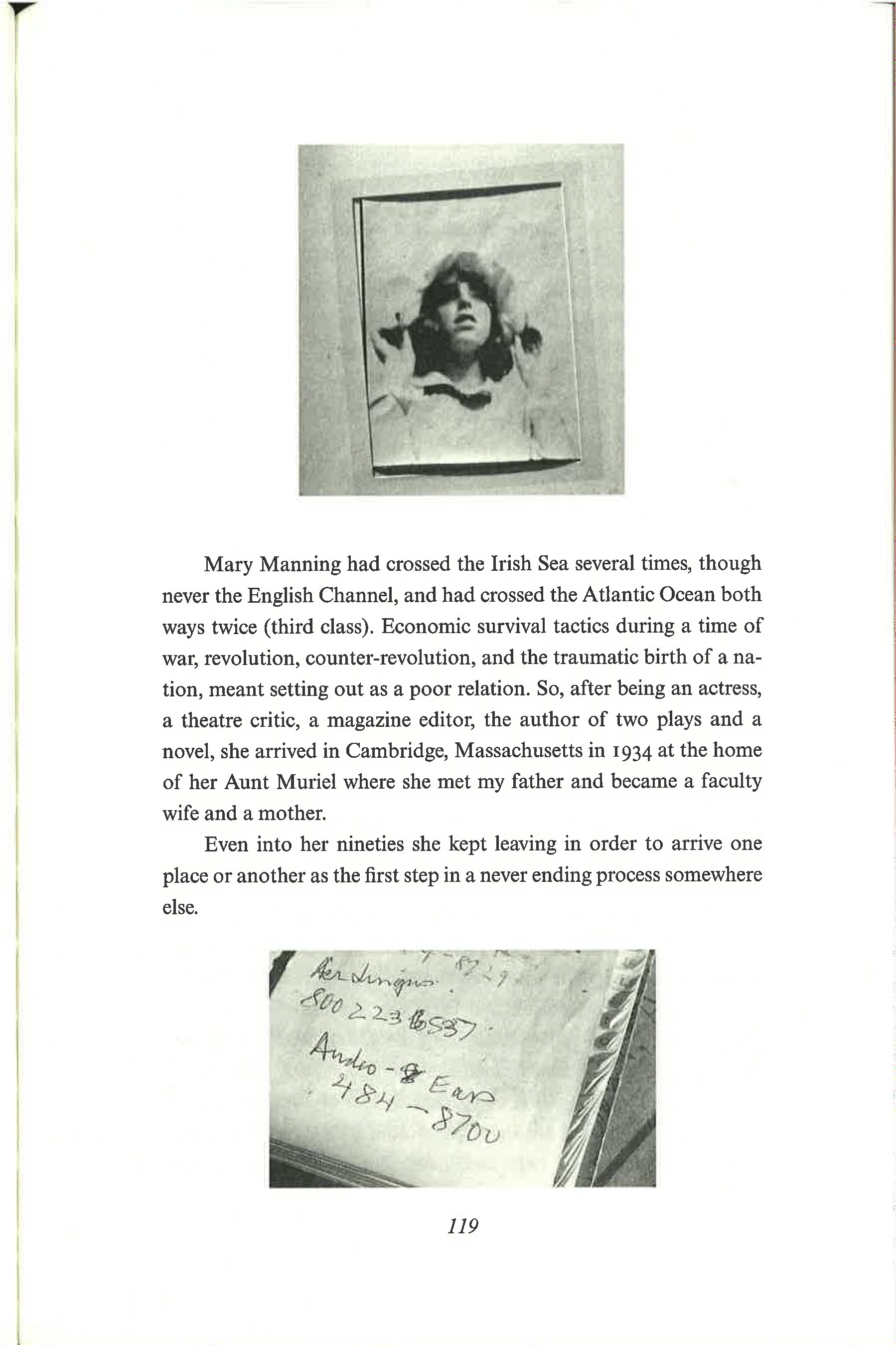
(Perloff, in Unoriginal Genius, p. 117, describes this photograph together with the one below it in such a way that it seems it’s been very carefully chosen. At the back of the book, in the photo credits, we learn that the photograph shows Howe’s mother “watching an aeroplane.” Perloff says that isn’t clear in the photo, but it is clear in the picture below, which is identified—again, only in the notes at the end of The Midnight, and not in the body text—as her mother’s “last address book.” An entry visible in it reads “Aer Lingus 800-223-6537.” So the Irish airline is in the lower image, and Perloff goes on to read the next entry, “Audio-Ears,” as a partial anagram of “Aer.” Perloff’s reading is very detailed, and she even mentions the two numbers that are crossed out in the address book. I don’t doubt that Howe chose that page of the address book for the airplane reference, but it isn’t plausible to ask readers to look so carefully at images that are so manifestly carelessly lit, cropped, and reproduced: that very insouciance speaks against the kind of detailed reading Perloff wants to extract. If it was Howe’s intention that readers see “Audio-Ears” as an echo of “Aer Lingus,” then she should have chosen, cropped, formatted, and reproduced her images more carefully.)
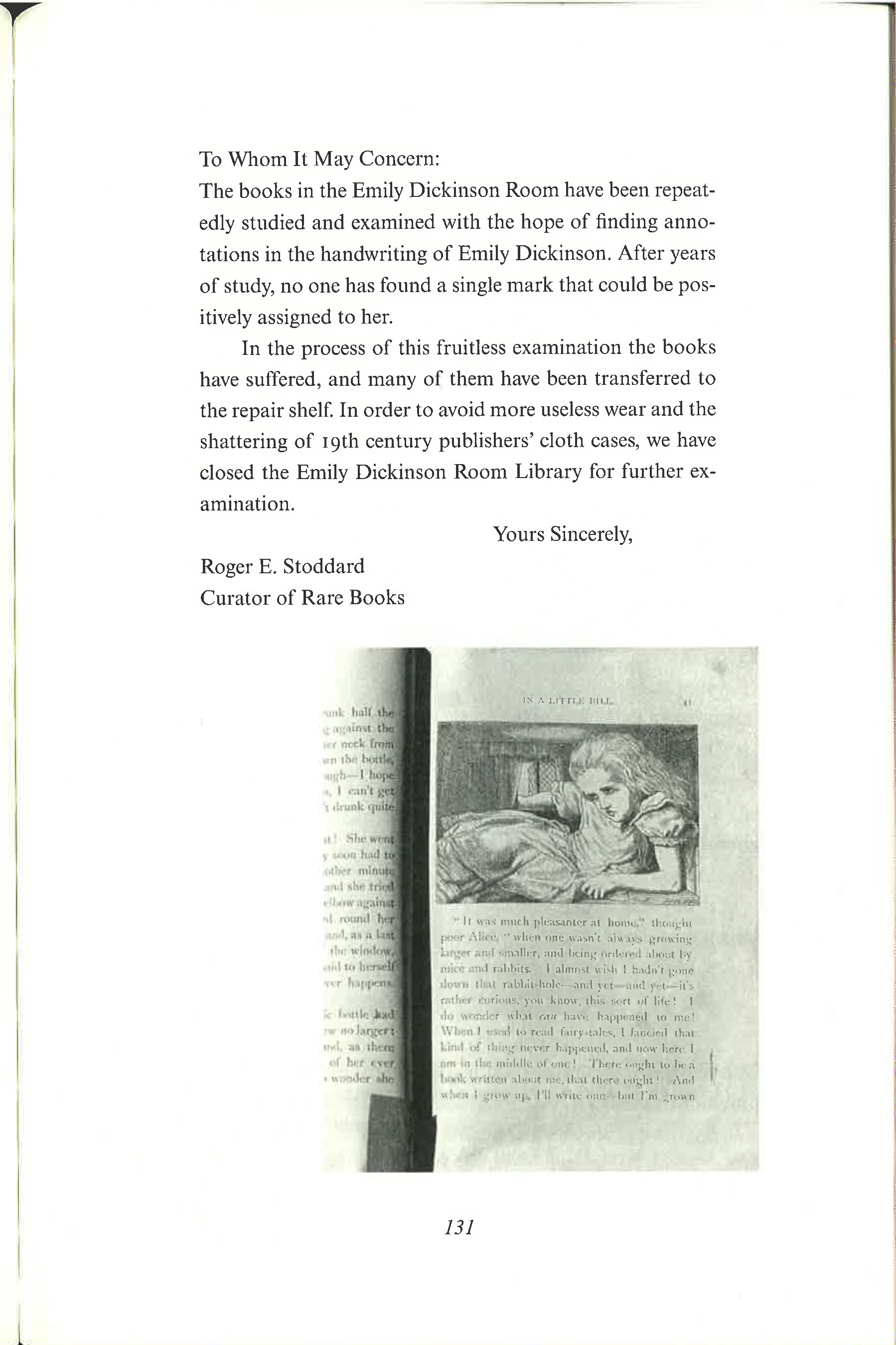
Some pictures are also formatted on the page in unaccountable ways: what is the reason for moving the picture on p. 131 to the right, so that it starts indented and overlaps the right margin? (Perloff, p. 121, notes the reason for the choice of the picture: it’s Alice’s humiliation in Alice in Wonderland, paralleling Howe’s humiliation at the hands of the librarians, described in the text above. But that doesn’t explain the offsetting of the image, or the utter carelessness of the cropping of the image at the left or bottom.)
There are several styles of photographs, which seem to have been taken in batches at different times: there are for example the photos with deep shadows; the photos that show an entire book open against a white background (pp. 59, 86); a couple with a turtle ink-stand holder or paperweight (pp. 62, 68); and several photos with ripped pieces of paper—John Manning’s bookmarks—carefully arranged so that they reveal just what Howe needs to be seen (pp. 80, 140). I don’t think readers are asked to notice or assign meaning to these different styles or batches of photographs, and that is another sign of the limits of attention paid to the visual.
Overall, I have the impression Howe took many of the photos or scans herself, quickly, in different libraries, and augmented them with pictures she had to buy from libraries, apparently thinking that readers would take their miscellaneous quality as a way of conjuring Howe’s many different reading experiences. But why be so insouciant about the photographs’ visual properties, given the trouble it took to collect and reproduce them?
Envoi
This book is as rich in embroidered references as Perloff says, and from her standpoint it’s an interesting example of the vexed relation between the documentary, the memoir, fiction, quotation, and poetry. I agree with all that, but I don’t see it as having any especially interesting thing to say about the relation between images and writing.