This has been a practical project all along: it has been aimed at contemporary practice, rather than the history of the genre—if “writing with images” ever was a genre. My interest has been in seeing what can be done now, with awareness of the past, and my motivation is selfish, because I am myself experimenting in writing of this kind. I thought it would be appropriate to end with some practical notes on how it might be possible to write experimental fiction with images with a more or less full awareness of what has been done in the past.
None of this means that it isn’t possible to write in any fashion at any time. Many authors I have named in this project have only known a few earlier examples of novels with images in them, and some authors have imagined they invented the very idea of writing with images. But my interest here is in writing that is done while thinking of what went before: in other words I am treating this subject the way critics and historians have long treated media like photography and painting, or for that matter genres of fiction: writing with images is a medium, a manner, a strategic possibility, which takes place in a particular context. What is of most interest is what happens when an author sets out to write with many other authors in her head—feeling the pressure of the past, as any number of critics have said, from Harold Bloom to Enrique Vila-Matas.
These thoughts are in no particular order. I hope to add to them as I accumulate material for this project.
1. The Photoshop Effect
Let me begin with a problem that has become ubiquitous since the mid-1990s: photographs that have clearly been manipulated by Photoshop or some other photo software. It is hard to date the origins of this, because they go back to the first desktop computers in the early 1980s, but I think many examples date from c. 1994, when Photoshop 3 was released with the Layers feature.
The problem, from a writer’s point of view, is that manipulated images call attention to their production. As a reader, especially if you use photo software yourself, you’re drawn into speculating how the author changed the images. That’s the Photoshop Effect: being taken out of the narrative, or out of the pictured scene, and being distracted thinking about palettes, curves, healing brushes, layers, contrast, color balance, and filters. For me at least the most distracting thing of all is noticing where the author did not know enough about Photoshop (or other software) to make the improvements she clearly intended. This happens, for me, in Eco’s Mysterious Flame of Queen Loana, which has some incompetent soft brush effects.
2. Different styles or kinds of images in one book
Another problem is using different styles or kinds of photographs in one book. Sebald was aware of this, and even though he used telephoto and close-up lenses, and also Xeroxed documents, he made sure they were sufficiently uniform throughout any one book. (This is all documented in Searching for Sebald.) It is distracting to see a 1950s-style Kodachrome image on one page, a 1970s-style Tri-X low-light photo on a second page, a video grab on a third page, and so on—unless those changes are accounted for in the narrative. A character could, for example, be looking over a photo collection, or traveling in time: whatever the excuse, it’s necessary to have one, because changes in photo styles and kinds is more jarring than changes in narrative voice, tone, or style. The reason for that difference is probably just the shallower history of photography in prose, compared to the very long history of pastiche, Macaronic writing, and literary collage.
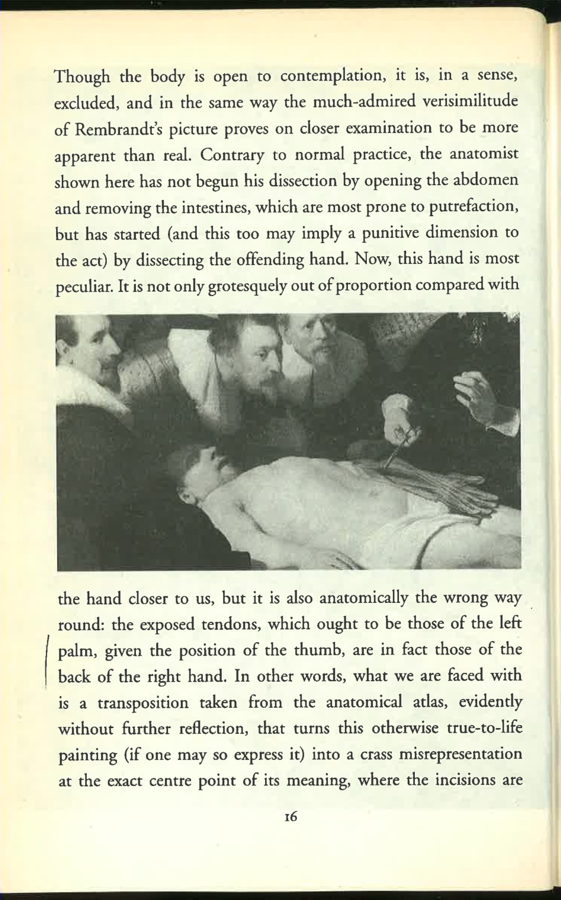
In Sebald’s Rings of Saturn, one of the few double-page spreads is the unfocused image of the replica of the Temple of Jerusalem (pp. 306-7 in the German edition, where it is more striking because it has no margins on left and right—the second illustration here is a scan of the German edition).

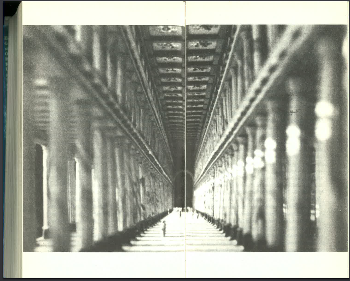
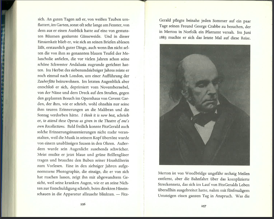
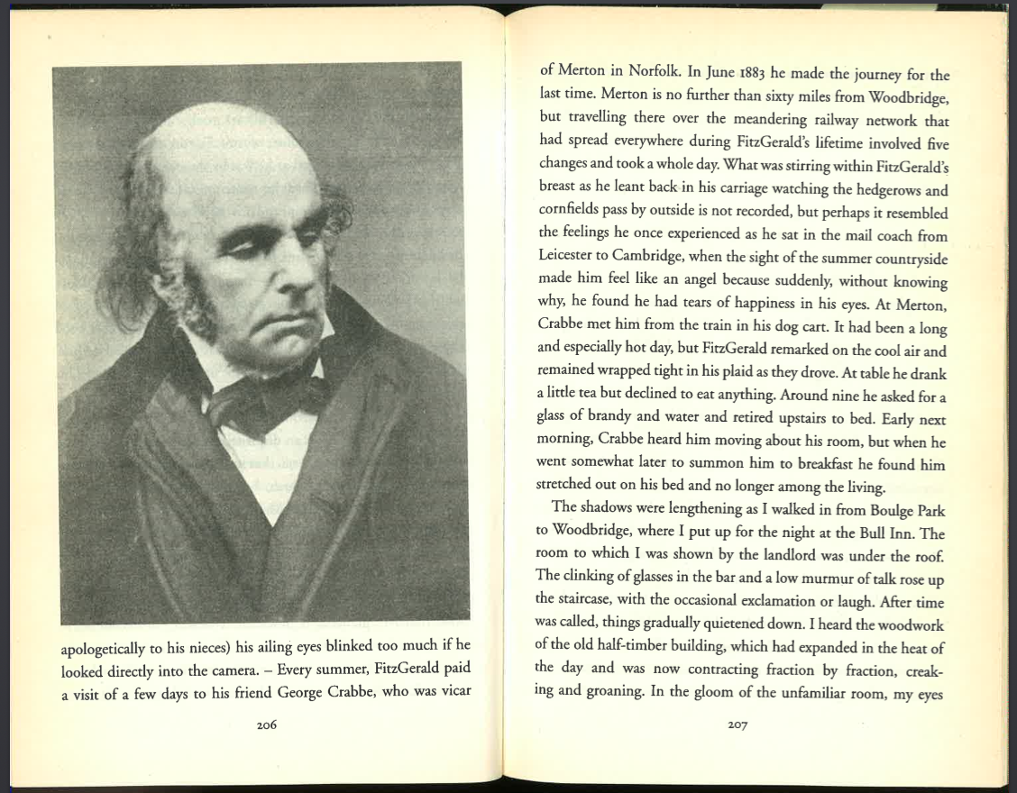
That photograph is different in kind from every other picture in the book: it’s the only close-up, and it’s unfocused. But it may work because of its resonance (to me, an incomprehensible resonance, but that’s another question) with two other double-page spreads in the book: the disturbing image of dead bodies at Bergen-Belsen, and the opening image of Rembrandt’s Anatomy Lesson of Dr. Nicolaes Tulp (see below). It may be that even minor echoes can bring anomalous kinds of images into some kind of provisional harmony, but it is certainly the case that many artists’ books display widely disparate kinds of image. Often, I think, a wide variety of images weakens a book’s interest because readers are licensed, by that diversity, to pay attention differently and less closely. That is the effect, for me, of the surprisingly large portrait of Edward Fitzgerald in Rings of Saturn (p. 206 in the English edition; second scan below). I think that is a mistake on Sebald’s part; in the German edition, which has a different proportion, the image looks substantially smaller (p. 257; first scan below). I think Sebald miscalculated the effect, because he could easily have brought the image inside the margins to control its size on the page, as he did for a number of other images.
It seems to be possible to have a limited number of styles or kinds of images in one book: for example landscapes, portraits, drawings, and graphs, provided they seem to be parts of one person’s experience or production. William Gass’s The Tunnel has logos, emblems, and signs, all done in an incompetent sort of 1980s graphics program. I once asked Gass if the images were supposed to be badly made, and he said yes, the narrator made them. Even readers who don’t think about the quality of the images could see them as being of a piece. In Eco’s Mysterious Flame of Queen Loana, the objects are expertly scanned (I suspect by an assistant), and their variety fits the theme of the book.
3. Keeping the distribution of images unobtrusive
Images that are loosely placed, like Rodenbach’s or Breton’s, make the process of publishing easier. If, as an author, you want to place images carefully, there’s a basic practical consideration: you’ll have to write at length between each image. That is because two images without at least a page of text between them cannot be placed accurately without leaving parts of a page blank. Sebald knew this, and intentionally wrote stretches of prose between his images so he could “anchor” them accurately without needing to break the continuous flow of text. Conversely, readers will notice if images come in regular succession and then there is a gap of some pages: that in itself can be distracting.
This means, among other things, that prose in a book like Rings of Saturn is partly filler; and conversely, it means that some images in Rings of Saturn are chosen partly because Sebald wanted his images to be fairly evenly spaced. This basic fact has not, as far as I am aware, been noted by literary critics.
The alternative is to permit parts of pages to be blank. An image can go on the top of each page, for example, and some text beneath it. There are few examples of books that mix these strategies—first placing images in regular succession with adequate prose between them, and then placing them irregularly so that parts of pages are blank. Alternating image placement in that way would draw attention to composition and formatting, and unless that is your intention, it may be best to choose a consistent strategy for fitting text around images.
4. Placing images on the page: justifying, text above and below, text wrap
There are just a few ways to place images on the page with text, if the text is continuous and its formatting is not a crucial issue. These are the vocabulary of page design for the problematic I have been exploring.
(a) Justified with the right and left margins:
(b) Bleeding into the margins:

(c) Text above and below:
(d) Picture above, then text, then white space, or some other combination that introduces blank space outside the text area:
(e) Double-page spreads, where the picture continues onto another page:
(f) Text wrap, where the image is centered or flush left or right, and the text flows around it.
Each of these has its associations (magazines, journals, scholarly books, and so forth) and each speaks to the author’s engagement with the appearance of the book. Note how an image shown in a text break (as in letter c) signals that the author is not too concerned with layout. It’s a way of saying: I am not really trying for any particular look on the page; I’m just trying to make sure the image is on this page (or maybe near these lines of text), and if I made it bigger, it would take up the entire page and make it difficult to coordinate it with the text. On the other hand, a book with text wrap (as in letter f) would communicate the idea that the author wanted the book to emulate the style of a magazine—and there would have to be a reason for that, because otherwise the choice of formatting would be distracting.
These six basic choices need to be weighed, and they probably should not be too varied: otherwise a reader will be continuously distracted by the author’s shifting decisions over whether the look of the page matters or not.
5. The possibility of repeating just one image throughout a book
Wright Morris’s Plains Song: For Female Voices (1980) uses a single image, over and over, at the head of each chapter. The photograph shows the corner of a room, reflected in an elliptical mirror. A painted decoration on the mirror—ribbons and flowers—is visible along the bottom. Aside from about a dozen family photographs, not much is visible in the photograph. On the right a door opens onto what appears to be a curtained closet; and on the left a curtain reveals what might be a second, closed curtain.
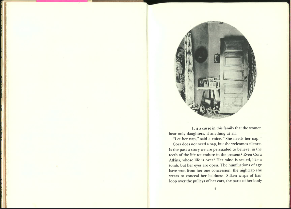 In the novel this image appears about a dozen times, at the head of each unnumbered, unnamed chapter. In the first few chapters the image changes meaning with each appearance. The book’s opening line is “It is a curse in this family that the women bear only daughters, if anything at all.” The family photographs in the oval image include at least one of a man, but the reproductions are small and indistinct. The oval image, the book’s subtitle, and the opening line all work together.
 Soon we’re told that the principal character, Cora, hardly ever looked at herself in a mirror, and certainly never looked at her body: so the elliptical image is something she might have seen, because it is an oblique view, and it does not reflect the viewer. The opening chapters are about Cora’s marriage and her move to a distant farm, which is presumably not the one in the photograph, because it is described as a much simpler, less ornamented place. The photograph might therefore be Cora’s ideal, or something from her childhood, or something from her old age. (The book tells her story up to and past her death.)
For me, the first three or four appearances of the elliptical image were fascinating, because the image shifted back and forth from document to ideal, from memory to projection. The image itself seemed to change: at first it was a document of Cora’s life, then a nostalgic remnant of the life she’d given up, then an ideal form of the house she would have liked.
But Plains Song is a missed opportunity in this regard, because Morris does not mention the image or describe anything in it, and eventually a reader looks right past the image in order to continue reading. It is possible to imagine a book in which a single repeated image could be mesmerizing, but it would require the narrative to refer, at least indirectly, to the image; otherwise readers will conclude it is emblematic in a general sense and therefore not worth attending to.
Plains Song does have a central image, but it is in the text. On her wedding night, Cora is so terrified and in so much pain she bites through her own hand, down to the bone. Morris manages the many appearances of that image beautifully. If I think of that written image along with the elliptical photograph, the photograph becomes an emblem for Cora’s scar and her indistinct but indelible memory of it. I don’t doubt Morris had that in mind, but it is another missed opportunity: it would have been possible to find a link, no matter how distant, to ensure that readers make that connection.
I am not aware of any novels other than Plains Song that repeat a single image: it is a wonderful opportunity waiting to be explored.