This is a long novel about a philosophy professor who buys a house in rural Pennsylvania. Every fifty pages or so there’s a full page or double-page photograph. For these purposes what interests me is not the novel, but Gardner’s decision to illustrate it. Here is a brief description of the use of photographs in the novel:
Gardner isn’t particularly interesting or reflective about his use of photographs, so a reader can proceed without paying much attention to his images. The photographs function, in the end, to help set the mood of different passages and of the book.
I think that would be a reasonable way to describe the images in the novel Mickelsson’s Ghosts in two sentences. But it raises some very difficult issues. What does it mean to imply that the meaning of images is reduced when they are used only to set a mood? And what would constitute interesting uses of images? Is an image more interesting when it is used reflectively? Does the reflective nature of the text itself call for a reflective use of images?
Questions like these are difficult to answer, I think, without at least the beginnings of a poetics of reading fiction with images.
Let me open that subject, and try to develop some principles of that poetics, with some more detailed remarks on this book.
All the photographs in Mickelsson’s Ghosts are full page or double-page spreads, printed beyond the text margins but not quite to the trim edge. (I bought the original hardcover, because the print in the pb is very small, and the illustrations seemed to be cropped. More on this at the end.)
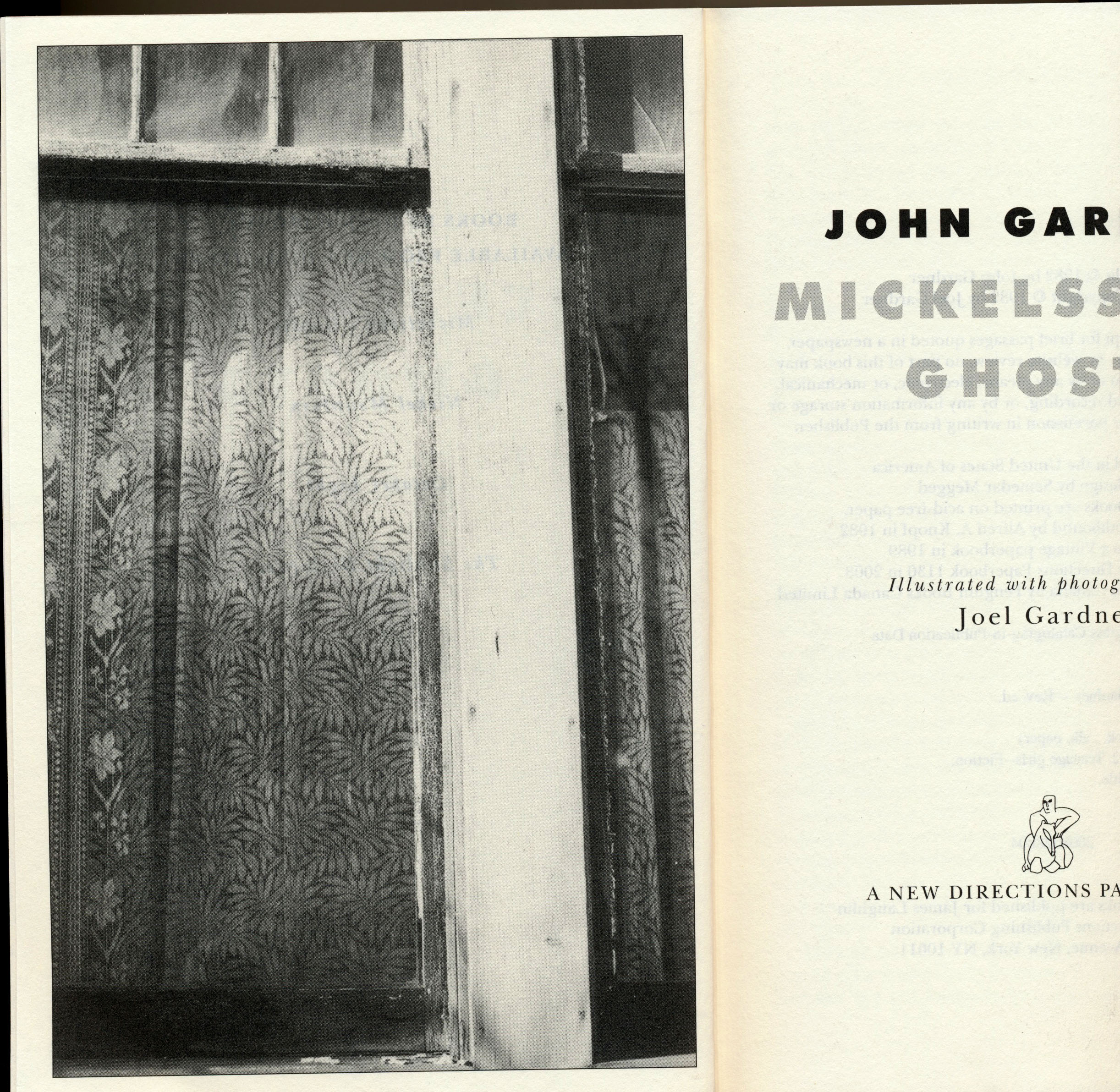
Even if I look at the frontispiece very quickly—as I am likely to do if I don’t realize the novel has illustrations throughout, and that therefore illustrations are important—then it signals several things: this is a novel about rural life, and possibly about poverty; it’s about closed windows and possibly also hidden lives; and it might have something to do with the rural aesthetic that began with WPA and other photographs taken at the time of the Depression. I’d be right about some of those, and wrong about others: but I think most readers would have something like those sorts of thoughts. Like all frontispieces, this one sets the tone of the book, and serves as an emblem of its contents—or so a reader might expect.
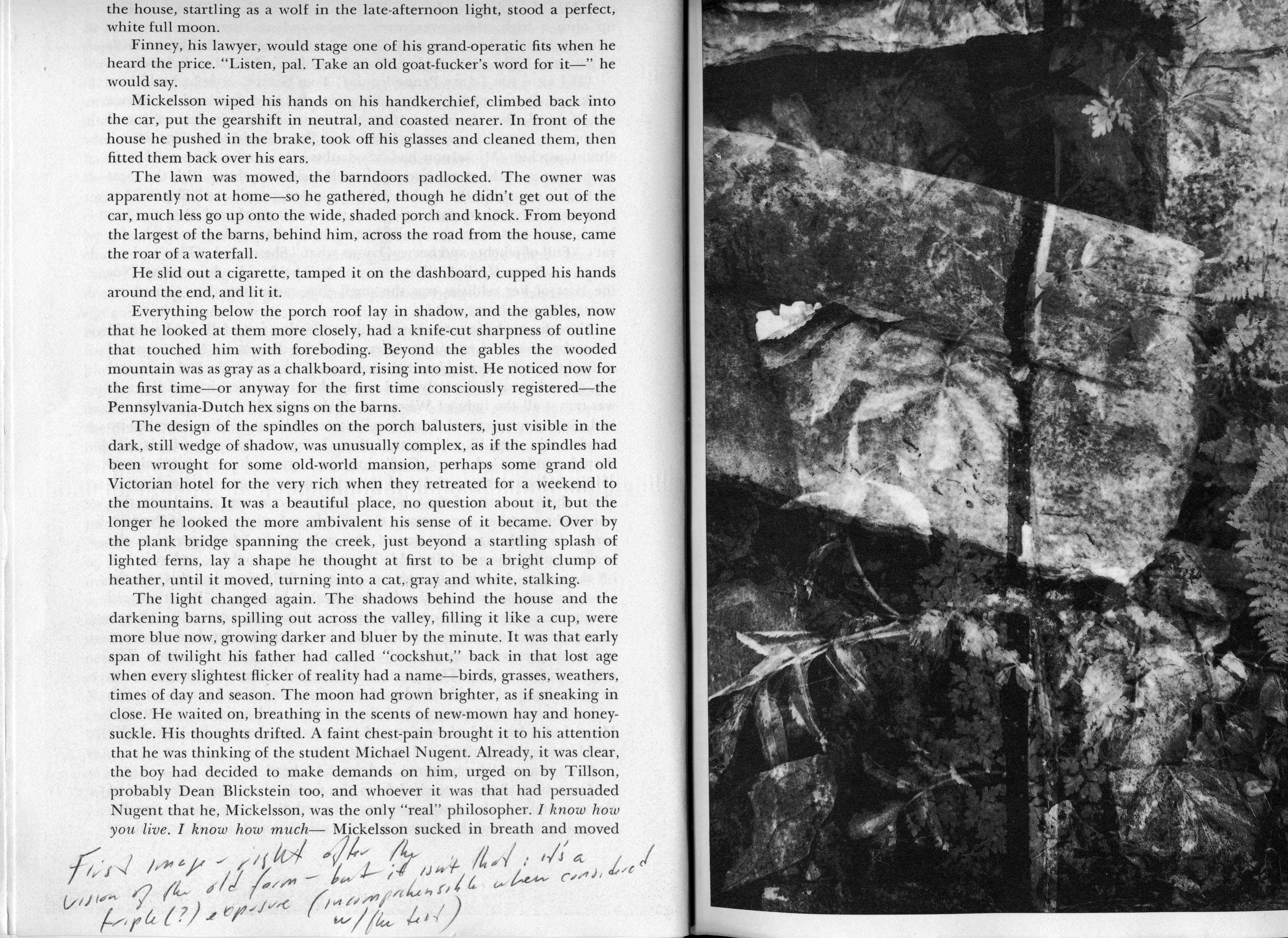
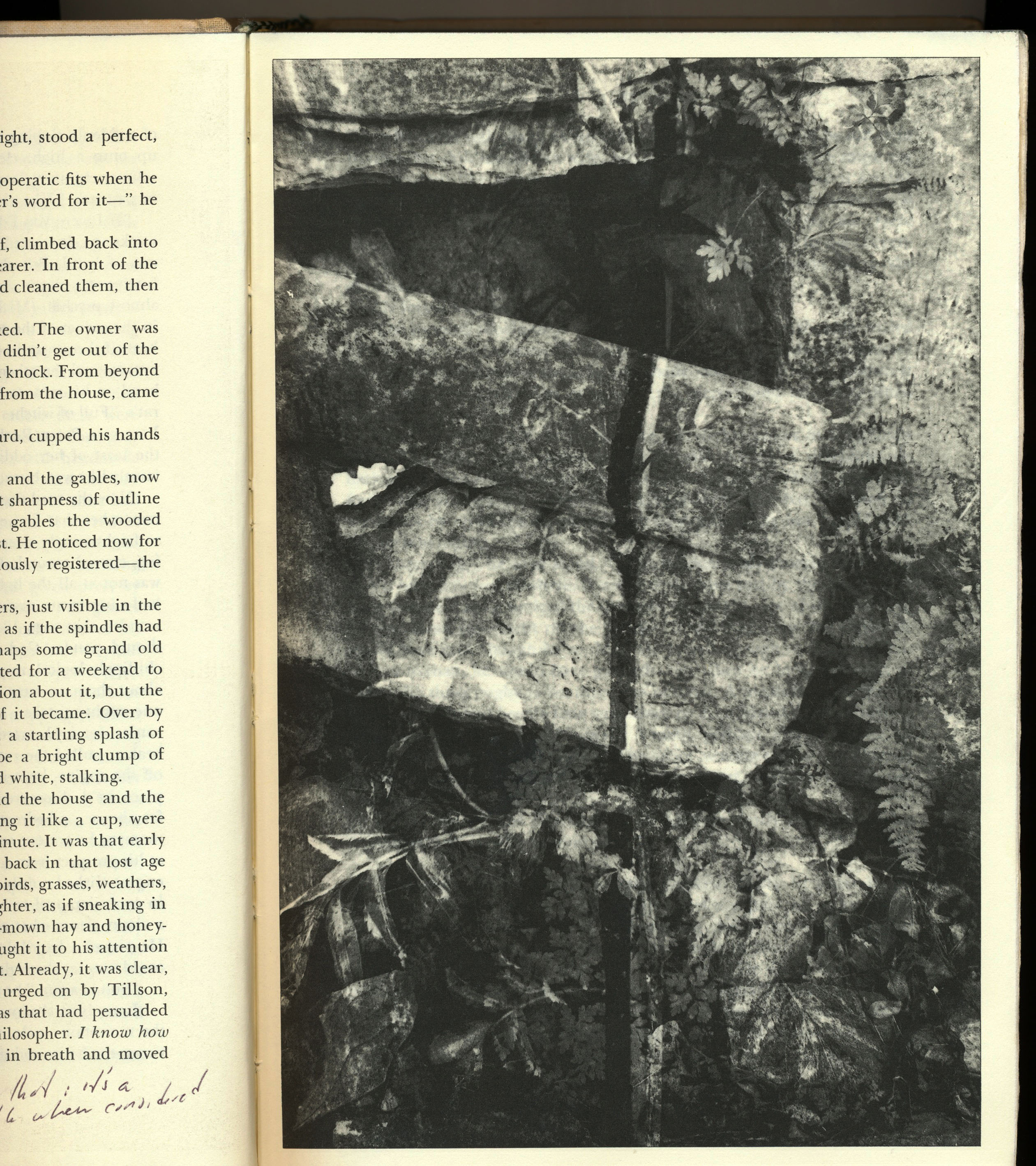
The first illustration after the frontispiece is placed opposite p. 22. At that point in the narrative, the main character has just discovered a rural home he wants to buy. It’s described for the first time on p. 21, and when the reader turns the page, she sees the photo, which is, unaccountably, a triple exposure of a decaying wood wall, rocks, and ferns.
The photo doesn’t correspond with anything in the description, and its late 1970s black and white art technique doesn’t fit the nostalgic descriptions of rural northwest Pennsylvania. Apparently it did not concern Gardner that (1) the image is largely illegible, (2) it doesn’t fit the description, and (3) it has a style that is at odds with his narrative. It is possible that Gardner wanted the triple exposure to conjure the ghosts of the book’s title, but if so then it is odd that (4) he did not think readers might expect the multiple-exposure still lives to recur throughout the book, or (5) wouldn’t be distracted by the appearance of such a specific fine-art convention, even to the point that (6) they might wonder whether Gardner himself took the photo (his main character is not a photographer), and if he did, where he took it, and why he didn’t use any other photographs like it.
All six of these points go to the larger possibility that Gardner does not expect readers to think much about the image.
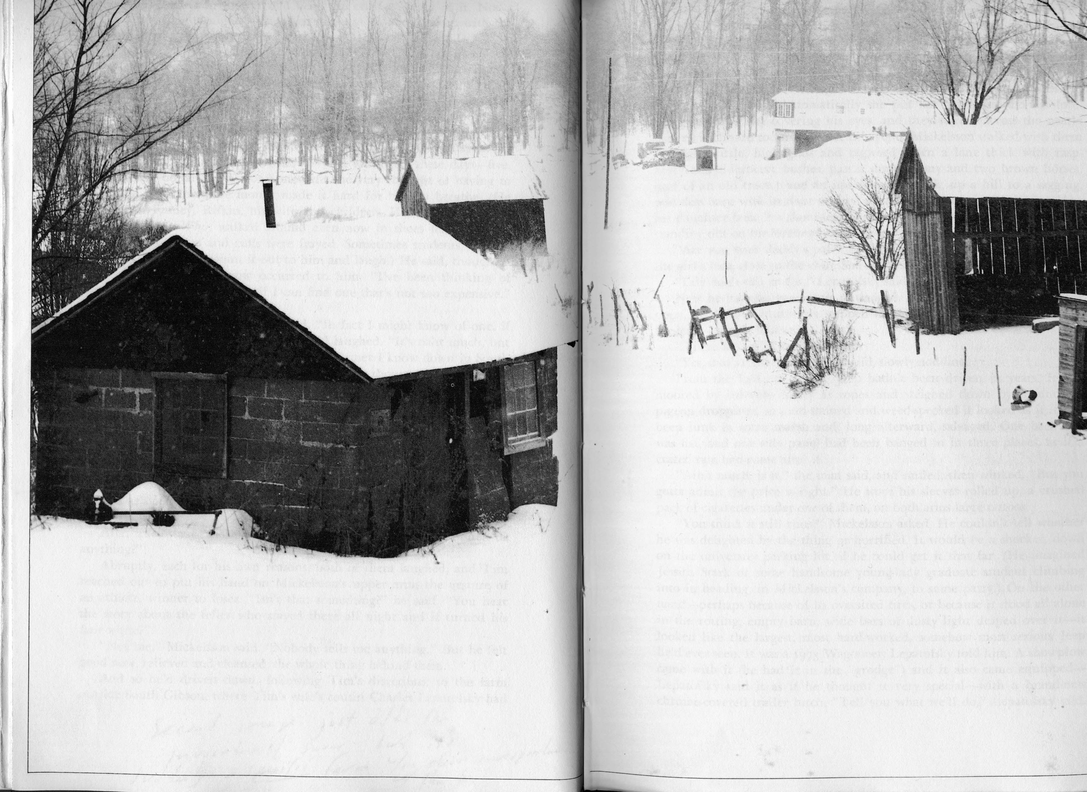
The second image is a double spread of farm buildings in the winter. This one could be of any place the northeastern US, and so it fits the region Gardner is describing, and it comes just after the book’s first invocation of snow. (The main character wonders how he will get through his first winter in his new house.)
But the photograph is a specific farm, with a house and four small farm buildings; the house doesn’t correspond with the house the character has bought (even though the book has detailed descriptions of the house Mickelsson buys), and the land is entirely different from the hilly place, with a waterfall, described in the book.
Apparently it did not concern Gardner that (1) this farm is wholly different from the one he has been describing, or (2) the brief mention of snow in the narrative is at odds with the very specific and detailed scene of snow in the photograph.
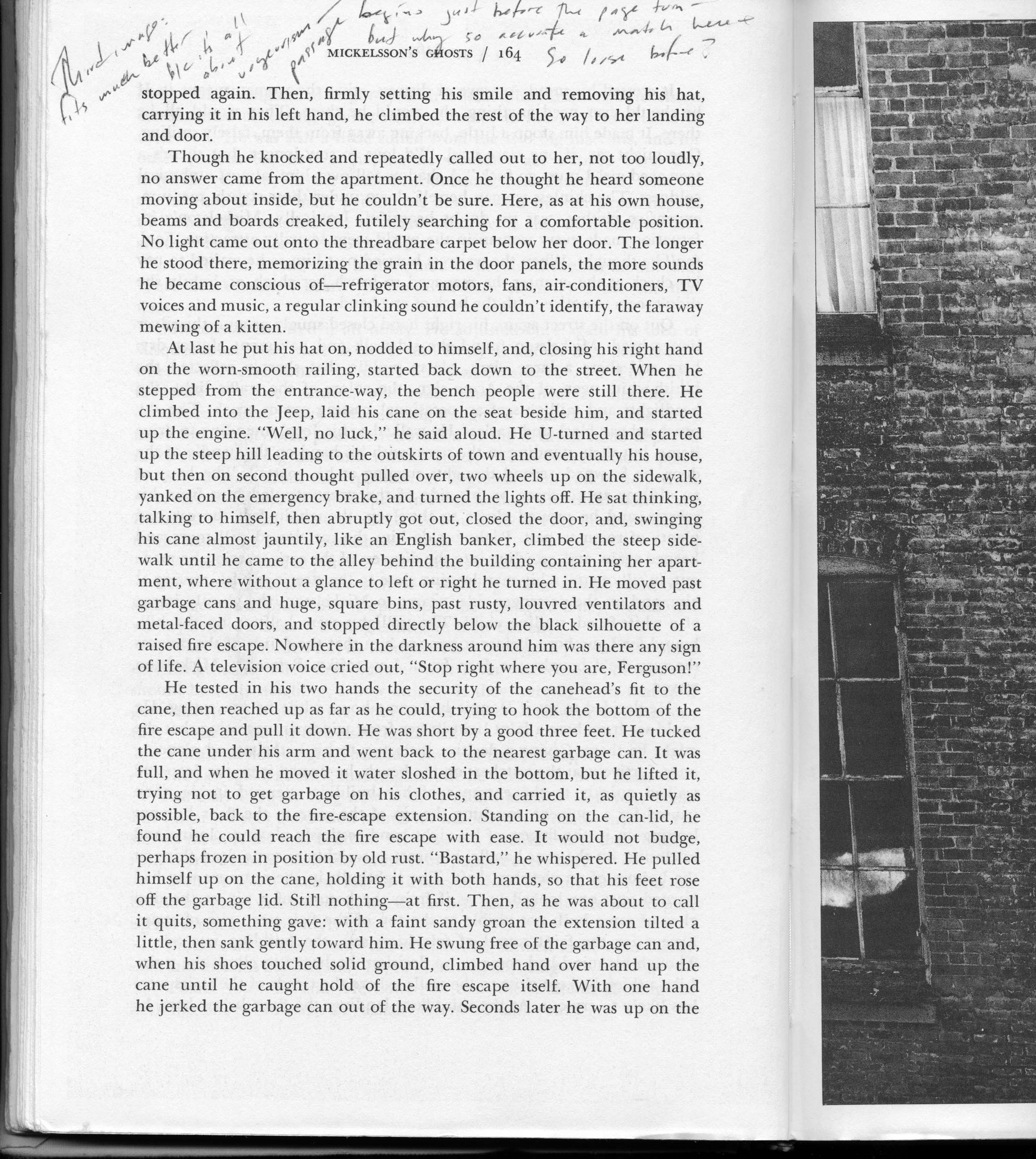

The third image faces p. 164; it shows parts of six windows in a brick building, from the outside. Each window has some reflections and some have hints of things inside. This fits the narrative much better than the previous photographs, because the narrator has just been thinking of spying on the prostitute he’s been seeing. As the story develops, he peers into someone else’s apartment, so the photograph invites the same kind of looking that the narrative describes.
But apparently it did not concern Gardner that (1) the relation between text and image here is so close, while the relation between text and images in the other photographs is much more distant, or that (2) readers, encouraged by this closeness, might return to the previous images in search of more information, which they wouldn’t find.
These three examples suggest a kind of general problem in fictional narratives that use captionless images:
The first two or three images in a book tell what the relation between text and images will probably be. As they reveal that relationship, they also give some evidence about the author’s awareness of it, and of the author’s way of looking at images.
I’m trying to put this as generally as possible, to keep it flexible. I’ll try to develop it in analyses of other books.
Although it is clear that Gardner did not expect his readers to look closely at the images, or to think about what they saw too analytically in relation to the text, it is not clear how imprecisely we are meant to look. A way to think about this is provided by the difference between the hardcover and the paperback.
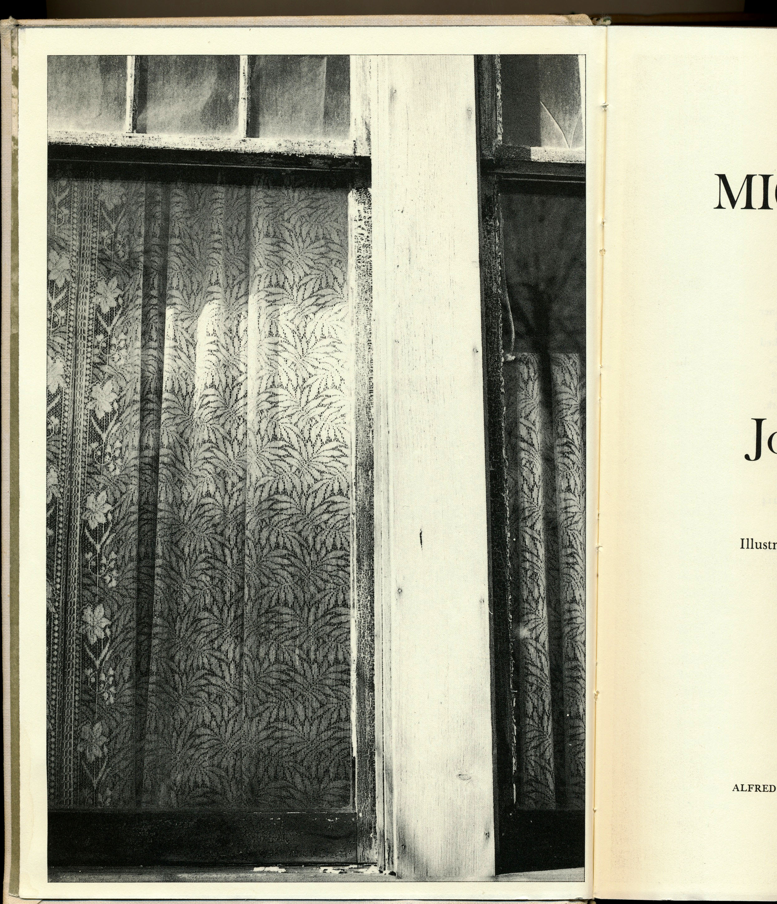
The hardcover is 9 1/4″ by 6 1/4″, substantially larger than the paperback, which is 8″ by 5 1/4″. The result is more detail in the hardcover, and because it’s printed better, there is more detail in the darks and a little more in the lights, and a greater value range. These features result in a substantially greater visual impact in the hardcover. Here are comparison images.
The frontispiece, in the paperback:
And in the hardcover:
The first image, in the paperback:

And in the hardcover:
These are small differences to anyone but a photographer or book designer. But they serve to raise an enormous issue: what is the effect of the quality of reproduction on the reading experience? Before W. G. Sebald died, I wrote him a letter, asking—among other things—whether he would want to have reproductions in color, on coated stock, in large trim size, if his publishers said they could afford it. I was curious partly because his images have to do with incomplete memories, nostalgia, and history, and some would have a very different effect if they were high-resolution color photographs. He wrote back, saying it was a complicated question, and that I should visit. Before I could, he was killed in a car crash.