Here I want to do the kind of housekeeping that seems preliminary but always threatens to expand to engulf a project: I’d like to distinguish between “writing with images” and several other practices that could be included in the same theme: (1) writing about images (ekphrases); (2) writing as images (typography); (3) pages as images (design, layout, books as objects); and (4) books of images (books without text).
The second and third of these four will double as an occasion to explore the concept of preciousness. When typography is a strong presence (“writing as images”), there is a temptation to be finicky: our attention may be drawn to an unusual font, or to the kerning, the management of margins, or the presence of ligatures. When the layout is prominent (“pages as images”), there can be a tendency toward redined compositions: multiple columns, footnotes, margialia, elaborte headers and footers, wraparound texts. In both cases the visual appearance of the text can become the object of intense curation, even if the text itself is not, or carries other themes. I find that the word preciousness can help explain what happens in these cases. It’s an important word in this project because every page that includes an image must also be the product of certain choices about layout. Some movels with images are distractingly carefully formatted; some are unaccountably insouciant about the placement of their images. Preciousness, which I will examine along with the second and third of the four themes, is a good critical term for the dangers of drawing too much attention to composition, font, spacing, and other potentially conventionally unimportant properties of text and of the page.
Ekphrasis, the first of the four, is a fascinating topic in itself and also because it tends to be written about in such a way that it is indistinguishable from the texts with actual images. I present it here in some detail, but if you are more interested in typography and design, skip down to topics 2 and 3.
In the rest of this project I will be minimally concerned with these four possibilites, because I want to think about prose that does not draw special attention to its own visuality, but rather poses itself alongside visual objects.
1. Writing about images (on ekphrasis)
(A revised version of this section has appeared in Visual Worlds, co-authored with Erna Fiorentini, Oxford University Press, 2020.)
There is a long history of novels and poems that include descriptions of images such as artworks: Proust’s description of the yellow wall in Vermeer’s View in Delft, John Ashbery’s meditation on Parmigianino’s painting in Self-Portrait in a Convex Mirror, Don DeLillo’s use of Douglas Gordon’s Twenty-Four Hour Psycho in the novel Point Omega, Thomas Bernhard’s use of one of Tintoretto portraits in Old Masters. Those possibilities take up where the final chapter of “What is Interesting Writing in Art History?” left off, because such books aren’t really about artworks, and don’t have images physically present in the book. And just outside that theme, in turn, are books that describe imaginary artworks (including, I suppose, the passage on Achilles’s shield in The Iliad), and the many novels that describe non-art images (of which I would single out Robbe-Grillet’s Jealousy and Georges Perec’s Life: A User’s Manual as crucial examples).
I’d like to draw as firm a distinction as I can between all instances of ekphrasis and examples of images actually present in texts. It’s not an unproblematic distinction. A number of philosophers have pointed out that there is no clear difference between writing and images: texts, and language itself, are inherently imagistic; and images are inherently discursive or voiced. As Jean-Luc Nancy says, the two are in a “distinct oscillation” and often interdependent. One way to get at the sorts of difference I have in mind is by listing several senses of ekphrasis, beginning with the classical uses. The more recent uses of ekphrasis are perhaps more difficult to separate from this project, but the earlier ones are helpfully different.
C. Then there is the less formal contemporary usage of ekphrasis, in which it means and description of a visual object in prose or poetry. In modern books on rhetoric, the description of Achilles’s shield in the Iliad has become the main example. For art history a better example would probably be Pausanius’s description of the Iliou Persis, a lost painting by Polygnotus. It would be optimal because the painting has been visually reconstructed everal times based on Pausanius’s text, with widely varying results. (See for example Mark Stansbury-O’Donnell, in American Journal of Archaeology vol. 93, 1989.) This way of thinking of ekphrasis may be related to modernism, because scholarship often centers on modern fiction, including Pound, Williams, Auden, Woolf, and others; but in general it is limited to passages that are explicitly presented as descriptions of specific static, usually two-dimensional, images, often artworks. Art history’s deep implication in this history of reception, and its modernist affiliations, has yet to be examined.
D. A fourth sense of ekphrasis depends on its deconstruction. It’s the strain of thought that generates claims that this project should include ekphrasis along with the study of reproduced images. This moment in the reception history of ekphrasis may derive from Foucault’s claim that Don Quixote is a break in the Western history of naturalistic depiction. He argued that representation was shown to be deceptive, so that descriptions of objects could no longer be trusted—and ekphrases would be the epitome of what could be revealed as untrustworthy. (See Frederick de Armas, “The Hermetic Raphael: Ekphrasis in Don Quixote and John Crowley’s Aegypt,” 2007. Foucault carries this analysis further in his account of Roussel: more on that later. Below, one of Doré’s illustrations of Don Quixote.) Tom Mitchell’s essay “Ekphrasis and the Other” in Picture Theory (1994) is a good example of a deconstructive approach. He proposes a theory of “ekphrastic fear”: “when we sense that the difference between the verbal and visual representation might collapse,” and the “desire of ekphrasis might be realized literally and actually” (p. 154). The opposite is “ekphrastic hope,” of “free exchange and transference between visual and verbal art,” “the overcoming of otherness” (pp. 155-6). In affective terms, ekphrasis is suspended between these impossible extremes (and Mitchell adds a third, “indifference”). The ekphrastic image acts “like a sort of unapproachable and unrepresentable ‘black hole’ in the verbal structure,” and it sets up this veering series of desires, none of which can be fulfilled (p. 158). The deconstructive moment in this reading comes when Mitchell uses the “hope” and “fear” to reveal assumptions we have about media—that “arguments, addresses, ideas, and narratives are in some sense proper to verbal communication,” and that “the visual arts are inherently spatial,” and so forth (p. 160). In terms of this project, Mitchell’s deconstruction is a rejoinder to those who may want to use literary theory to argue that ekphrasis is inseparable from what I concerns me: but on the other hand, Mitchell’s reading also undermines the kinds of properties I might want to attribute to the images that are actually reproduced in books.
E. Monica Westin has developed a sense of ekphrasis that affiliates it with enargeia, phantasia, energeia, imitation, and other rhetorical tropes; her argument is that ekphrasis is best understood as a way of conjuring presence in texts, and that it cannot be usefully defined as a rhetorical device among others, or a rhetorical exercise (progymnasmata); rather it is an optimal example of how presence “is an effect in which rhetoric attempts to overcome its own context. By this I mean an attempt at framelessness, whether the framelessness of self-evidence or another way by which the rhetor tries to overcome representation using the tools of representation.” Partly following Hans-Ulrich Gumbrecht’s The Production of Presence (2004), Westin argues that ekphrasis, among other figures, is an example of “the use of representation to (seemingly) overcome its limited, mediated nature in order to enact a particular kind of conviction, related to evidence and proof, that takes the form of several effects that are aesthetic as well as rhetorical.” (“Presence as Evidence: An Alternate Visual History of Rhetoric,” dissertation prospectus, University of Illinois at Chicago, fall 2013.)
From the perspective of this project, Westin’s sense of ekphrasis is the most difficult to exclude, because it identifies ekphrasis with a breaking of frames (she says the ekphrases in Philostratus’s Imagines are “hyper-real” and “proto-cinematic”) in the pursuit of presence: a perfect working definition of the effect of images actually reproduced in novels. As Mitchell says, “a verbal representation cannot represent—that is, make present—its object in the same way as a visual representation can”: but a lot depends on that phrase, “in the same way.” (Picture Theory, 152.) (Below: one of the many illustrated versions of Philostratus’s Imagines, showing the desire for presence actualized for readers.)
These five usages of ekphrasis are an indication that rhetoric is not the way to police the boundary between ekphrastic writing and actual images reproduced in texts. Theories of ekphrasis don’t answer the question of the place of the actual image itself. I hope that some of the distinctions I make in “An Attempt at Theory” can help in that regard, because an actual image—like the one above—always interrupts its surrounding prose, always inserts unacknowledged details, always slows the argument. But more on those possibilities later.
2. Writing as image (on preciousness)
This heading and the next one, “The Page as Image,” offer ways of thinking about what happens in artists’ books and in other kinds of publications where readers are asked to consider text as a visual object. In pondering what sometimes puts me off about such projects, I thought preciousness might be a useful critical term.
Preciousness is a quality in art that I do not generally find interesting or persuasive, but it is common in artists’ books that are printed in color, or with high printing standards. The issue of preciousness comes up several times in texts I consider in this project, for example Umberto Eco’s Mysterious Flame of Queen Loana, Sebald’s Rings of Saturn, and Anne Carson’s Nox.
Artists’ books that contain small, high-resolution color reproductions can be precious, and preciousness is inevitable when the illustrations are also pull-out, tipped-in, accordion, or otherwise specially inserted in the book (for example in Nick Bantock’s The Forgetting Room: A Fiction).
“Preciousness” comes from the 17th century French women’s literary moment called Preciosité. Les Précieuses is a later name given to a salon of women who met to read fairy tales and theatrical pieces to one another, and to read and write Platonic romances. Today the precious is a complex category. A look at several French and English dictionaries yields four pertinent definitions:
1. Affected (meaning insincere, ostentatious, theatrical, artificial, pretentious).
2. Delicate and refined. The precious, one dictionary says, occurs when “les manières, le langage, les sentiments sont empreints d’une délicatesse et d’un raffinement artificiels,” and another defines preciosité as “délicatesse extrême, raffinement voire affectation dans les manières, le langage.”
3. Precious art is also art in which ornament becomes more important than content. As one dictionary puts it, the precious is an “expression artistique très raffinée où les nombreux détails, les ornementations dominent l’ensemble de la création.”
4. In literature, preciousness is a style that is intentionally unnatural, with rare words and metaphors. The precious style “manquant de naturel” and is “marqué par un grand nombre de mots rares et de métaphores recherchées.” Huysmans would be precious in this sense.
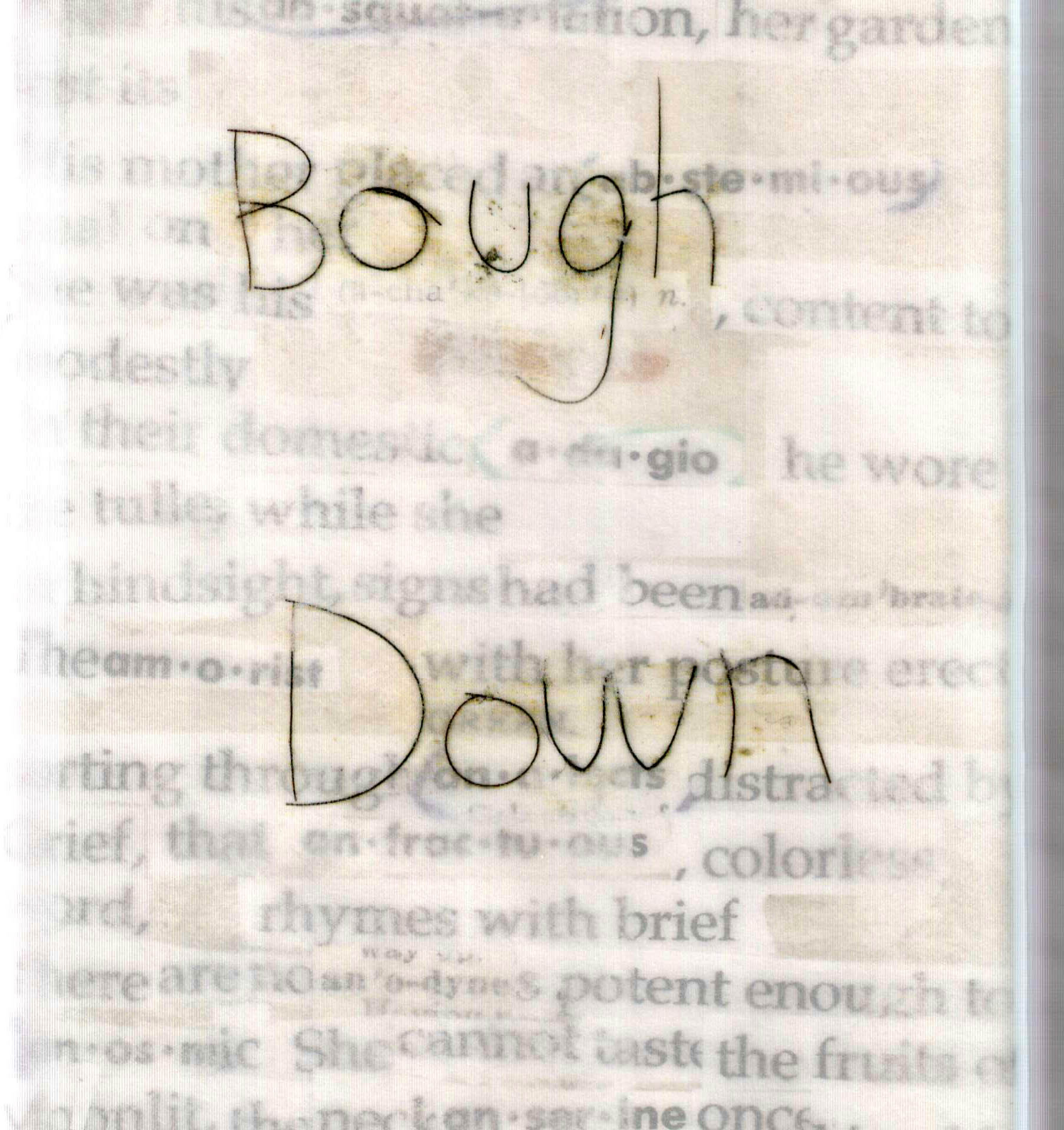 The first of these meanings might be misleading, both because it’s unhelpfully broad and also because it could pertain, for many reasons, to many texts. Consider the second, third, and fourth meanings, taking as an example Karen Green’s Bough Down (2013). I choose it because I think it is an excellent book aside from its choice of images: the text is a strong series of poetic reminiscences of the death of Green’s partner, David Foster Wallace. Because the prose is so good, I can be critical of the images without implying that precious images will necessarily affect their accompanying text.
The book’s visual preciousness begins with the cover, which is a translucent “oil paper” with the book’s title printed on it in smeared letters. You can see through to the cover board, which is printed with a scanned color image of a text collage. Immediately, before the book has been opened, this signals the use of text as image, and preciousness in the second and third senses.
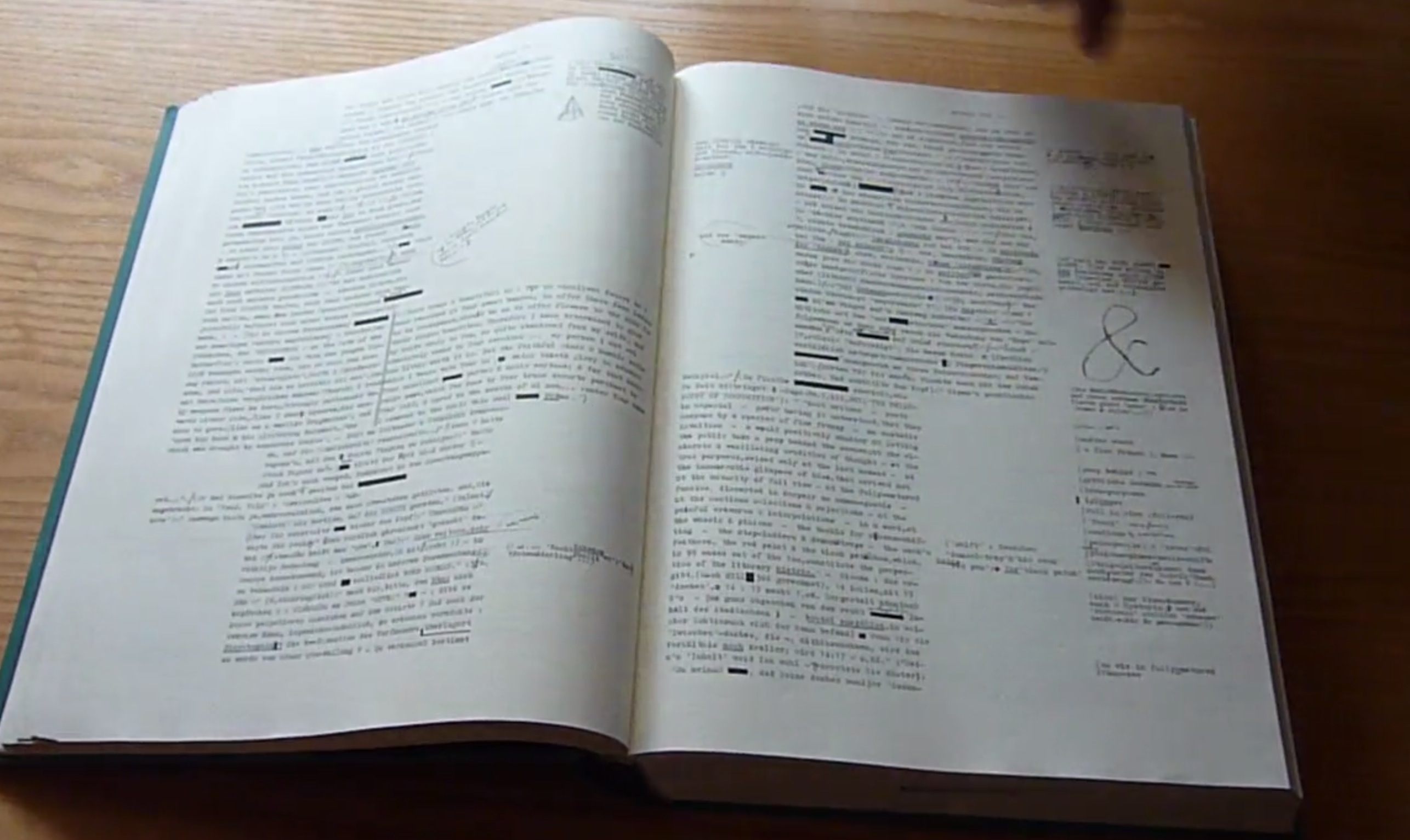
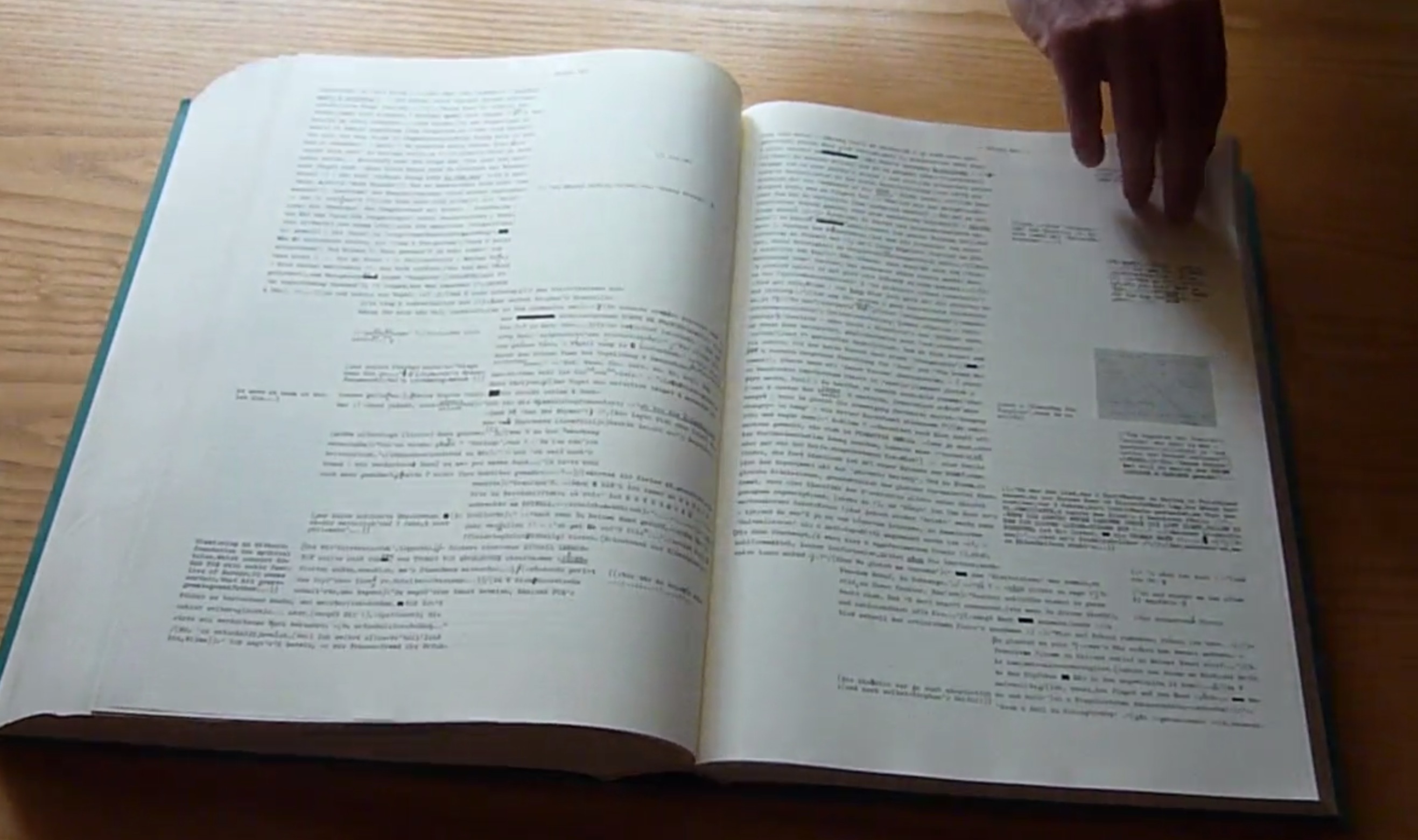
The book alternates between prose and images, both printed with very large margins. The prose pages have left and right margins as wide as the text blocks, and upper and lower margins that average twice the height of the text blocks. (My scans here include the margins; that’s why the text and images float on the page.)
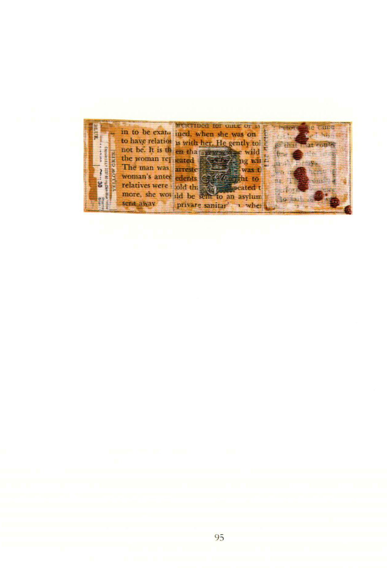
The images are even smaller in relation to their pages—usually one-half the page width, and less than one-sixth its height. They are scans of Green’s collages, presumably life size or nearly life size (some contain postage stamps).
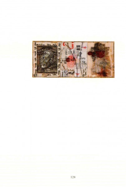
Some have poems and pieces of text that are legible, so they ask to be read along with the printed pages:

And others are too small to read, or else the text is too much obscured by cutting and pasting, by stains, paint, and overlaid objects:
For me Bough Down is precious in the second, third, and fourth senses I listed above:
2. It is delicate and refined, which has an affective force, because the book is a record of mourning, and the prose is often intense with feeling—producing a strange contrast, as if Green was in real mourning in language, but in a kind of suspended, aestheticized mourning in images.
3. Bough Down also proposes that ornament is sometimes more important than content, because it exhibits illegible, private, and obscure images and text fragments. By contrast the text reports, as best it can, on experiences that are at once personal and full of feeling. But the images don’t tell a story of a narrator’s grief: they imply a maker who does not wish to share, who wants, on the contrary, to demonstrate the impossibility of sharing, and the senselessness of attempting to communicate.
4. And the illustrations in Bough Down are precious in the sense that they are full of the equivalent of “rare words and metaphors.” The postage stamps, stains, curated objects, tiny drawings, fragments of documents, and other marginally legible forgotten objects are the aestheticized descendants of Kurt Schwitters’s collages of garbage, overlooked, and forgotten objects.
Preciousness can’t cover all of what needs to be said about certain arrangements of word and image, but I think it can help clarify what sometimes doesn’t work in books like Anne Carson’s Antigonick, Nox, or Stephen Farrell’s VAS. Still, those books have other properties and expressive qualities, and I will return to this issue throughout the project.
3. Pages as images (on layout and design)
If words can be presented as images, then so can pages. Perhaps the simplest example is the facsimile edition, because it presents a book as pictures in a book. A recent example is Flannery O’Connor’s Prayer Journal, reproduced in facsimile by Farrar, Straus, & Giroux in 2013. In a review in The New York Times, Marilynne Robinson notes without comment—and apparently without much interest—that O’Connor’s notebook is reproduced “complete with the empty final pages” and “not omitting a bit of musical notation on the inside of the back cover.” Robinson’s review is thoughtful, and if it were possible to assign meaning to the publisher’s decision to reproduce blank pages other than the fetishization of the author and work, it seems Robinson would have found it.
Does it help a reader to have Nabokov’s note cards for his unfinished Original of Laura reproduced in color, front and back?


The editor suggests readers might cut them out and rearrange them. I wonder if anyone has bothered: there are so few that they’re easily held in mind, and rearranging would seem to be fairly pointless.
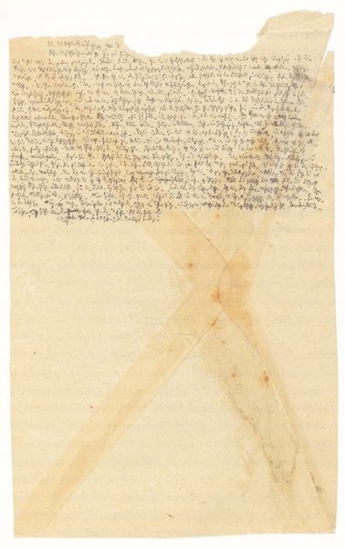
Preciousness is also an effect of the implication that visual ornament is more significant than written meaning. In Bough Down the carefully done visual objects imply the value and delicacy of the relationship the author had with Wallace. In Nabokov’s Original of Laura, the 3 x5 cards that were used to compose the novel are reproduced in color, front and back, even when the backs have nothing but an X on them. The color reproductions imply that the cards are valuable, like old postage stamps or diminutive works of art, and suggest there is a relation between the visual qualities of the cards, Nabokov’s handwriting, and the interest of his words and ideas… but there isn’t. Preciousness, here, is the spurious imposition of visual significance on literary meaning. (A Nabokov facsimile book that isn’t at all precious is the wonderful Nabokrossvords: Selected Puzzles from the Russian Émigré Newspaper Rul’, 1924-1926, edited by Joseph Mills and Kate Kozhukohva, 2012, which reproduces Russian-language crossword puzzles Nabokov wrote early in his career.)
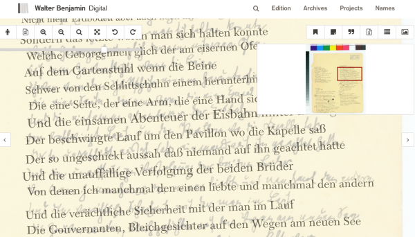
Another facsimile publication, Walter Benjamin’s Archive: Images, Texts, Signs gives us Benjamin’s notations and manuscript scraps in high-resolution color, but the author himself seems to have been oblivious of much of their visual quality. The book makes them look like holy relics. (The image here is from a wonderfully myopic review by Robin Kinross.)
There is also a website that fetishizes Benjamin’s manuscripts by overlaying transcriptions:
On the other hand, seeing Robert Walser’s microscript essays in their original scale is meaningful if they’re read the way Sebald suggests—as emblems of the author’s disappearance.
 Sebald sees a connection between Walser’s ephemeral subject matter—as several readers have noted, it can be hard to keep in mind exactly what some essays are about—and their smallness. Facsimiles involve the fetishization of the graphical or visual qualities of the texts, which may or may not be connected to the authors’ intentions or the contents of the texts themselves.
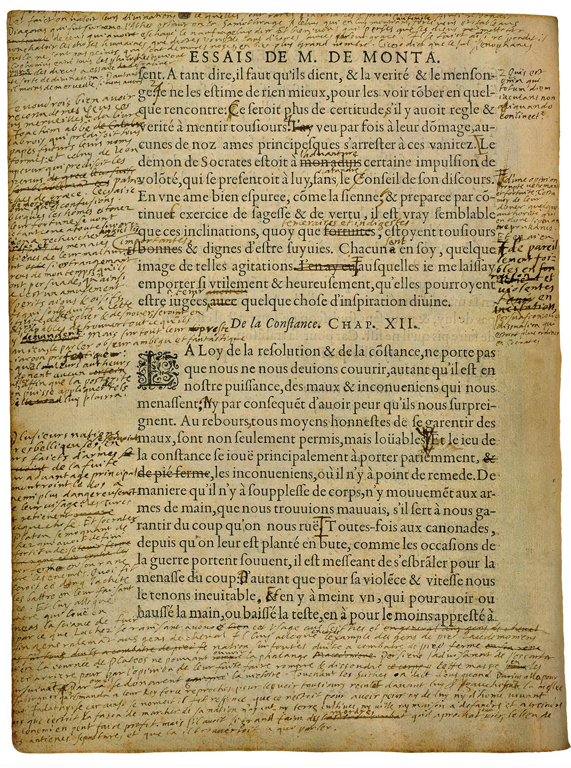
I think it is important not to begin the history of the page as an image with concrete poetry as in Apollinaire: as Tom Conley and others have shown, the 15th and 16th centuries were full of such experiments. Conley’s readings of Montaigne’s marginal corrections in the Essais does not depend on Montaigne’s handwriting, or the way he compressed text to fit in the space he had available: there is no evidence that Montaigne thought of his handwritten corrections as visual objects. But Conley’s readings of the printed texts are sometimes visual, and there is no secure division between persuasively visual readings of the printed text and close-up looks at Montaigne’s handwriting.
In the history of modernism, one of the most elaborately formatted books is Arno Schmidt’s Zettels Traum., which I discuss separately on this site.
My preference would be to begin an account of the page as image with books like these, instead of premodern formatted pages such as the Talmud or Bayle’s Dictionary, because Schmidt’s modernism (or postmodernism) is more appropriate to the current condition and possibilities of formatted pages.
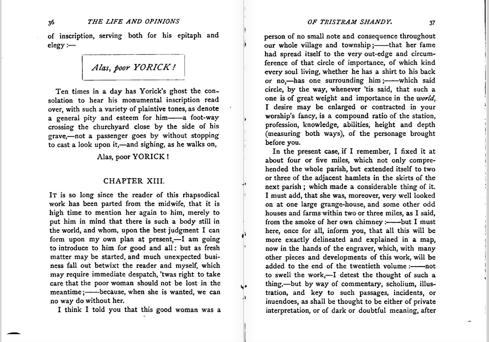
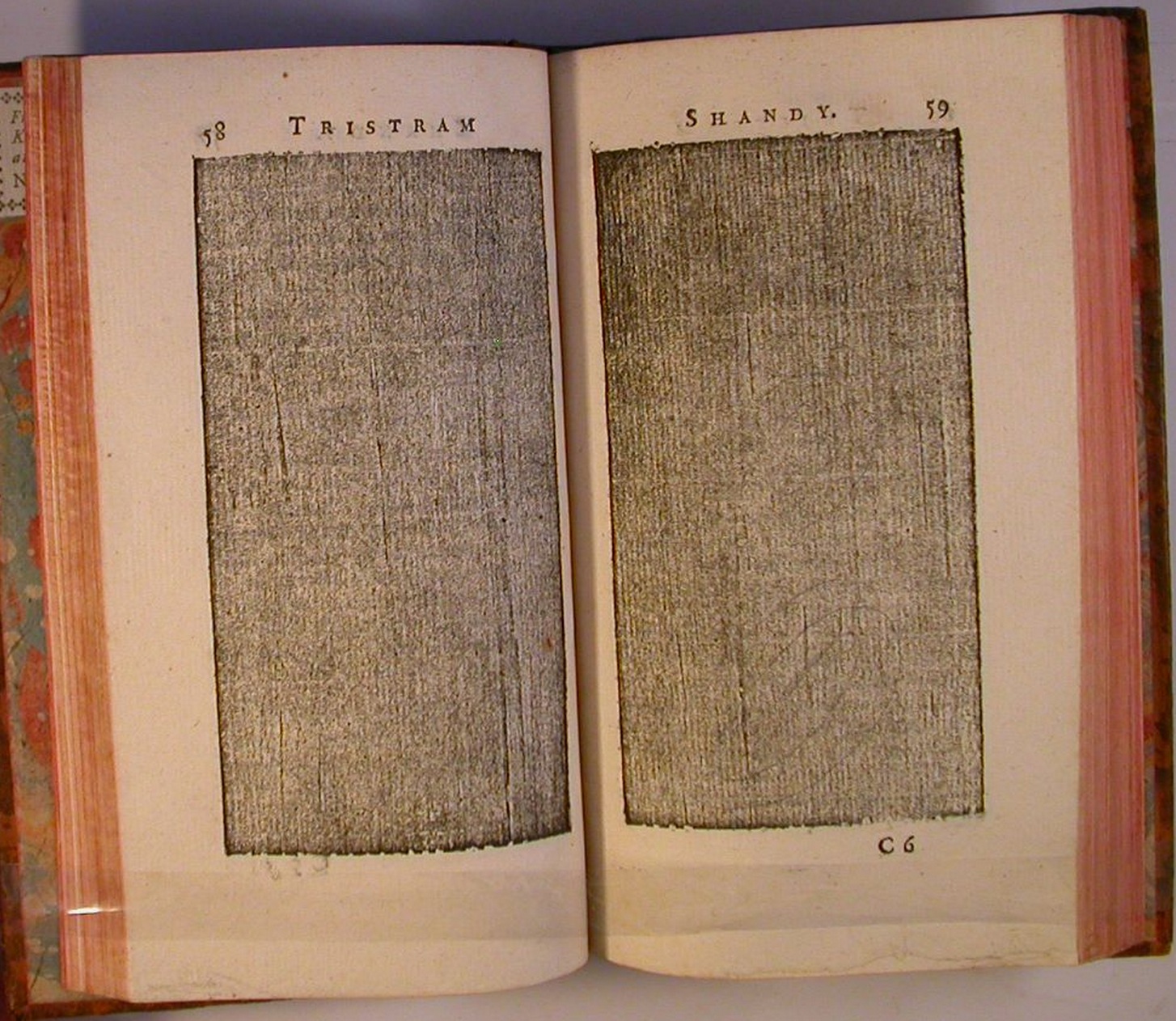
Pages are images these days in ways they haven’t been before digitization. Consider these instances of the “black page” in Tristram Shandy, which I’ve collected from different editions. The older ones are mainly from the Laurence Sterne Trust, and the newer ones from a variety of sources including the Internet Archive. This is the first edition:

Here is a later edition, which makes the black page into a framed vignette, as if a picture were to be tipped in:

Some 19th c. versions don’t reproduce the black page at all.

Some digital versions reproduce a black rectangle.

Other digital editions (this is Project Gutenberg) omit the rectangle:
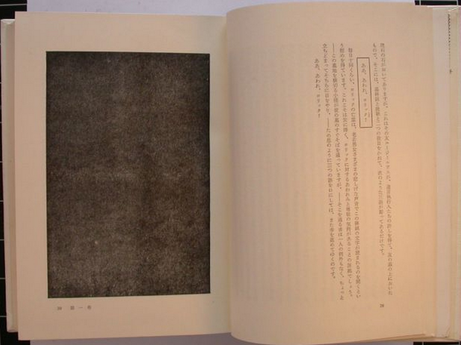
Here is a Japanese translation:

Some editions double the black page.
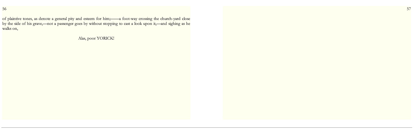
The wonderful Visual Editions version creates some new typography with the “Alas, poor Yorick” line:

Then they print two pages of text with strikethrough:
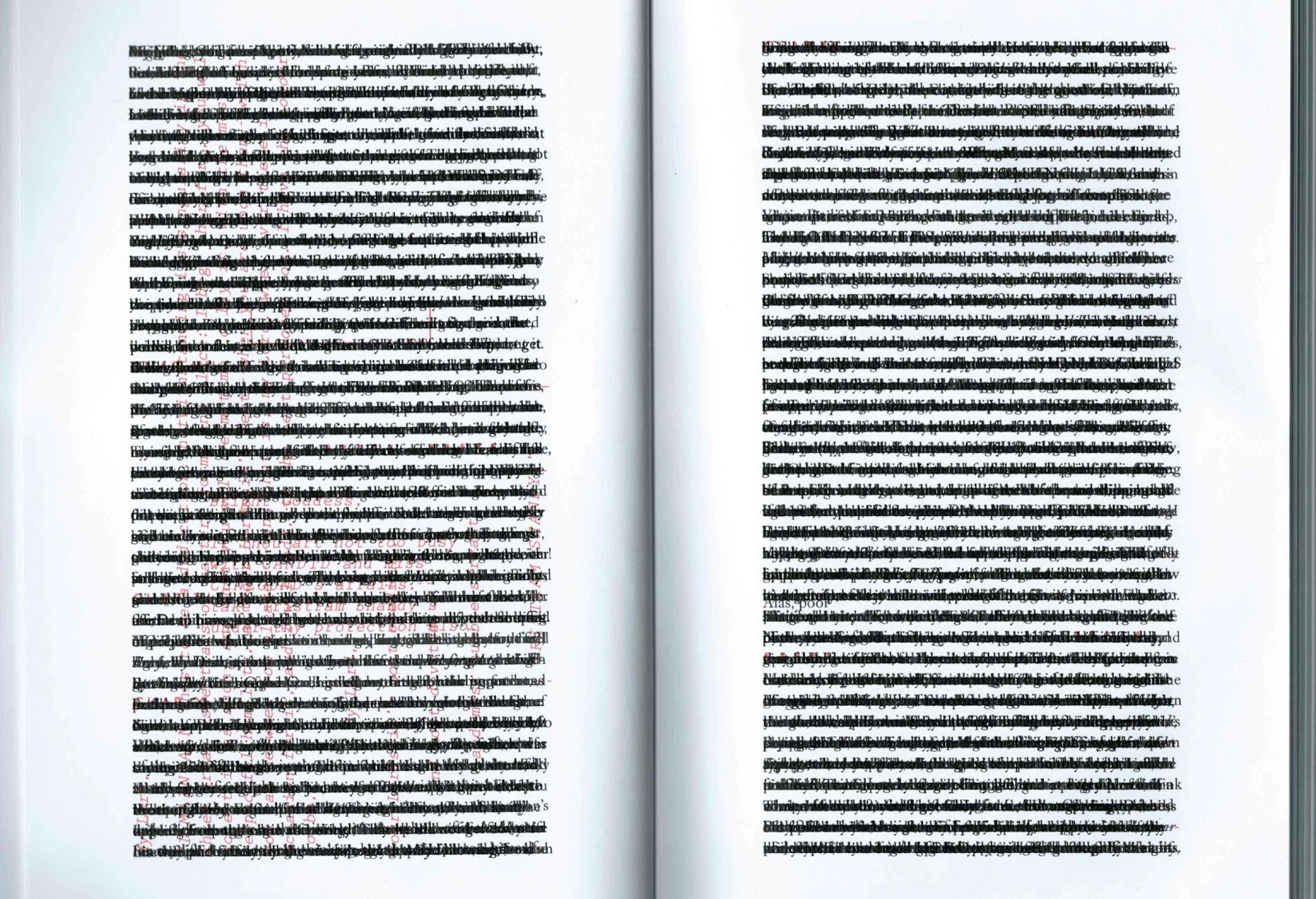
A close look shows that there’s another text—taken from elsewhere in the novel—printed at right angles, in red:

A great deal could be written about these variants, and such an analysis could be made relevant to the first editions, because the body text in those editions has that very graphic kind of typesetting typical of the 18th century: wide line spacing, quotations marks set off in the left margin, m-dashes, and so forth. By 19th and 20th century standards, the early editions are already graphical throughout. But aside from that possible parallel the contemporary digital and online versions do much more, and go in many more directions, than the impressed black page in the first edition.
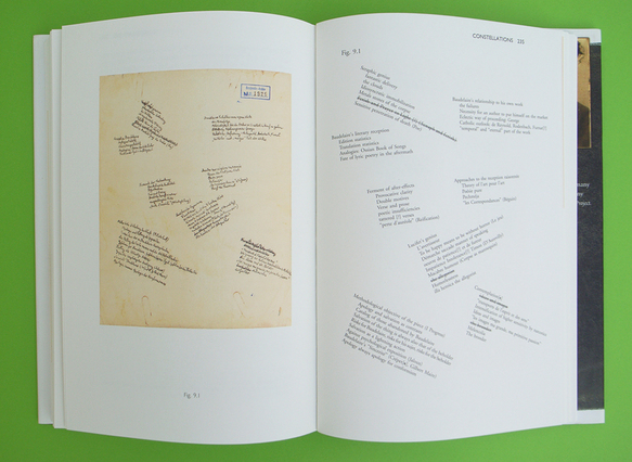
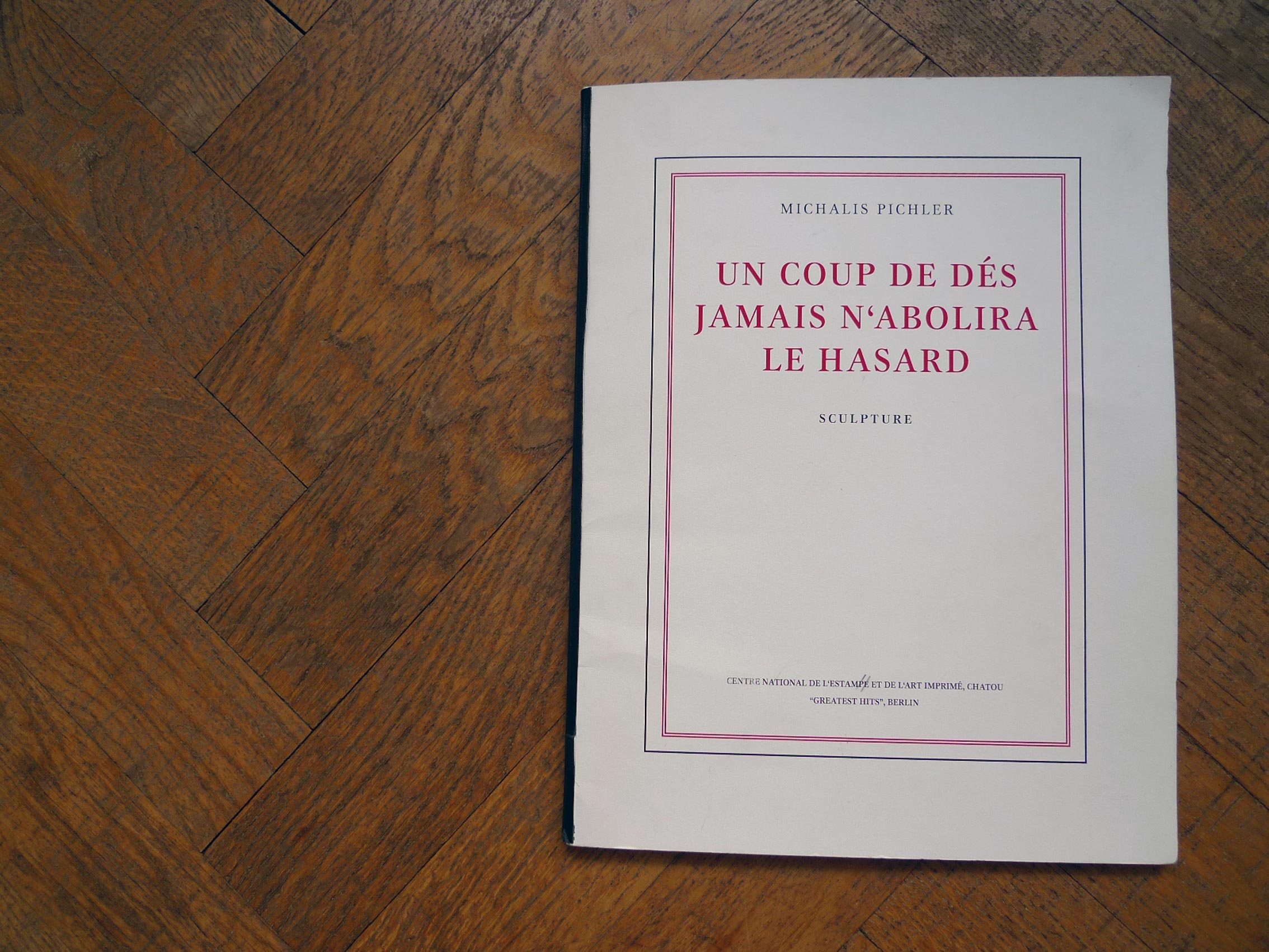
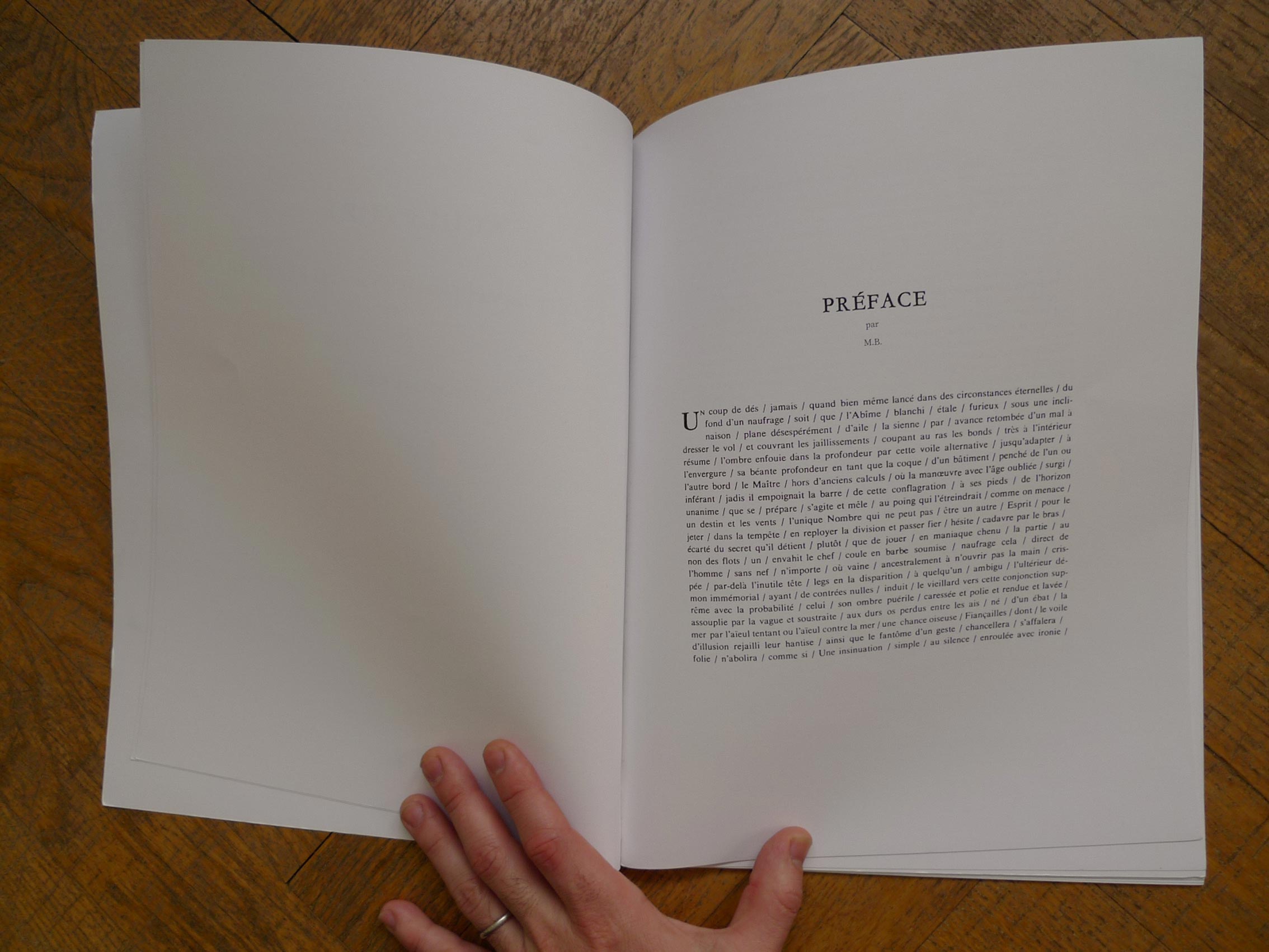
Mallarmé’s Un coup de dés is central to this theme because its pages refuse to be recognized as images in the naturalistic sense, even though it toys with naturalistic conventions throughout. (For example in the cascading shipwreck, and in the crucial trope of the constellation.) Michalis Pichler calls his version of Mallarmé’s poem a “sculpture”:
The “Preface” is the entire text of the poem, rather than Mallarmé’s original preface:
And the poem is replaced by cut-outs in place of words and lines:
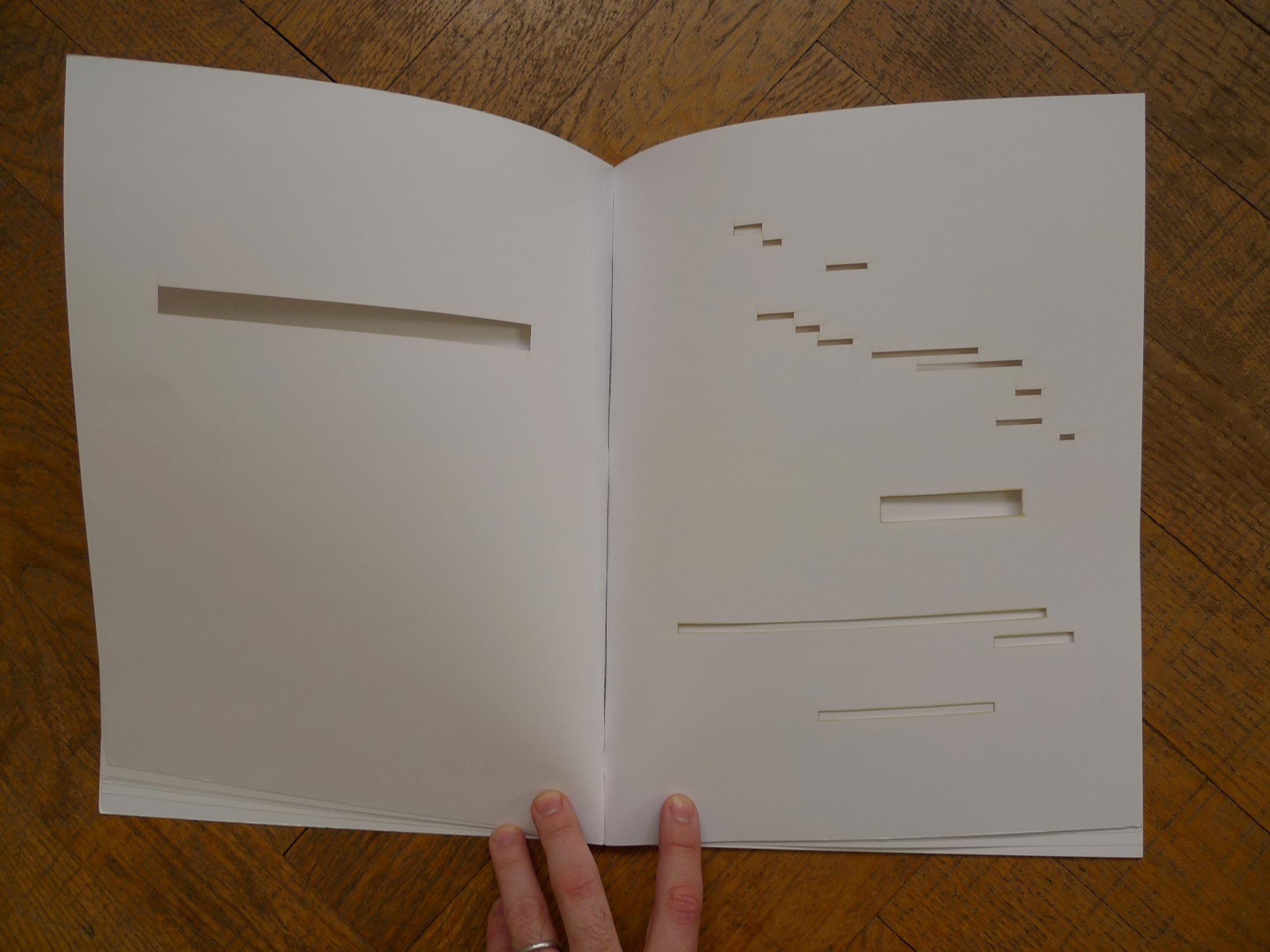
Here too the page becomes an image, but there is a possibility of reading, or rather remembering reading, depending on how well you remember the poem (or compare this edition with a version of the original). As in Marcel Broodthaers’s version, in which words are blanked out, this text is almost available—in Broodthaers’s book, Mallarmé is arguably more nearly available because no holes are punched in his formatted pages. Conversely, in Pichler’s book, the poem itself becomes a text—not even a poem with an ordinary left justification. (Another example of punch-cut pages is Jonathan Safran Foer’s Tree of Codes, which I discuss in this section.)
For me these books raise questions of what counts as a page or a text. Un coup de dés does not produce a new interaction of words and images; in fact the visual aspect of the book (pamphlet) reduces the interest of Mallarmé’s “constellation” by making it appear to be reducible to an abstract question of page, writing, and poetry. A difficulty with attending to the graphical, visual properties of text, typography, or layout, is that it is not possible to know when, or how, to stop attending. By limiting this project to books in which print is not meant to signify as a visual object—regardless of the impossibility of that lack of signification—I am hoping to simplify this project, which is already difficult enough.
4. Books of images (on wordless texts)
Artist’s books often relinquish narrative in favor of other principles of organization, or in favor of randomness, insouciance about order, or visual patterns. I am mainly interested in books that retain the right to trouble their reader to turn pages in order, even if the reader might not end up doing anything of the kind. People reading drafts of this project online have wondered why it is so narrowly focused on continuous narratives and interpolated images. Why focus on the relation between narrative and static images, given the enormous variety of kinds of word and image combinations? What about artworks in different media, with words in attendance? What about Jenny Holzer, or Bruce Nauman’s neon signs, or Ed Ruscha’s paintings of words? What about videos and films, with and without subtitles? Why, given the explosion of media, focus on books with continuous written narratives?
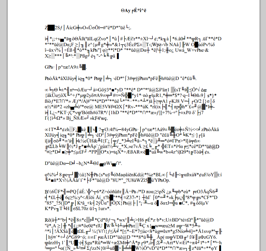
I’d like to argue that continuous narrative with included images presents the most difficult case, and that other arrangements and combinations can rely on the idea of a fundamental encounter of narrative and image. Often artist’s books invite skimming or sampling, and so do many novels. An interesting list of books that function as images was given by Kenneth Goldsmith in an essay in The New Yorker. He mentions for example Angela Genusa’s Tender Buttons, which turns Stein’s book into computer code:

And also a conversion of Ulysses into Q.R. bar codes:
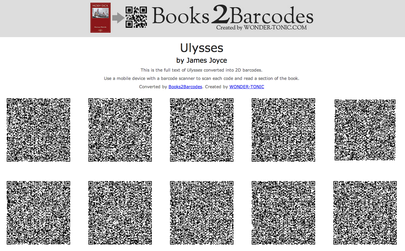
These are interesting because text becomes illegible as it becomes visual: these are more visual than books in which text is altered to emphasize its graphical interest. That makes these projects radical in a way that Goldsmith doesn’t mention, because he is more interested in the rule-bound unoriginality of these projects. My rule of thumb here is that an artist’s book falls within this project if there’s the possibility that a reader might sit down and read through it.
Prof. Elkins: A timely post & one needed for “housekeeping.” I would like to see some young conceptualist (or even one “over 50”) perform a Burroughs cut-up on Nabokov’s notecards.
At the risk of grandstanding, I’d like to enter my own practice in the “graphical writing” department. Since 2003, I’ve been transcribing (or dictating my words for transcription) text on blackboard (handmade wood panels) for viewers to engage & “decipher.” Examples are at http://www.markcameronboyd.com. I’m uncertain whether my efforts fall under your graphic writing categorization but perhaps some of your readers might find this an intriguing discourse.
Cheers!
MCB